Trade-in
Argos offered trade-in for years, but it sat in an accordion near the bottom of the product page and handed customers to a partner’s site. I moved it up the page, guided two partners through our design system, and finished with trade-in built into Argos itself.
OutcomeTrade-in conversion up to 4% from almost nothing, and an embedded journey live in August 2026.
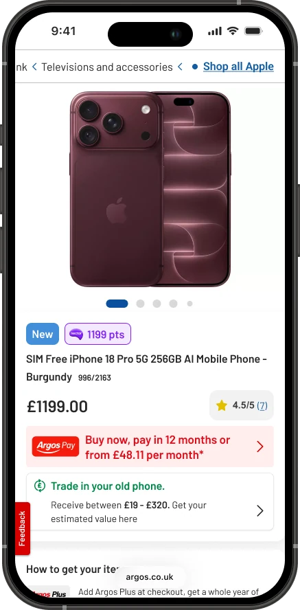
Worth up to £320, and hard to find
Someone buying a new phone often has an old one in a drawer. Trade-in turns that into money off. On the product page it lived inside Special offers, an accordion near the bottom, competing with voucher codes and bundles.
Customers who did find it were handed to Likewize, our trade-in partner at the time. The service had run for years on low volumes.
Before the move, trade-in conversion was almost nothing.
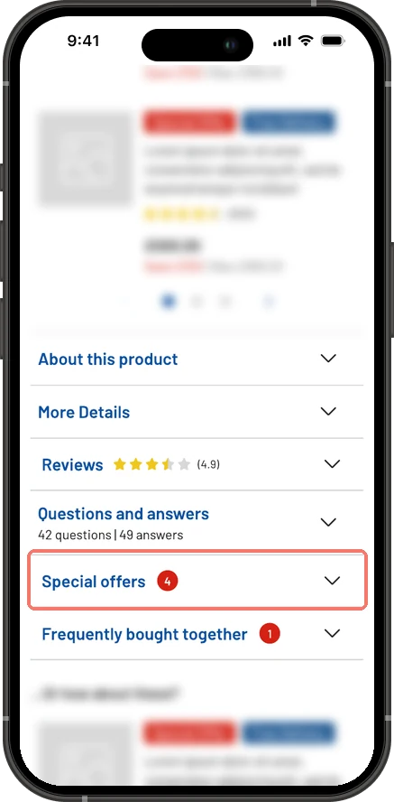
Two problems
The first problem was findability: trade-in needed a place on the product page where people would notice it and understand it. The second was the partner. Trade-in runs on an external partner’s platform, and neither partner had UX support of their own, so it was clear from their screens where things were going wrong.
My role: I was the senior designer, working with a product manager, the propositions team and the trade-in partners, first Likewize and then MTR. I designed the placement and messaging on the product page, taught each partner to use our design system, and kept watch over the customer experience in every screen they built.
- Summer 2025Placement and messaging on the product page, tested with first click tests.
- 2025Reworking the Likewize journey with Argos patterns.
- The switchArgos switched trade-in partners, from Likewize to MTR. Trade-in paused, with a holding page promising April 2026.
- 2026Reviewing MTR’s first journey, then designing the embedded version with them.
- August 2026The embedded journey live, from the product page to the trolley.
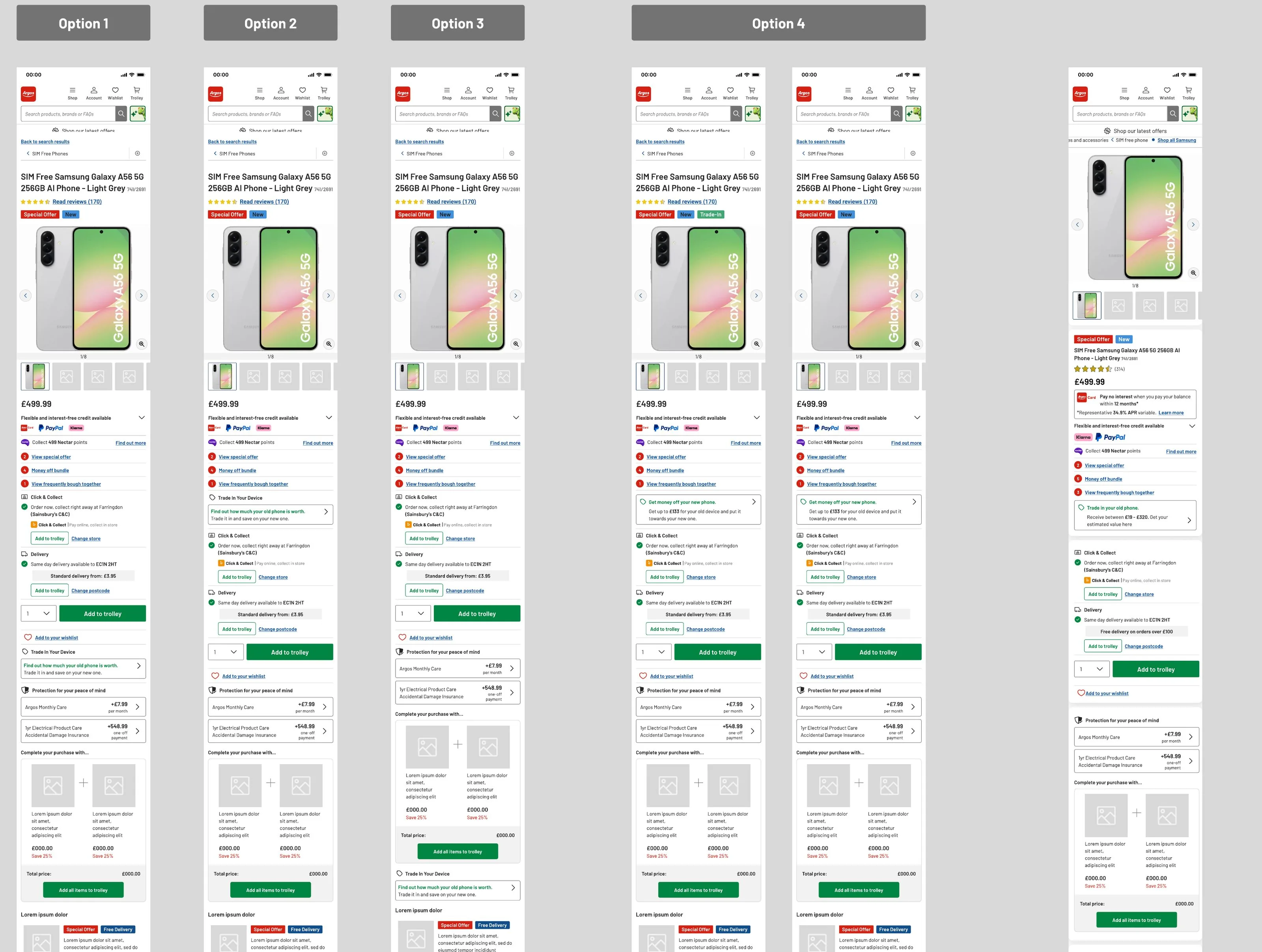
Finding where trade-in belongs
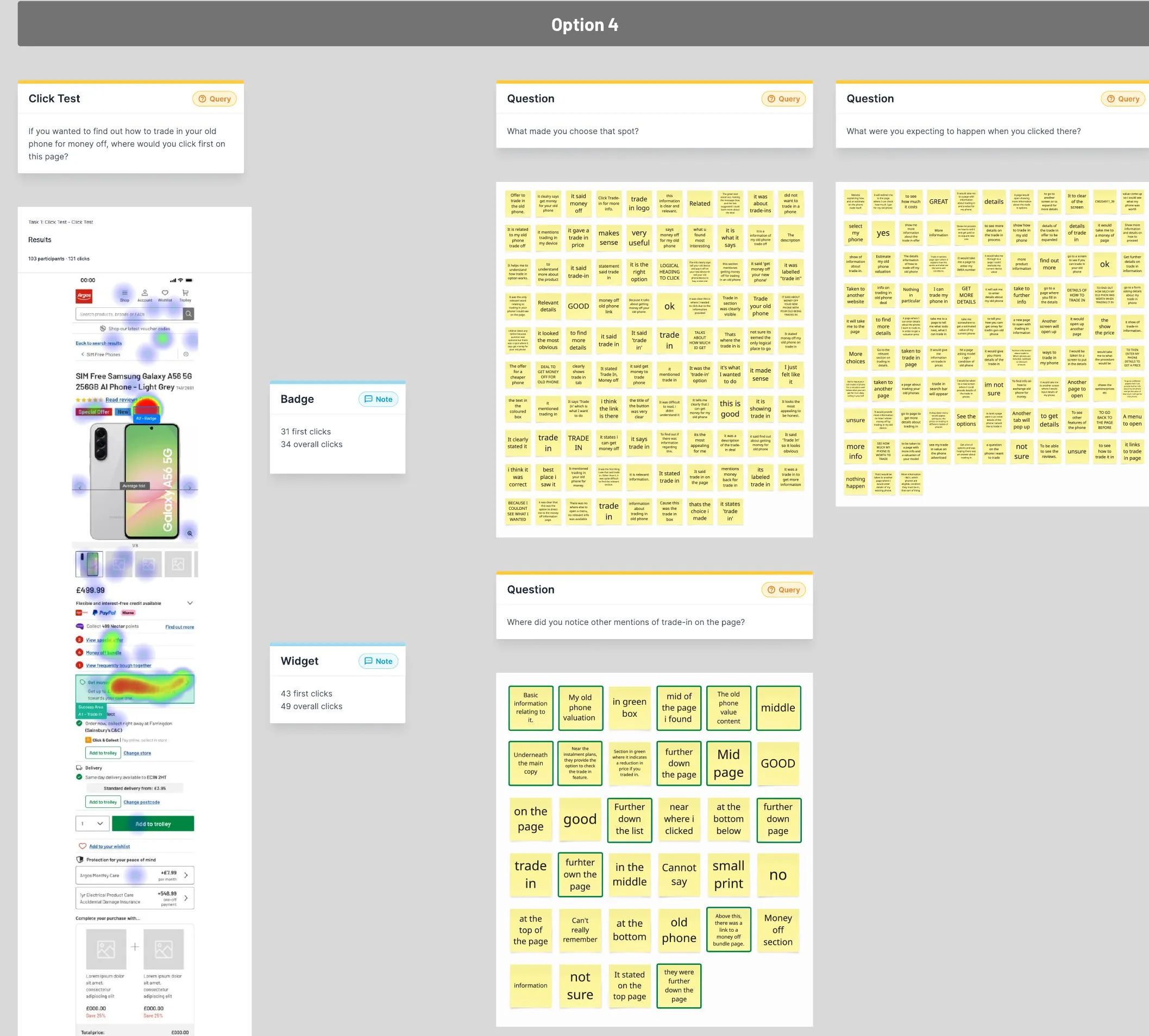
Where it went on an already busy page needed testing. I designed four placements, from the offers under the price to further down the page, and a badge by the product title, then ran first click tests with around a hundred people per option.
What the test told us
The widget under the offers beat the badge by the title, 43 first clicks to 31. It sits with the other things that change what you pay, like credit, Nectar points and bundles.
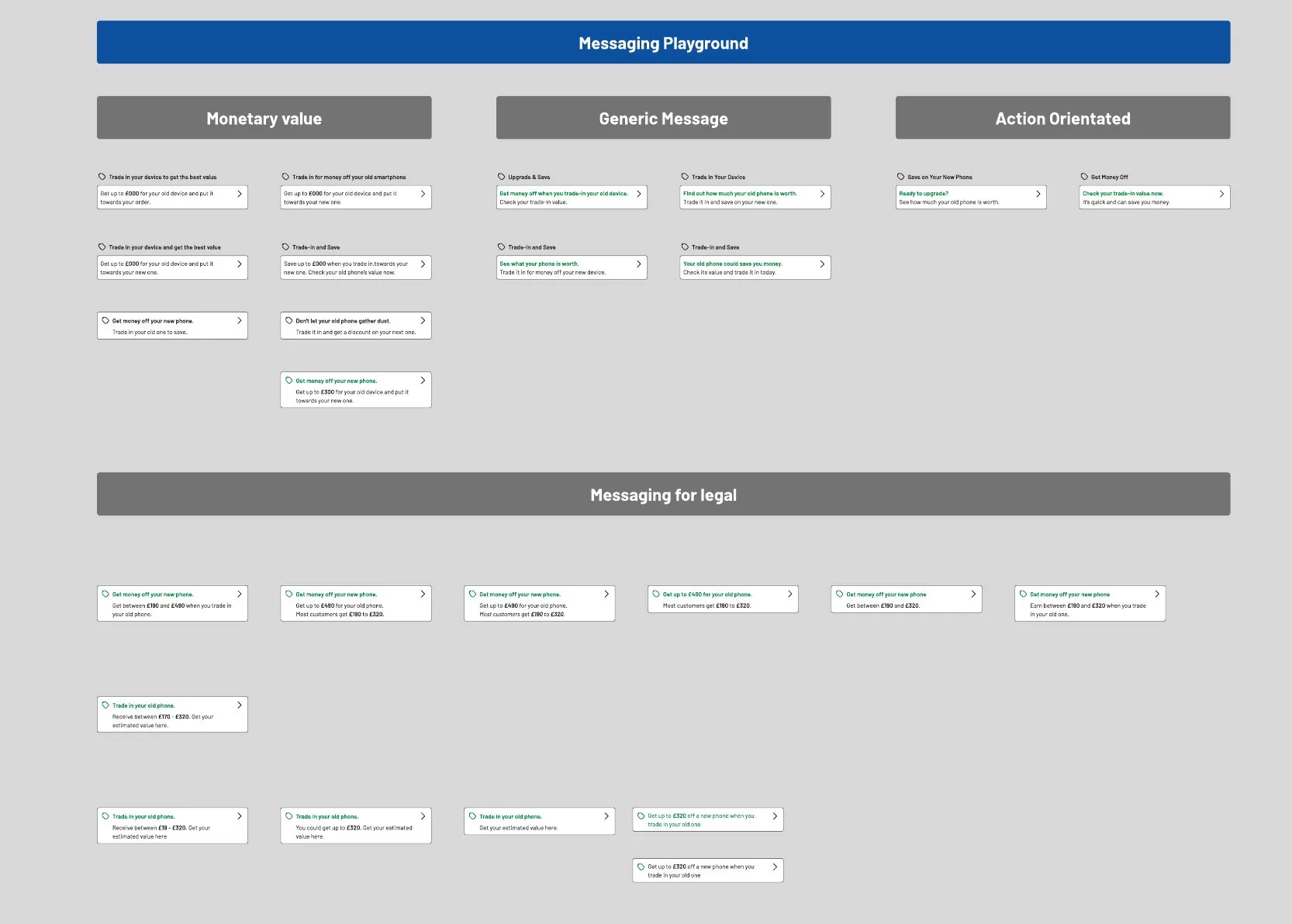
I tried messages built around money, generic messages and calls to action. Then I worked through the options with legal: an “up to” figure, a typical range, or the full range a customer could get. The full range is what shipped, so the number you see is one you can actually get.
“Trade in your old phone. Receive between £19 and £320.”
Making a partner’s screens feel like Argos
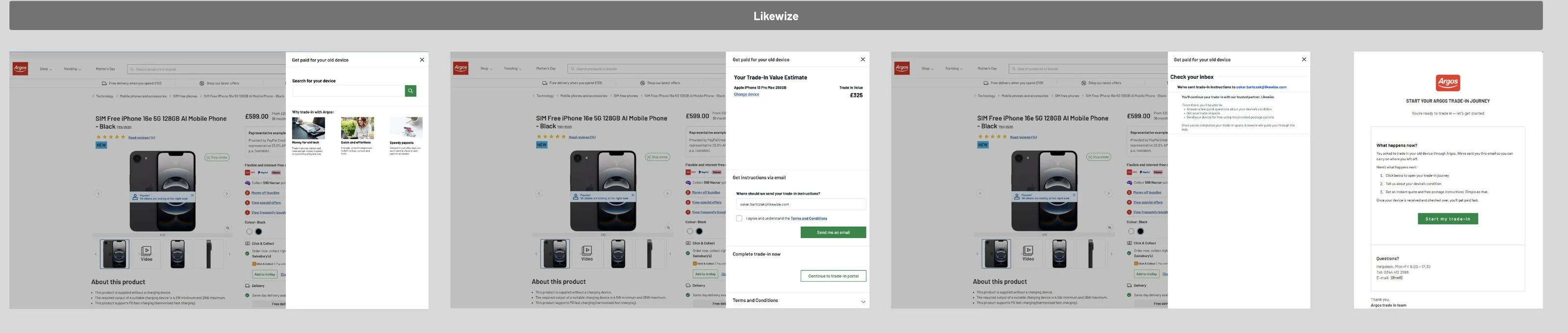
Likewize’s flow opened in a panel over the product page, gave an estimate, then sent customers off by email or to a separate portal to finish. I reworked it with Argos patterns: popular devices up front, a clear choice between finishing now or getting instructions by email, and emails that looked like they came from us.

Switching partners, and the gap
Argos then switched trade-in partners, from Likewize to MTR. There was a gap between the two, so trade-in went offline for a while. Instead of a dead end, customers got a holding page: back in April 2026, and a way to keep shopping tech in the meantime.
With Likewize, trade-in always ended somewhere else. With a new partner, we could build it into Argos from the start.
A partner without designers
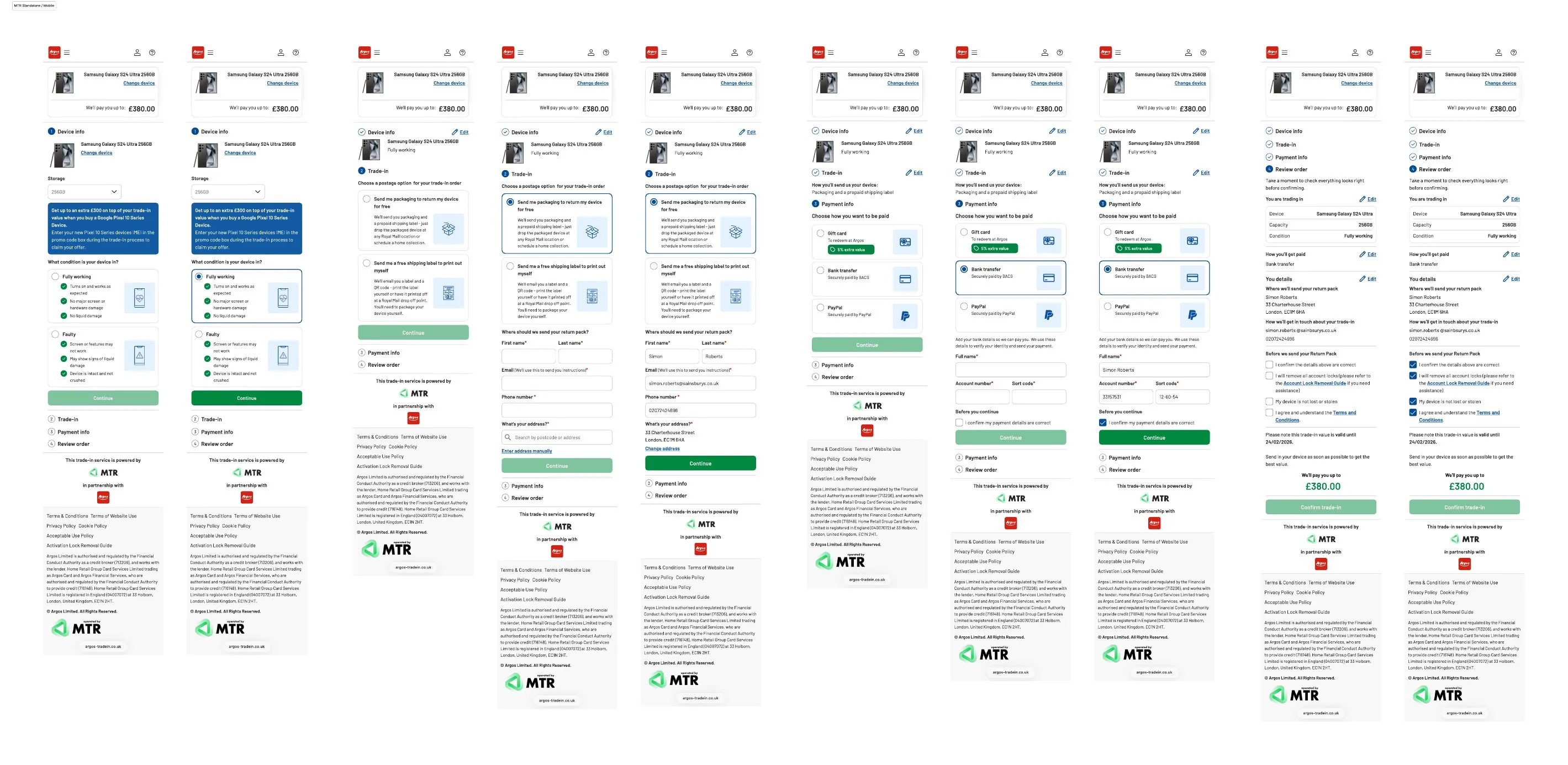
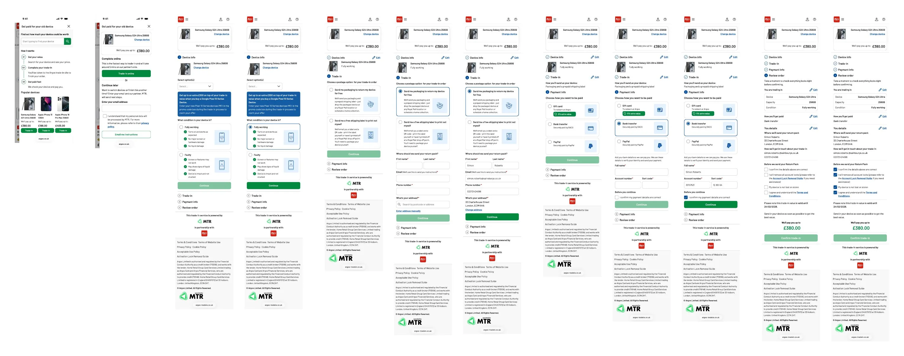
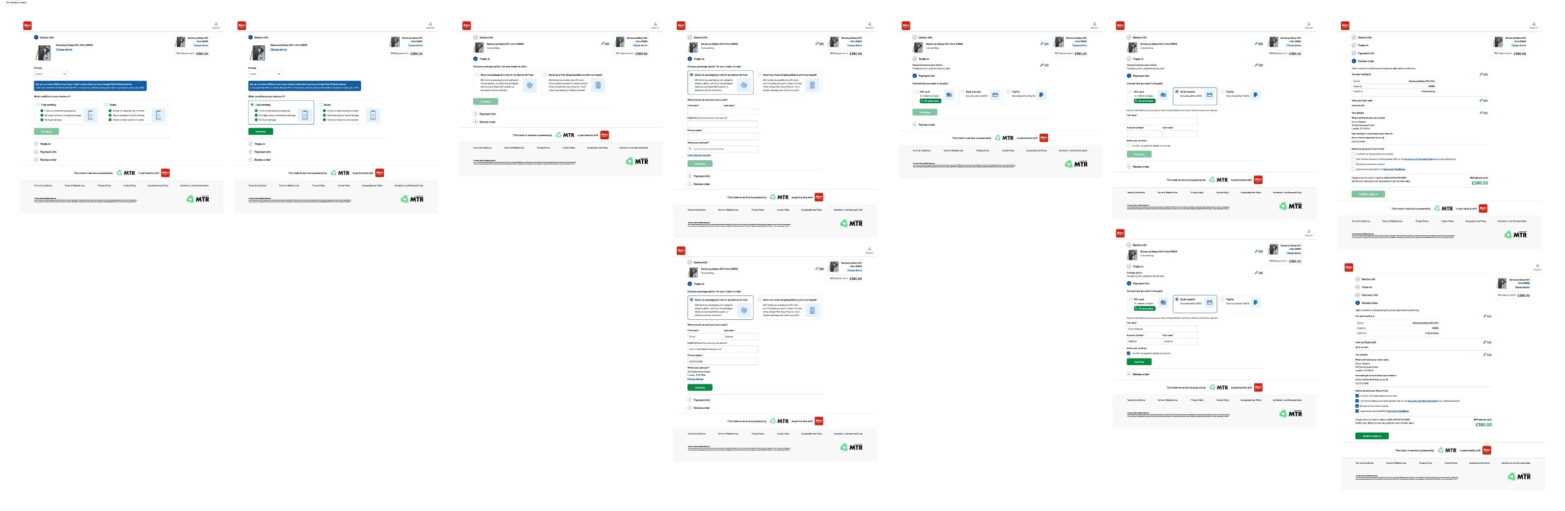
MTR’s first journey was a separate site in four steps: your device, how to send it, how to get paid and a final review. It worked, but it used its own patterns and repeated a long block of legal copy on every step.
MTR had no UX support, so I walked their team through our design system, reviewed their screens as they came in, and redesigned it with them as a sheet inside Argos.
Where we started with MTR
Their first designs on mobile and desktop, and the widget that opened them. This is what I reviewed with them, screen by screen, before we brought it into Argos.
The embedded journey
Stay on Argos
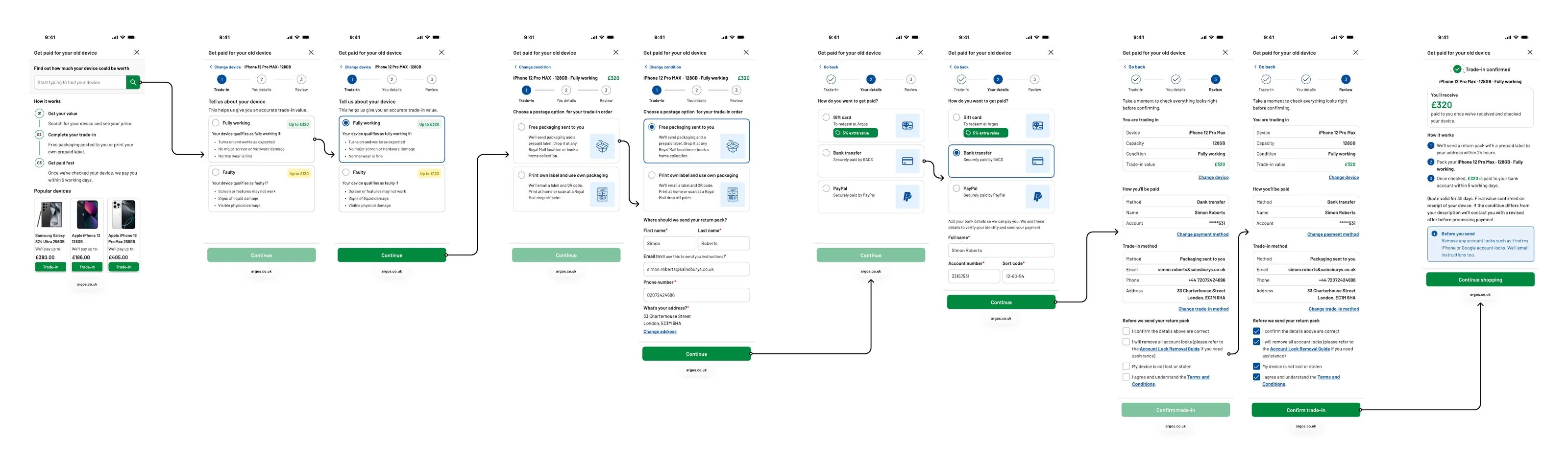
Trade-in opens as a sheet over the product page instead of a separate site. Customers search for their device or pick from popular ones, and see how it works in three steps before they start.
Show how condition changes the price
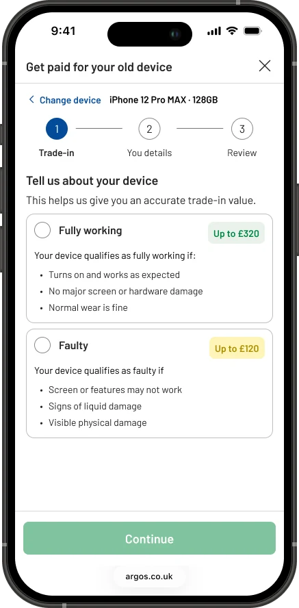
Two choices, fully working or faulty, each with what qualifies and what it’s worth. Customers see the difference before they pick, instead of finding out at the end.
One line per option
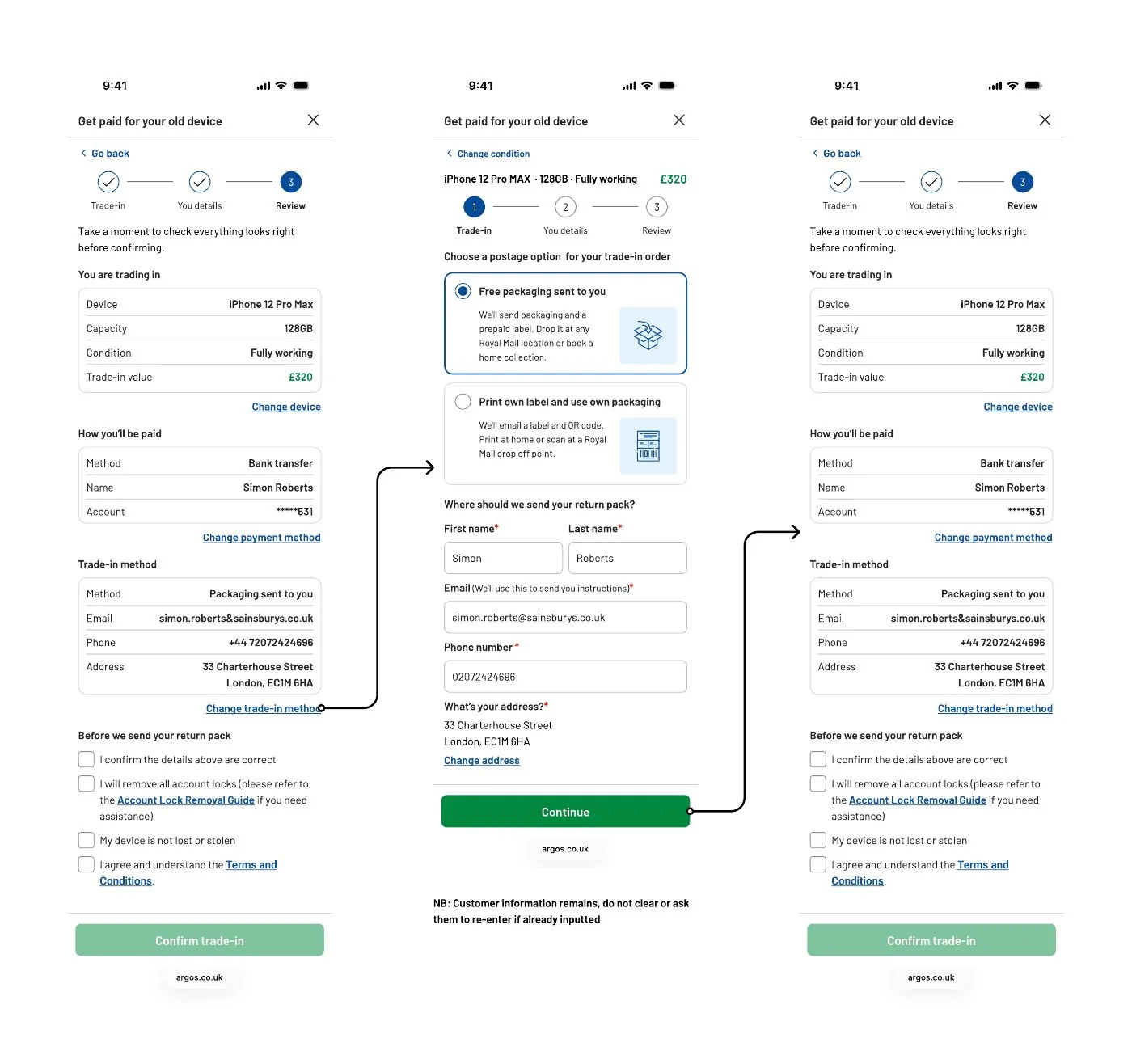
Free packaging sent to you, or print your own label. Each option says what happens in a sentence, with an icon to scan by, and the device and its value stay pinned at the top of every step.
Make the payment choice honest
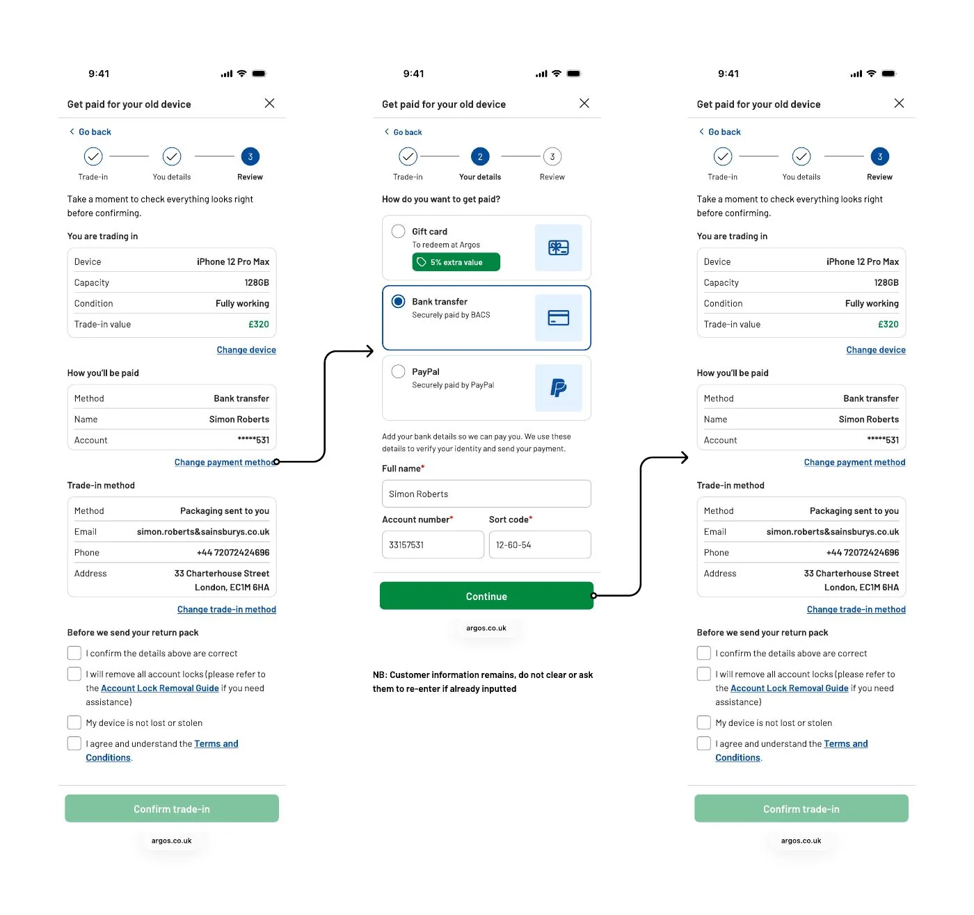
A gift card with 5% extra value, bank transfer or PayPal. The extra value is a small label on the gift card option, so customers choose the one that suits them.
Check everything before committing
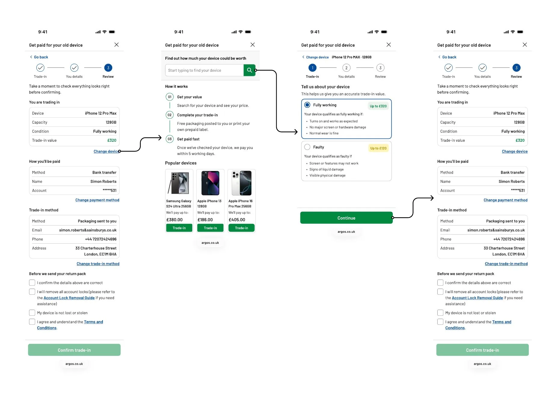
The review puts the device, how you’ll be paid and how it’s posted on one screen. Each has a change link that returns here with everything else kept, so nobody starts again.
Take the trade-in to the trolley
Trade-in follows the new phone into the trolley as its own card: the device, its condition and the value, with a way to remove it. The customer sees both halves of the deal in one place.
Say exactly what happens next
The confirmation leads with what you’ll receive, then three steps: a return pack within 24 hours, pack your device, and payment within 5 working days once it’s checked. How long the quote lasts and what happens if the condition differs sit right there, along with a reminder to remove account locks before sending.
Every path through it
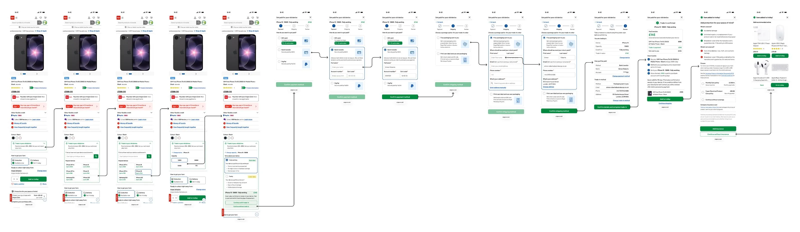
Start to finish, then the paths around it: changing the device, the payment method or the postage from the review, and opening trade-in from the trolley.
What changed
The offer stayed the same. Moving it under the price took conversion to 4%. Volumes are up since it moved.
Where it goes next
Today, trade-in still opens as a separate step. The north star puts trade-in inside the product page itself: choose your old phone, its capacity and condition in the widget, see the value before you add to trolley, then pay and post in one flow that ends with the new phone in your trolley.
What I learned
Test placement first
A first click test told us where to put trade-in before anything else was redesigned.
Test the words as well as the place
Where trade-in sat mattered, but so did what it said. Working the value message through with legal early meant the number customers saw was one they could actually get.
Being the partner’s designer
Neither partner had UX support. Teaching them our design system and reviewing their screens was as much the job as designing my own, and it’s why trade-in now feels like Argos.
Design the gap too
Switching partners meant trade-in went offline. A holding page with a date and somewhere else to go told customers when trade-in would be back.
Try the trade-in journey yourself
The embedded journey is live on Argos phone pages. Open the product page, tap the trade-in component under the price, and it starts from there.
Next case study
Ask Trevor →Argos’s generative AI shopping assistant, from a one day hackathon to over a million customer conversations.