Ask Trevor
Argos’s generative AI shopping assistant. It started at a one day hackathon and was live nine months later. I led the design, and it now handles over a million customer conversations.
OutcomeOver a million customer conversations. Customers who use Trevor convert at 2.5 times the site average, and satisfaction rose from 58% to 70%.
When search isn’t enough
Someone after a TV for a bright living room, a laptop for a seven year old, or a present for a teenager into gaming isn’t helped much by a search bar and a filter panel. Argos sells more than 28,000 products, and for bigger purchases customers were leaving the site to find the information they needed to feel confident.
83% of Trevor conversations happen on a phone, so every decision was made mobile first, even though we built for web.
From hackathon to a million chats
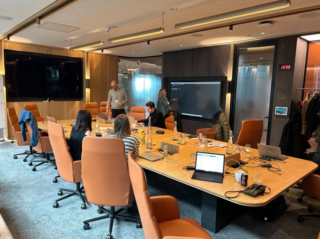
Trevor started at a one day generative AI hackathon at Microsoft’s Paddington office in January 2024. The engineers spent the day adding AI review summaries to a live product page. In the next room, product and design looked at AI for search and browsing, and I designed concepts live on the big screen while the room threw ideas at me.
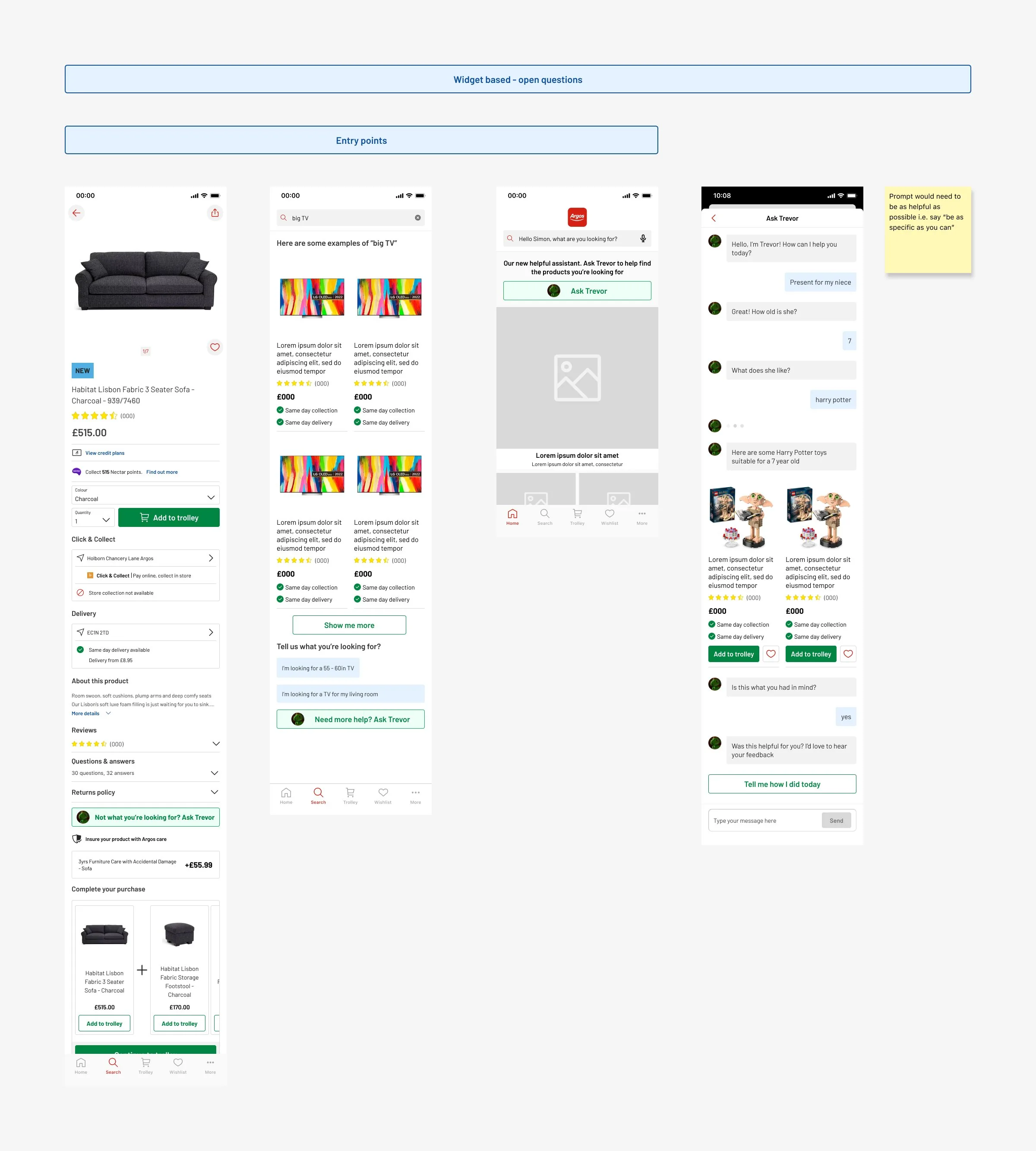
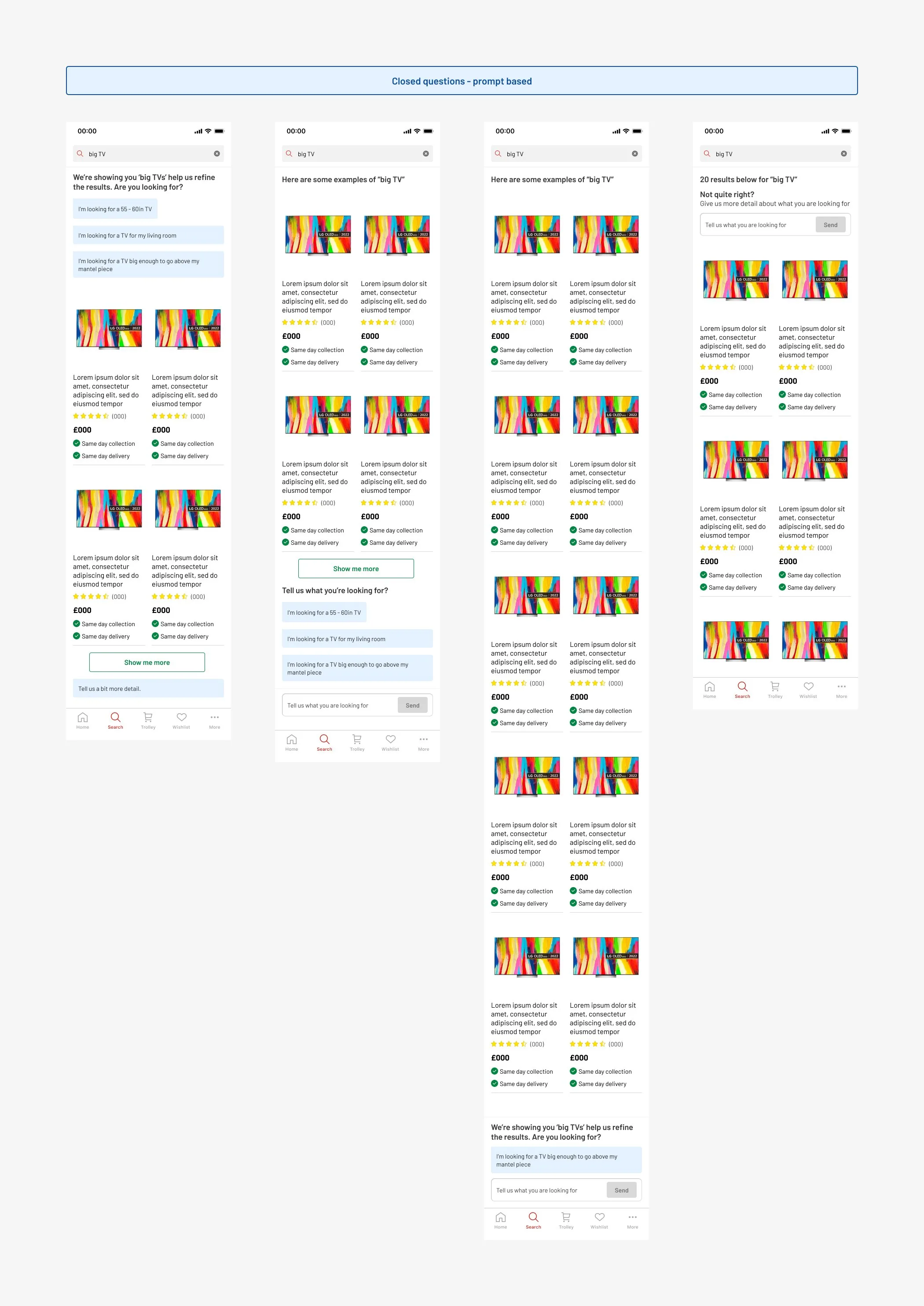
Two concepts came out of it: a search that asks follow up questions when you type something vague like “big TV”, and a chat assistant. I called the chat assistant “Ask Trevor” as a joke, and the name stuck.
A colleague said designing live in front of everyone was the design equivalent of being a contestant on Gladiators.
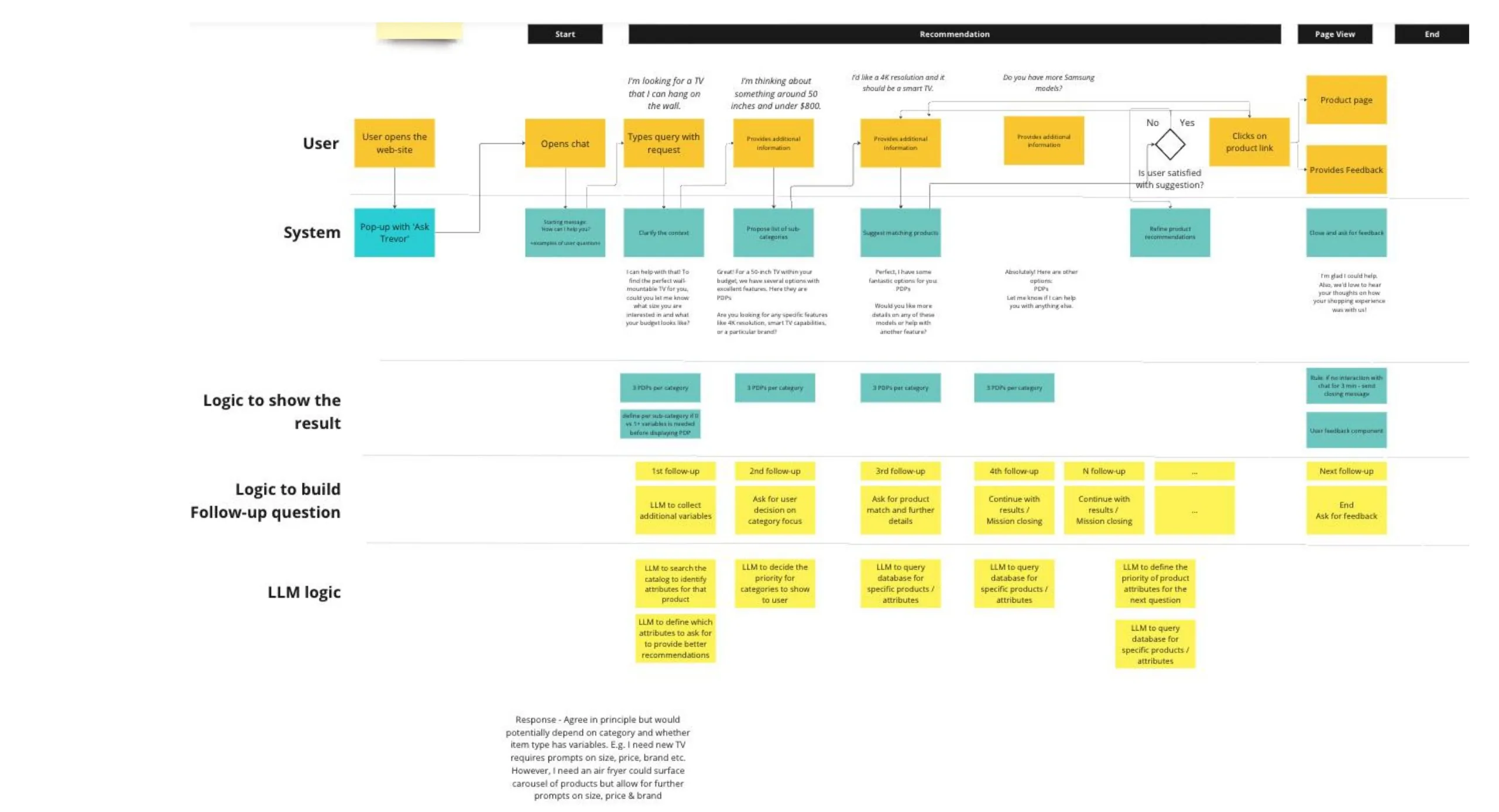
My role: I was the only designer, working with a PM, a UI engineer, an LLM engineer and a top of funnel engineer. I owned the experience end to end: the conversation design, the guardrails and trust messaging, the entry points, and the PDP summary and comparison features. I shaped the roadmap with the PM, and the business wanted to see results before it invested more.
- Jan 2024Microsoft hackathon. Two concepts and a name.
- Spring 2024Discovery with outside AI specialists. Three missions: a new product, a gift, and a multi category shop like kitting out a home office. It ended with a green light for a dedicated team. App first UI, then a move to web, built with Fable, the Argos design system. What the LLM could and couldn’t do became the main design constraint.
- Summer 2024Internal launch. Colleagues across tech were asked to stress test Trevor with anything they liked.
- Autumn 2024Full customer roll out.
- Winter 2025More entry points, PDP summaries, comparison and a feedback system.
- Mar 2026One million customer conversations.
What it changed
Part of that 2.5x is who chooses to use Trevor: people who start a conversation were already likely to buy. The cleaner proof is the compare test further down, which showed a statistically significant uplift on its own.
Where it started
The room at Microsoft, and the two concepts I designed there that day: a chat assistant that asks a few questions and comes back with products, and a smarter search that offers to narrow down “big TV” before you scroll.
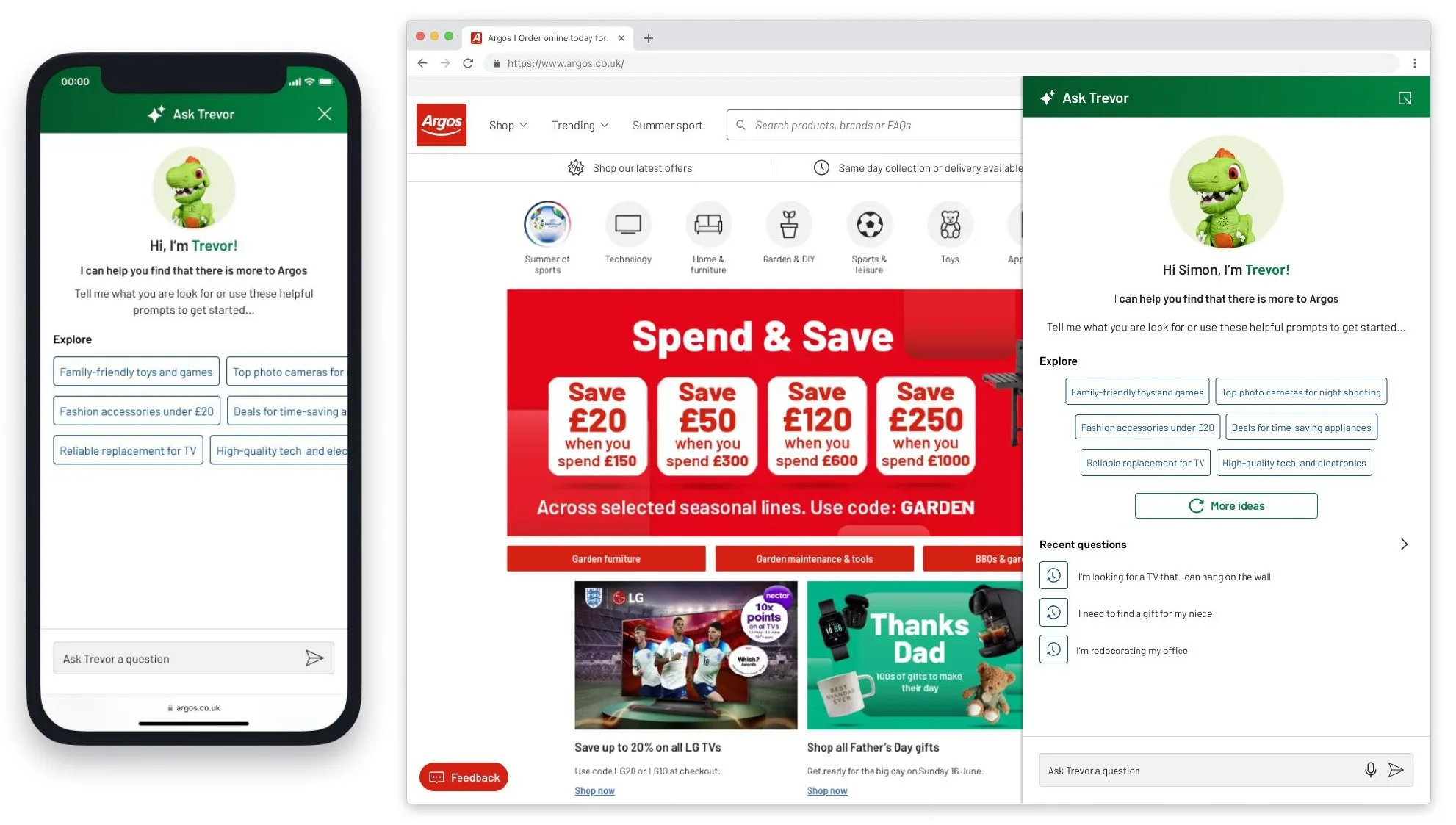
You ask, Trevor answers
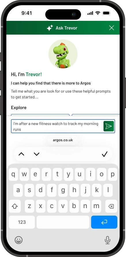
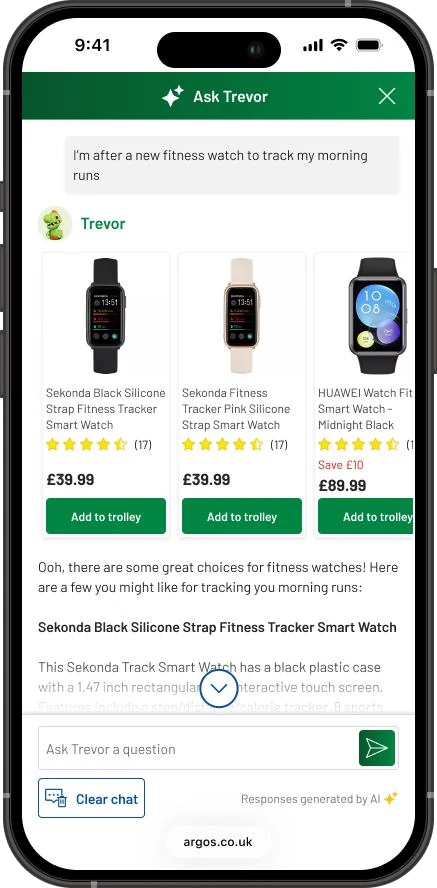
Discovery, comparison and gifting were the three missions Trevor had to handle well. These are real questions and the real screens he gave back. Pick one.
Three watches, each with a reason, and add to trolley right in the chat.
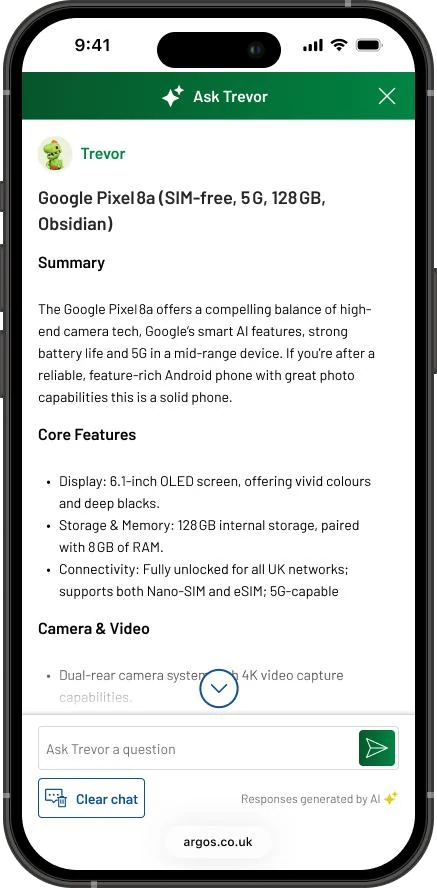
A product page boiled down to what matters, with follow up questions at the end.
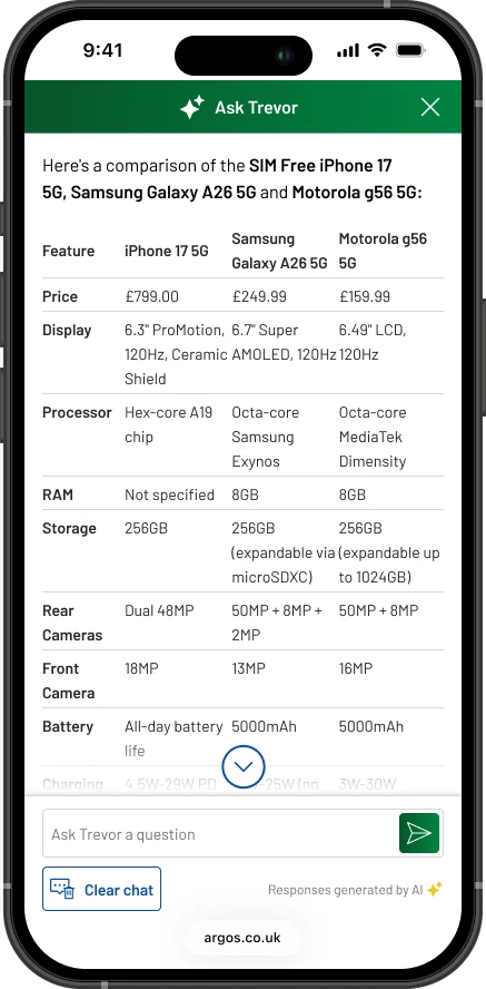
Picked from the lister, built by Trevor. A side by side table Argos had no other way of showing.
The calls that shaped it
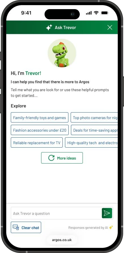
Scope: explaining what Trevor does and how to ask
The first version assumed people knew what to do with a chat box, and most didn’t. They weren’t sure what Trevor was for, and they didn’t know how to phrase a question. And when he couldn’t help with something nearby, like tracking an order, they lost confidence in all of it.
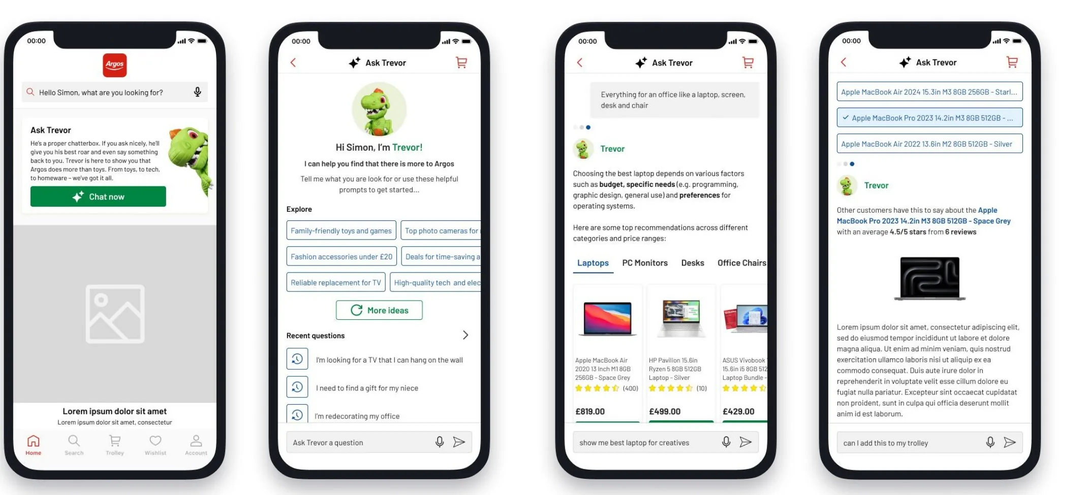
So the welcome screen now says what he’s for and gives example questions to start from, and when he can’t help, he points you somewhere that can.
Platform: web first, then native
Trevor was always meant to be mobile first. With a small team, building it once for web was the right call: one codebase, one LLM integration, quicker to ship and change. With 83% of conversations on a phone browser, the app is the obvious next step.
Designing for an AI that can be wrong
Before launch we ran trial groups with colleagues inside Argos. I could read their sessions, see what people asked, and watch how they tried to break him. That’s where the guardrails came from.
Ask for a game for a five year old and Trevor suggested Grand Theft Auto.
Our video game data didn’t reliably carry age ratings, so the model had nothing to filter on. We changed what Trevor could recommend in categories where the data was too thin to trust.
The internal launch turned up quieter problems too. Trevor couldn’t tell laptop memory from desktop memory, so ask for RAM for your laptop and he’d recommend sticks for a PC motherboard. Nothing in the answer looked wrong unless you knew.
Ask if something was cheaper at John Lewis and he’d invite you to go and check. He couldn’t see anyone else’s prices, and sending customers to a competitor is the opposite of the job. I spotted it in the sessions and we kept him to Argos only.
We also designed reassurance messaging around what Trevor is, and asked people not to type in personal details, so we never captured them by accident.
The small things that make it feel finished
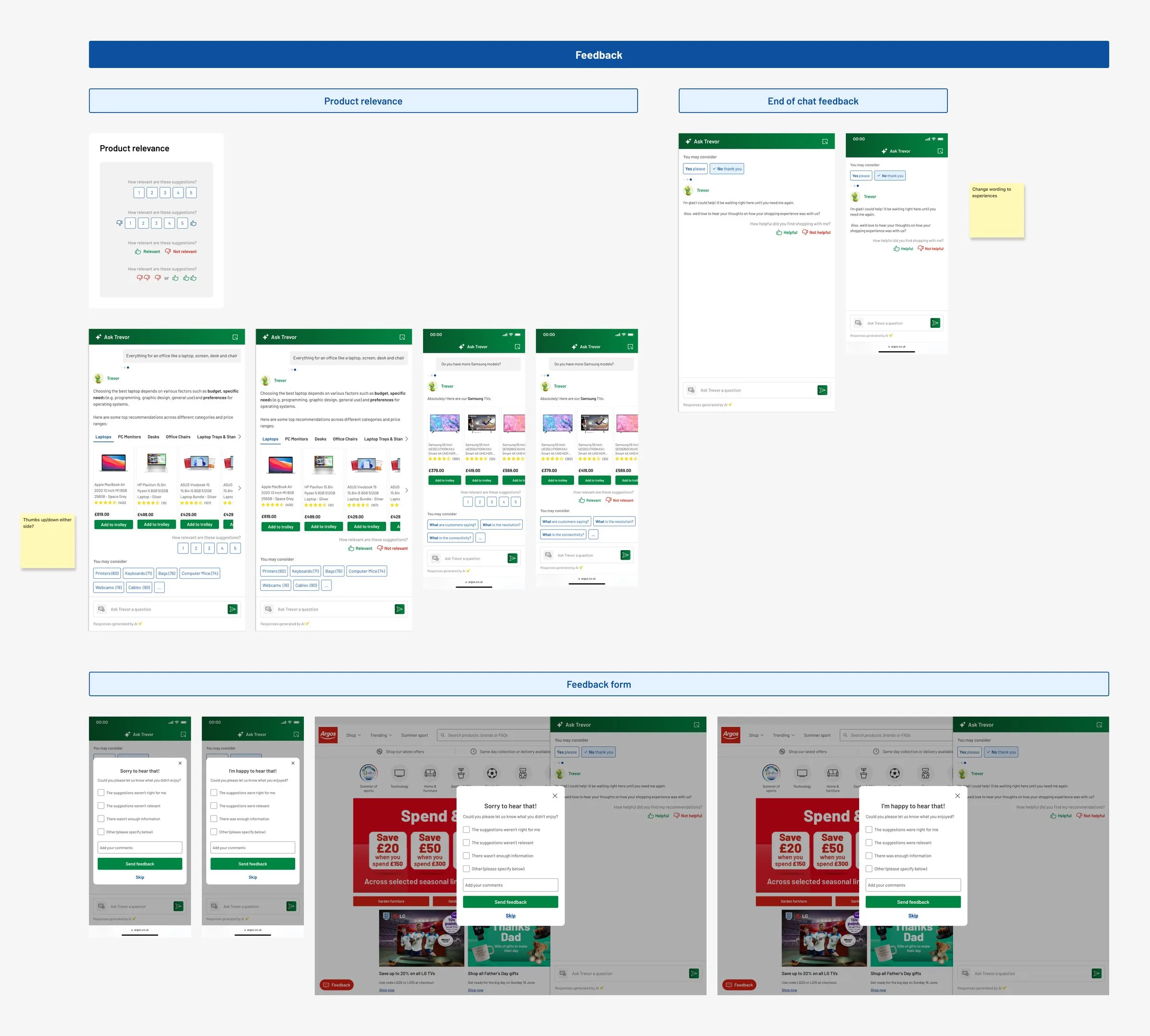
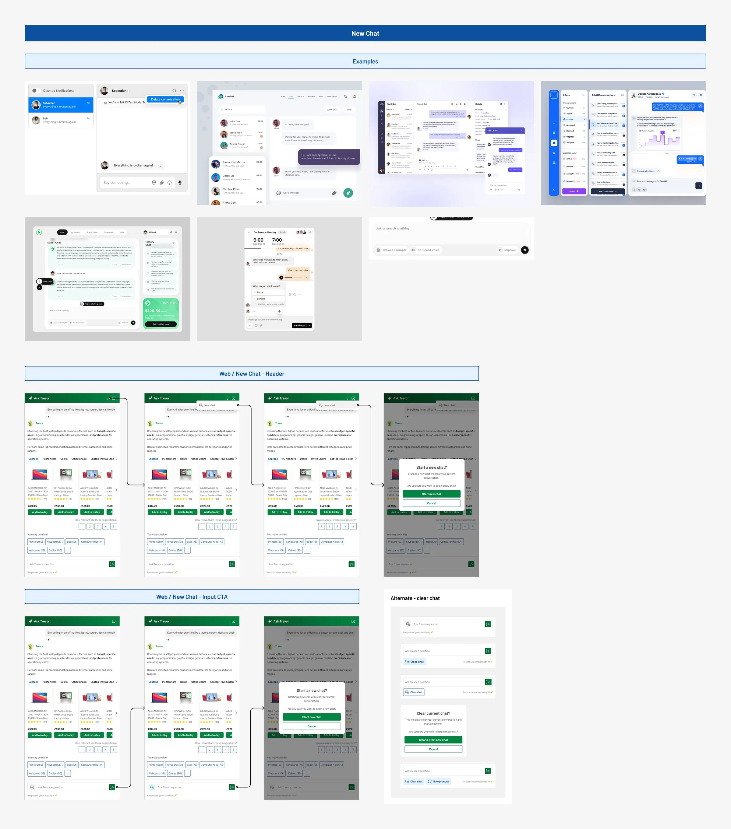
Three details from the live product.
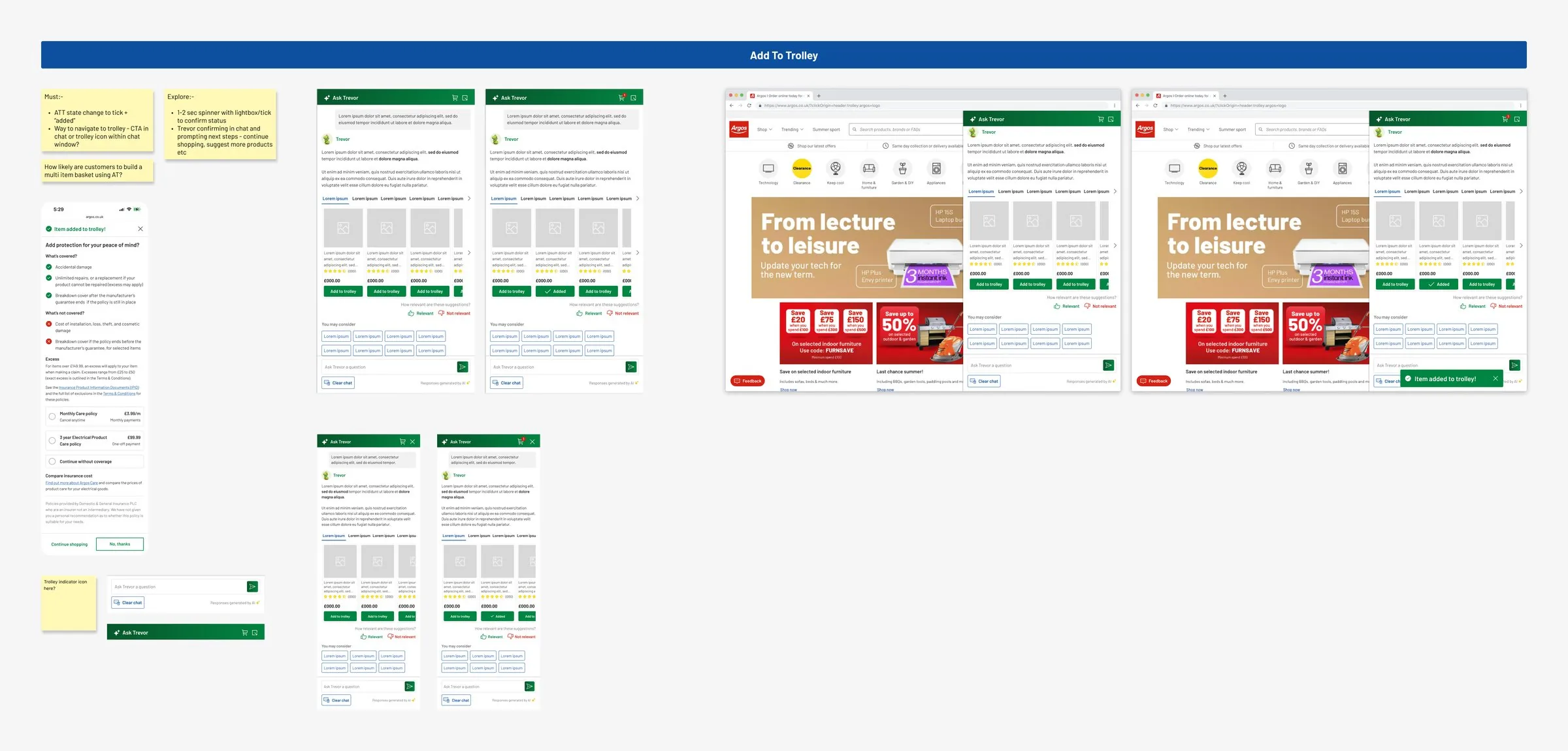
Adding to trolley without leaving the chat
The button changes to a tick and “Added”, a trolley indicator in Trevor’s header gives you a way through to checkout, and on desktop a confirmation slides in. We designed it without knowing if anyone would build a whole basket in a chat.
Where Trevor should live
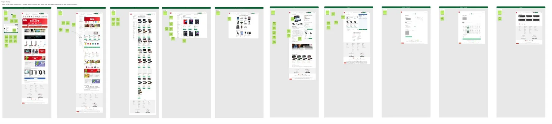
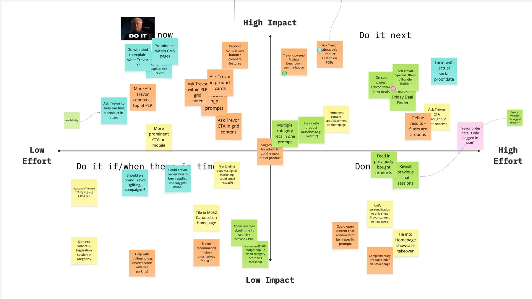
We mapped every moment in the journey where someone might need help, then scored each idea on effort and impact. The PDP summary and compare on the lister came out on top, and both shipped.
Getting people to Trevor
We launched with one entry point, a widget beside the search bar, and adoption was low. People who know what they want shouldn’t have Trevor in their way, but if nobody finds him he can’t prove anything. I kept making the case for more visibility, including homepage banners through the CMS, and each new placement had to earn its place in the numbers. The PDP summary did: more than half of all conversations now start on a product page.
In early 2025, only about 1 in 300 visits where Trevor loaded ended in someone opening him. On mobile it was even fewer.
The people who did open him on mobile were the most likely to add something to their trolley from the chat. So the work went into entry points, starting with a floating button on every page.
- Widget beside the search barAt launch
Easy to miss. Low adoption here is what started the case for more visibility.
- Floating Trevor buttonLive
On every page of the website, without getting in the way of the main navigation.
- Welcome screen promptsLive
Suggested questions and recent history, so returning customers can get going quickly.
- Summary button on the PDPLive
On every product page, below add to trolley.
- Compare on the product listerLive
Tick products on the lister and Trevor compares them side by side.
- Trevor cards in the listerNext
Prompts inside the product grid that respond to the category you’re browsing.
Summaries on the product page
Product pages for bigger purchases carry a lot: specs, variants, delivery options, reviews. The summary button gives you a short, readable breakdown that ends with follow up prompts leading into comparison.
Where it sat mattered. Below add to trolley, so it helps with the decision without getting in the way of buying. 0.32% of PDP visitors click it, and 40.3% of them go on to chat with Trevor. More than half of all Trevor conversations now start on a product page.
Trevor Compares, without new data
Argos had never been able to show products side by side because of how its product data was set up. A traditional compare tool would have been a big investment. With Trevor in place, we built it in the AI layer instead.
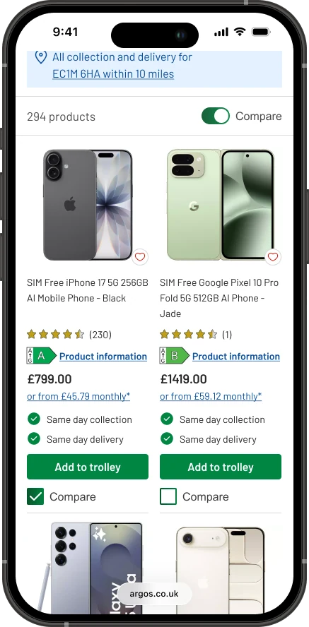
It starts on the product lister. A Compare switch above the results adds a tick box to every product, so the grid works exactly as it did for anyone who doesn’t want it.
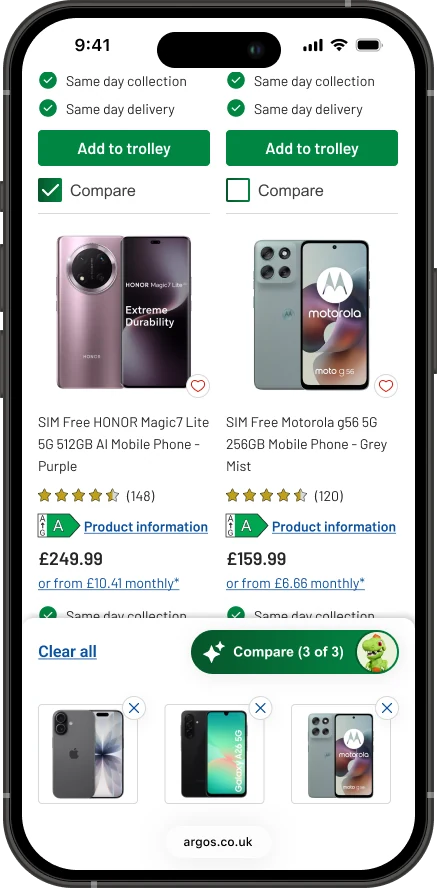
Tick up to three and a tray slides up with the products you’ve picked, a way to remove each one, and a Compare button with Trevor on it. The button counts as you go, “Compare (3 of 3)”, so you know when you’ve hit the limit.
Trevor opens with a table of price, display, processor, storage, cameras and battery, built from product data Argos already had. When something isn’t in the data, the table says “Not specified” rather than guessing. And because it’s a chat, you can ask a follow up question straight away.
Compare lifted conversion on browse and hurt it on search. So we pulled it from search and shipped it to all of browse, where the uplift was statistically significant.
The browse result was statistically significant.
Beyond the website
Trevor is now on the handsets colleagues use in store. Customers ask colleagues about products all the time, and with tens of thousands of lines, nobody can be an expert in all of them. The same assistant that answers customers online now helps colleagues answer them face to face.
That move was quicker because of groundwork I’d already laid. I built Trevor’s reusable components and a local Figma library from the start, so the conversation patterns, product cards and messaging weren’t one off screens. The in store team picked up the library and iterated on it for the handset instead of starting from scratch.
In 2026 Trevor started drawing on review summaries and answers from Argos colleagues and brands, covering over 90% of the questions asked on site. The idea the engineers built in the next room at the hackathon ended up inside him.
What I learned
If people can’t tell what it’s for, they stop trusting it
Customers lost trust when they couldn’t tell what Trevor was for, like asking him to track an order. An assistant that’s great at gifting but can’t track an order feels broken if nobody says so up front. The first version didn’t explain that well enough, and later versions fixed it.
Watch people try to break it
The trial groups taught me more than any test plan. People asked things we’d never have scripted, and the worst answers, like Grand Theft Auto for a five year old, only showed up because real people were poking at it.
AI can get round old constraints
Comparison was off the roadmap because of how the data was set up, and it became possible because the AI layer already existed.
Where not to put a feature is part of the design
Compare worked on browse and hurt on search. Pulling it from search meant shipping to fewer people. Fewer people saw it, but on browse the uplift was statistically significant.
Chat to Trevor yourself
Trevor is live on the Argos website. You’ll find him on every page, so go and ask him something.
Next case study
PDP Redesign →Leading the redesign of the Argos product page end to end, from five zones and swappable category blocks to a fulfilment component that lifted conversion.