PDP Redesign
The product page is the highest traffic page on Argos. I led its redesign end to end: the framing, a new structure, blocks that swap in for each category, a fulfilment component that lifted conversion, and every part of the page from the breadcrumbs down.
OutcomeA new product page live for every customer. The fulfilment component lifted conversion by 0.6% and add to trolley by 1.0%.
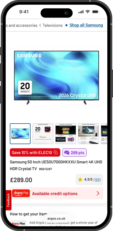
The same page for a £10 LEGO set and a £1,700 sofa
Every Argos product page looked the same, whatever you were buying. Same layout, same components, same order. A parent checking whether a toy is right for a six year old got the same page as someone working out if a fridge freezer will fit in their kitchen.
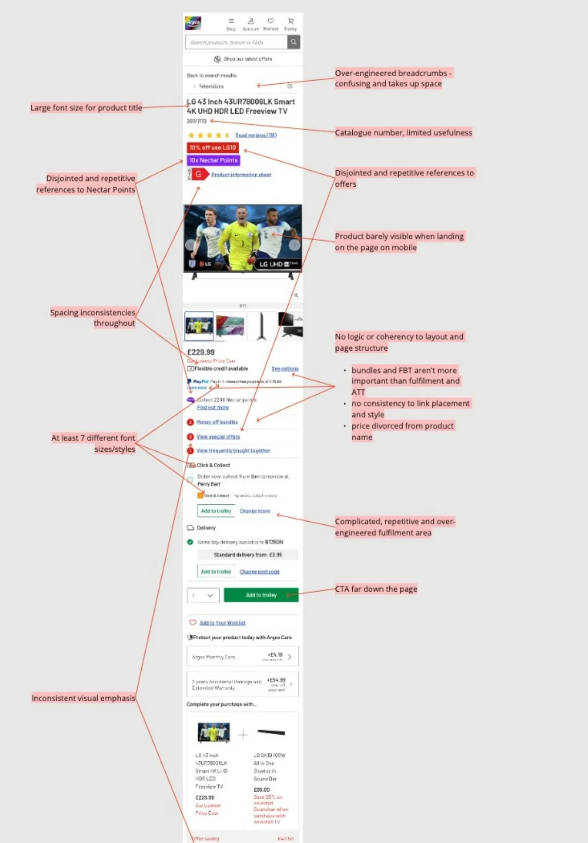
Over the years each team had added what it needed: credit, Nectar points, trade-in, bundles, care plans, offers. Nobody had stepped back to ask how it fitted together. When I annotated a TV page, I counted more than 45 components, with no clear owner for most of them. The list kept growing:
- Offers
- Mentioned in four different places, in four different styles.
- The product
- Barely visible when you land on the page on mobile.
- Add to trolley
- Three of them, under a fulfilment area that repeated itself.
- Type
- At least seven font sizes and styles.
- Structure
- Bundles sat above fulfilment, and the price was nowhere near the product name.
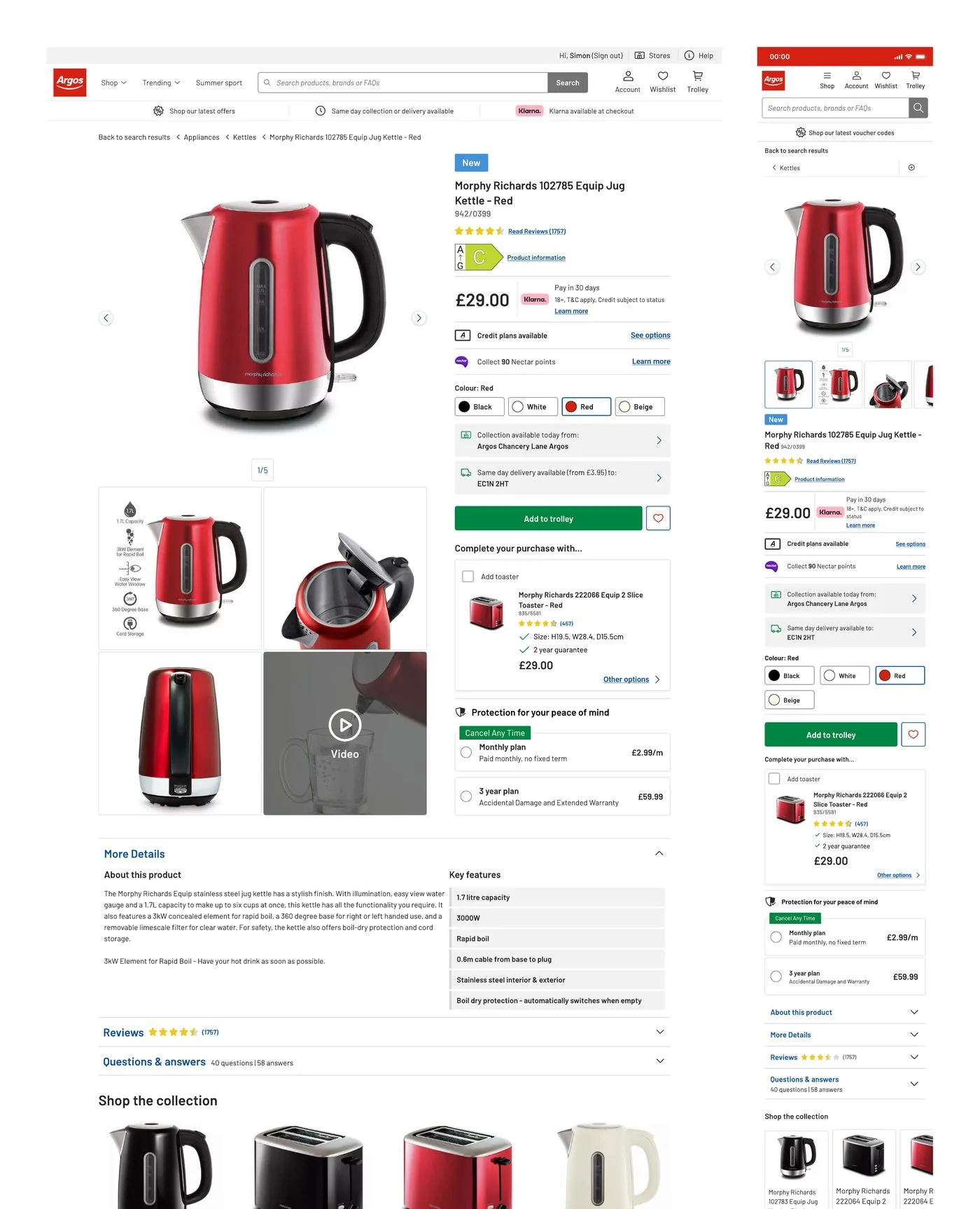
Where my thinking started
I’d already had a go at this problem before the project existed. My interview task for the senior role was a product page, and I used a kettle. Collection and delivery sat side by side, add ons came after the add to trolley button, and the detail was layered underneath.
Months later I got to do it properly, at the scale of the whole site and with the teams who run it.
The brief was category experiences
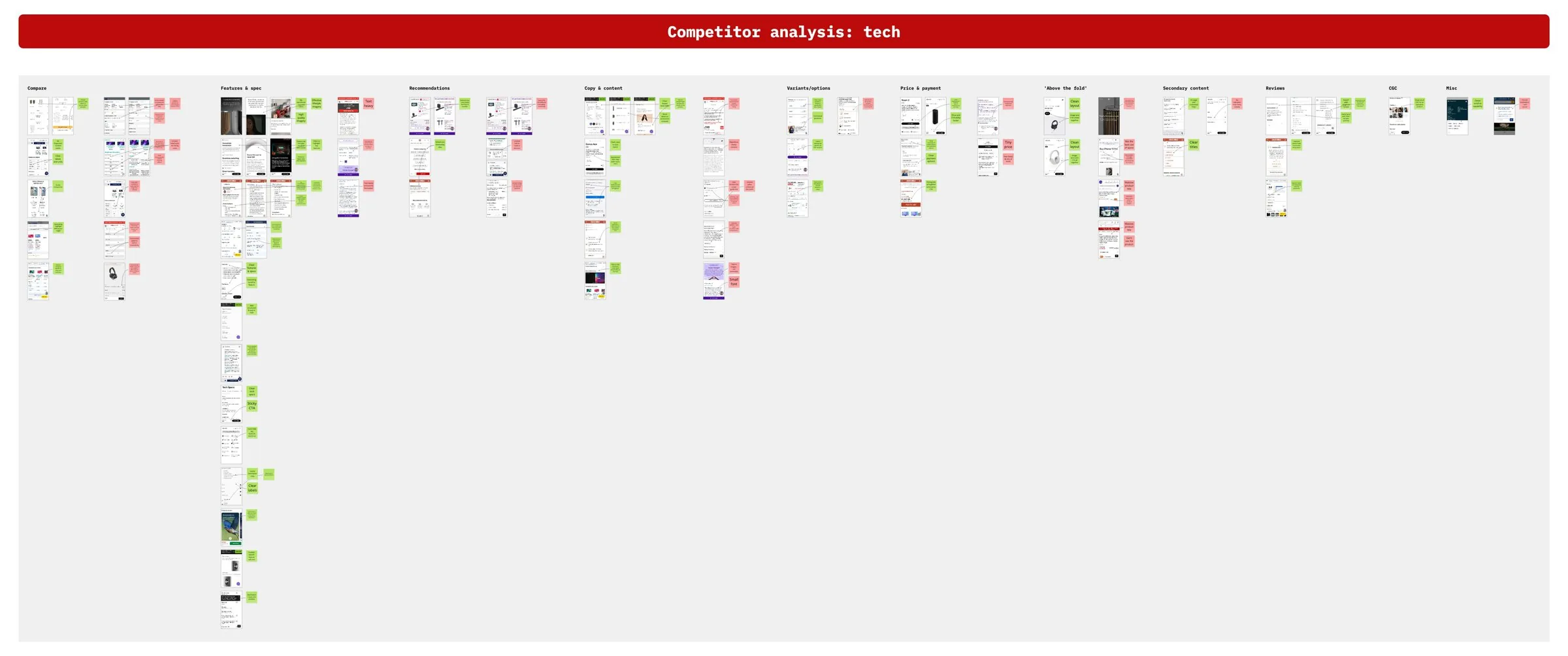
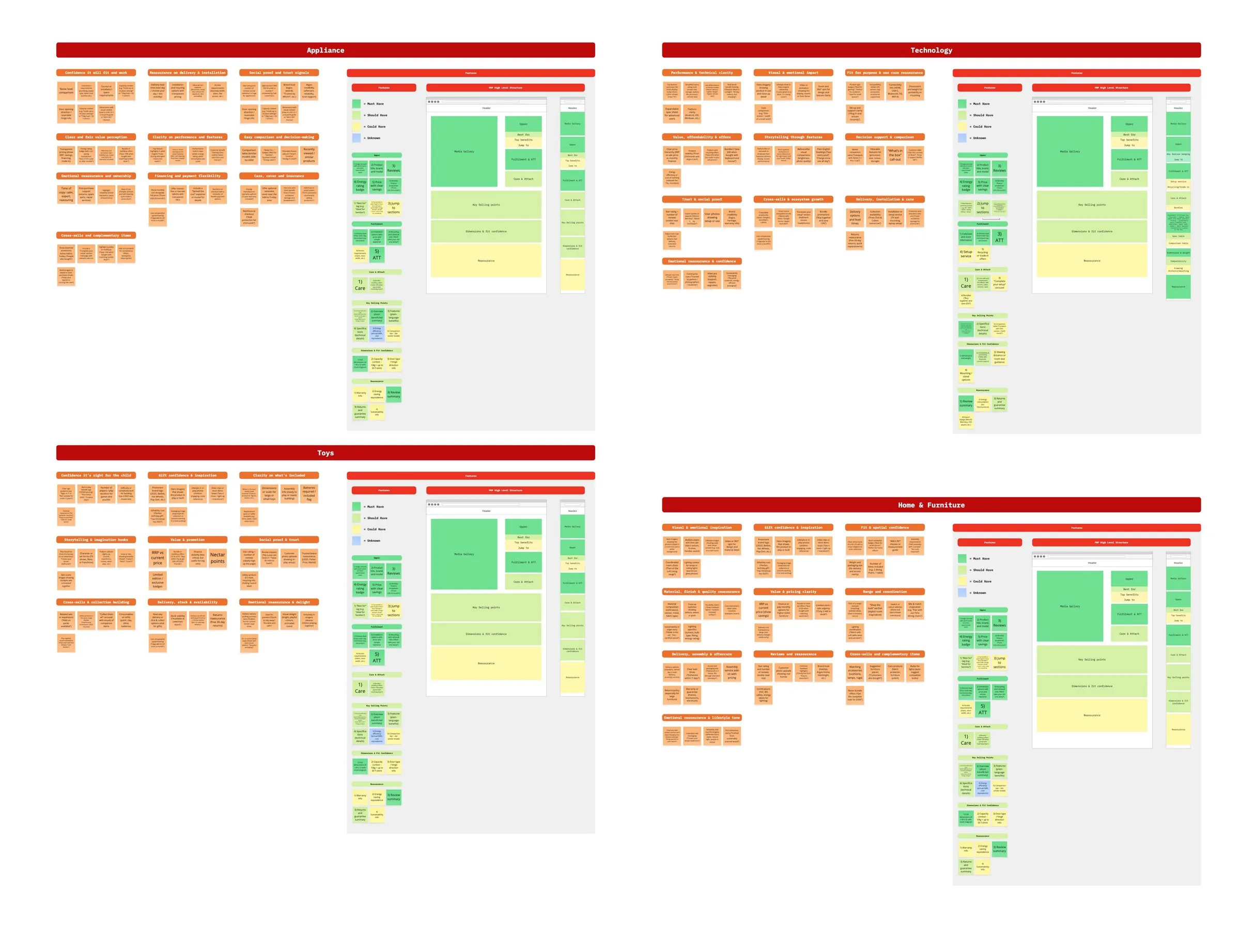
The ask was to make product pages work harder for key categories. Look at what Toys, Tech, Furniture and Appliances customers each need, and design for that.
My role: I led the design end to end, from the category discovery through the new template, every part of the page and each tested phase. I worked with product, engineering, analytics, content and the trading teams, and took the work to senior leadership for sign off.
Discovery kept showing the page had no structure to adapt. I could have designed category components and bolted them on, which was quicker and safer. Or I could argue to fix the foundation first.
A page can’t adapt to each category until it has a structure to adapt.
- Q4 FY24/25Category discovery across four categories: a Baymard audit, competitor analysis, customer segments and How Might We workshops.
- Q4 FY24/25Reframed as a product page redesign: zones, principles and a blocks framework. Taken to the senior leadership review in February 2025.
- Q1 FY25/26Every part of the page designed top to bottom, and the new template built.
- Q2 FY25/26Phased A/B tests: styling and structure, fulfilment and offer messaging.
- NowBack to where it started. Category experiences, rebooted on the new foundation.
Framing it before designing it
I set out the problem, the goals and how we’d measure success on one board, so product, trading and content were signing up to the same thing. Then I took each category apart: its pain points, the blocks it needed, and How Might We questions for customers and for the teams who’d run the page.
The problem
- Product pages were generic across every category.
- Someone shopping for toys needs very different things to someone buying a fridge or a sofa.
- Our block system gave us the flexibility to fix this, but we hadn’t yet used it by category.
The purpose
- Shape product pages by category, measured on add to trolley and conversion.
- Deliver commercial wins now and set a foundation for future product page work.
Primary goals
- Focus on categories with high revenue and low conversion. The goal that mattered most.
- Lift conversion during peak, in Black Friday and Christmas categories like toys and tech.
- Improve add to trolley rates by making critical information clearer and removing friction.
- Increase average order size through smart attachment: bundles, accessories and services.
- Improve satisfaction on “product information was clear”.
Secondary goals
- Use flexible container components that can be reused across categories and built into our design system.
- Give trading teams better space for promotions and bundles.
- Standardise content: tone, accessibility and trust signals.
- Produce a repeatable design and test framework for other categories in 2026.
How we’d measure it: the numbers
- Add to trolley rate, with a target set for each category.
- Conversion.
- Average order size, through the attach rate on accessories, bundles and services.
How we’d measure it: the signals
- Customer satisfaction on “product information was clear”.
- Product, trading and commercial agreeing on what good looks like.
- Positive feedback from peers, product and trading.
Five principles for every product page
- Consistent and flexible
- Pages feel familiar across Argos, with a block based structure that gives customers confidence wherever they shop. The blocks flex to each category.
- Clear and simple
- Easy to scan and understand at a glance. Critical details like dimensions, age suitability or installation come early, so there are no surprises later and fewer reasons to abandon.
- Informative and trustworthy
- Customers get what they need to buy with confidence: transparent specs, honest reviews, service options, warranties and clear fulfilment messaging.
- Engaging and inspiring
- Lifestyle imagery, shop the look, bundles and video help customers picture the product at home, and grow the basket.
- Intentional and future ready
- No more patchwork of legacy decisions. Every block has a clear job for customers and the business, so every block can be reused as categories are added.



What the research told us
I audited the page against Baymard’s product page research. It failed 25 guidelines, 14 of them high severity. I sorted every one by who could fix it: UI and styling, content and copy, recommendations, or out of our control. That turned an audit into a backlog with owners.
Baymard, and Nielsen Norman Group’s product page studies, also gave us a shared language. When someone wanted to put something above add to trolley, we could point at the research.
| What the research found | What we did with it |
|---|---|
Sites offering both product types should consider using separate page layouts to optimise performance for each category.Baymard, on visual versus spec driven products | The whole idea of category blocks. One structure, filled with what each category needs. |
The “Buy” section should focus solely on the information and options needed to add the product to the cart.Baymard | Fulfilment and add to trolley became one zone with one job. |
| 42% of desktop users relied on product images to judge scale.Baymard | A dimensions and fit block for Furniture and Appliances, with a diagram as well as the numbers. |
Don’t present too much product detail at once. Layer the information.Nielsen Norman Group | Specs at a glance near the top, everything else in clearly titled sections and side drawers. |
Quotes and figures from Baymard Institute’s and Nielsen Norman Group’s product page research.
Five zones, each with one job
Each zone has a single objective, so every new feature has an obvious home and a reason to be there, or not.
- Top of page
- A confident first impression and a reason to buy from Argos: gallery, title, price, credit, Nectar and offers.
- Fulfilment and add to trolley
- One job. Get people to the green button.
- Middle of page
- Attach: care, warranties, essential add ons and bundles.
- Detail and recommendations
- Discovery: reviews, Q&A, specs and alternatives, for people who want to dig deeper.
- Wireframe and navigation
- A light grey background and sticky navigation that hold a longer, richer page together.
Blocks you can swap in and out
The zones never move. What goes inside them is a set of blocks, and a category experience is a different set of blocks in the same places. A customer learns one page, engineering builds each block once, and a new category becomes a content decision.
The brief asked for category experiences. Blocks give every category one, without building a new page each time. Pick a category to see what swaps in.
Must haveEverything else is should or could have.
- Image carousel, door open and closed
- Energy rating badge
- Price with clear savings
- Best for families
- Delivery slot picker
- Installation, priced and explained
- We’ll take your old one away
- Care plans
- Save when paired with a matching dryer
- Short overview of the benefits
- Plain language features
- Specifications
- H x W x D with a diagram
- 10kg holds about 50 T shirts
- Door hinge direction
- Review summary
- Warranty
- Returns and guarantee
The worry: “Will it fit?”, unclear running costs and services hidden until checkout.
- Gallery and key specs
- Monthly finance up front
- Trade-in value
- Collect today or next day delivery
- One clear add to trolley
- Warranty and cover
- Cases, controllers and cables
- Spec grid in plain English
- Compare similar models
- Size and weight
- What’s in the box
- Review summary
- Returns
The worry: confusing specs, finance hidden away and nerves about spending a lot.
- Lifestyle imagery
- Fabric and leg options
- Free fabric samples
- Delivery lead time, up front
- Assembly included
- Shop the look
- Matching pieces
- Materials and finishes
- How it’s made
- Full dimensions with a diagram
- Measure before you order
- Frame guarantee
- Care instructions
The worry: flat imagery, unclear materials and not knowing when it will turn up.
- Age guidance
- Price and savings
- Limited edition
- Stock and Christmas cut off dates
- One clear add to trolley
- Batteries you’ll need
- Complete the set
- What’s in the box
- Play value
- Size once it’s built
- Pieces and build time
- Safety
- Reviews from parents
The worry: is it right for their age, are batteries included, and what goes with it.
The vision, category by category
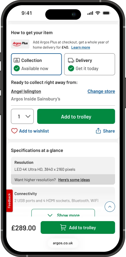
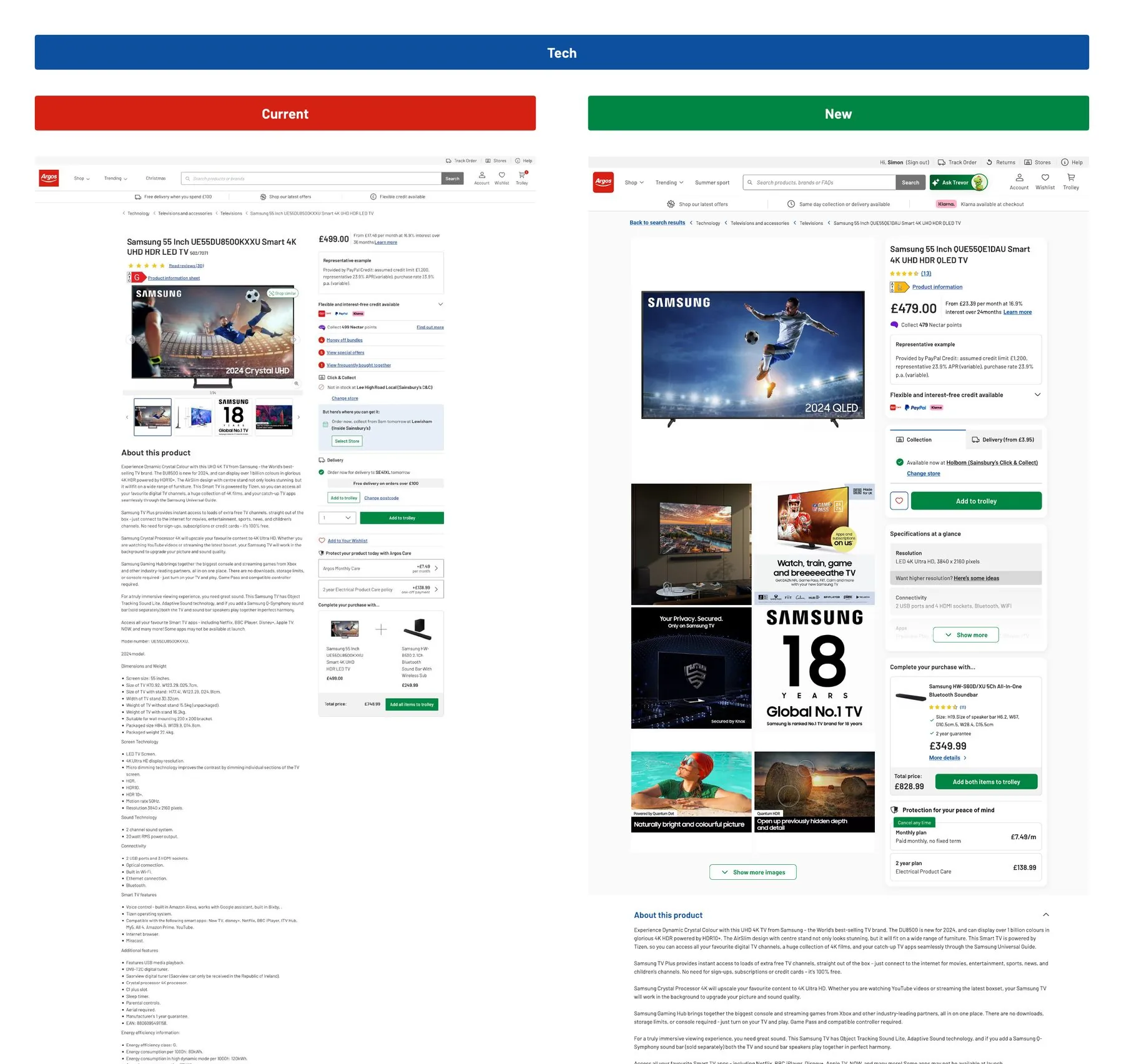
To get everyone pointing the same way, I designed the end state for each category on real products: today’s page next to the same product on the new blocks. Same zones every time, with the blocks that category needs swapped in. These became the north star the phased releases built towards.
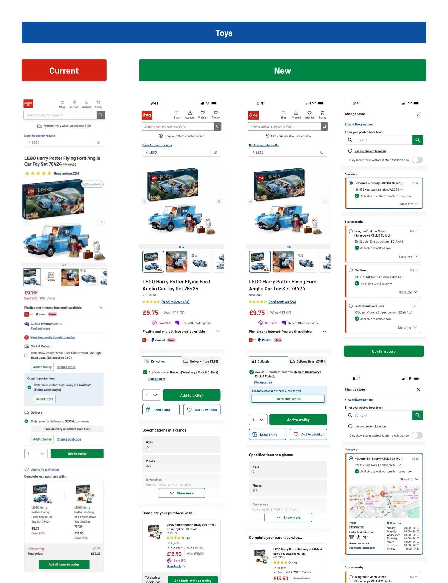
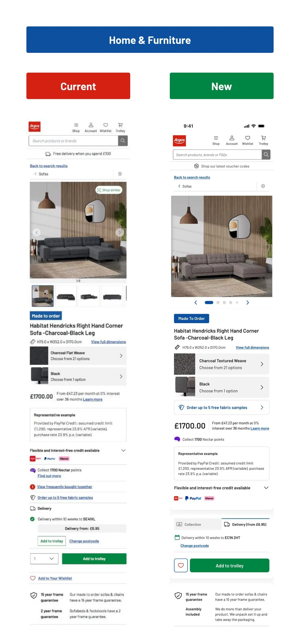
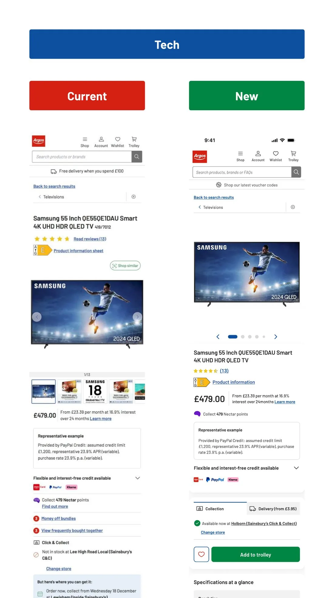
Fulfilment: the zone with one job
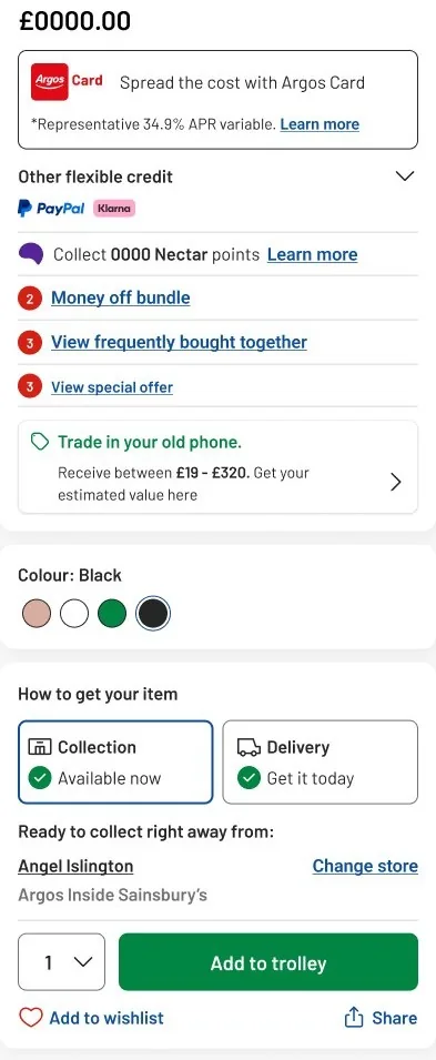
If customers can’t tell whether they can get something, and when, they don’t press add to trolley. I spent more time here than anywhere else on the page, because it was where the three add to trolley buttons were.
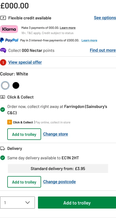
The starting point
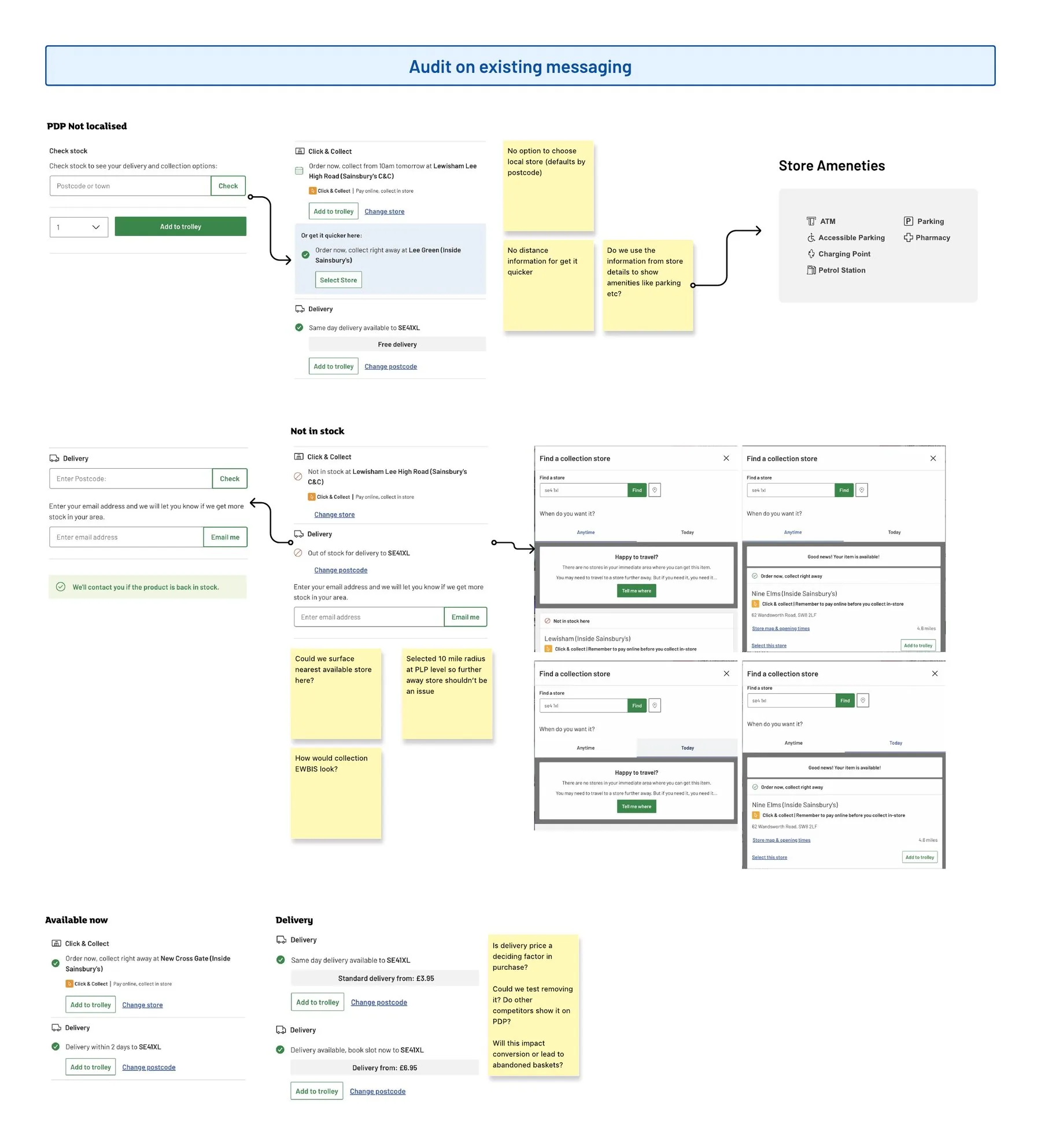
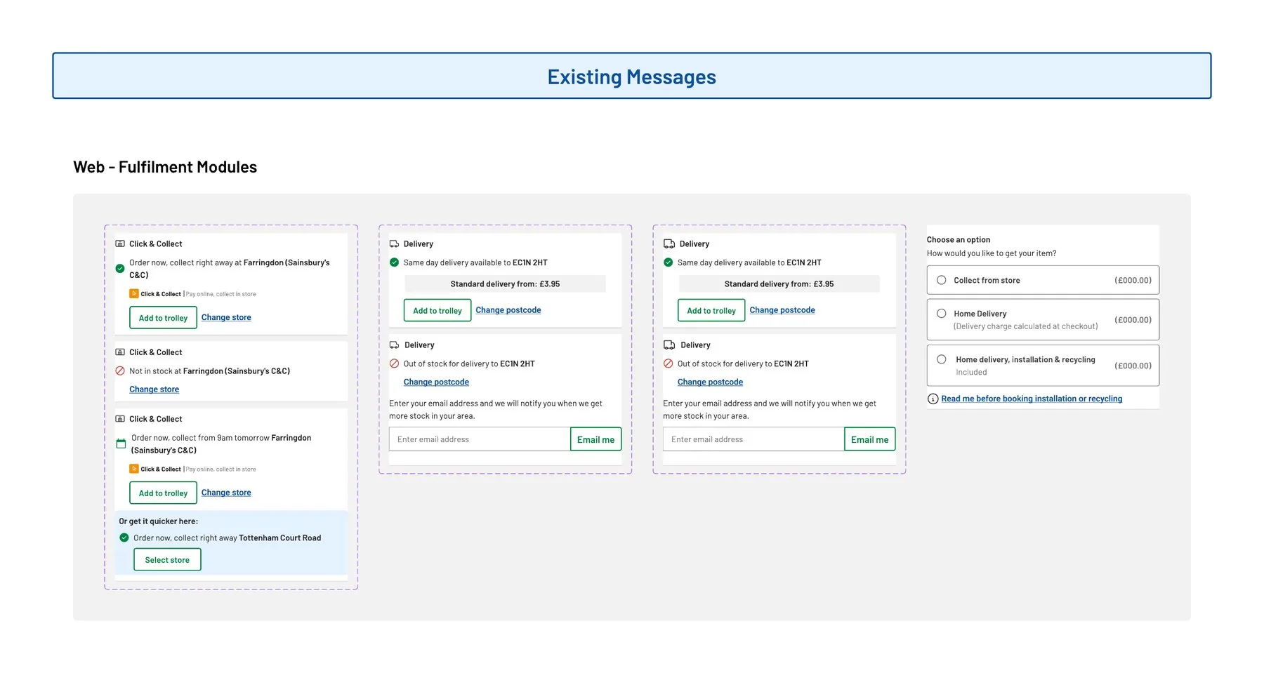
Collection and delivery each had their own box and their own add to trolley button, with a third button underneath. Every stock state used different words, and there was no way to choose a store before the page picked one from your postcode.
I audited every existing message and state, and wrote down the questions I wanted answered before designing anything. Could we show the nearest store that actually has it in stock? Is the delivery price a deciding factor at this point, and what happens if we move it to checkout?
Users wanted to pick up in store when they couldn’t wait for delivery, and to see bigger purchases in person first.Nielsen Norman Group, on in store availability
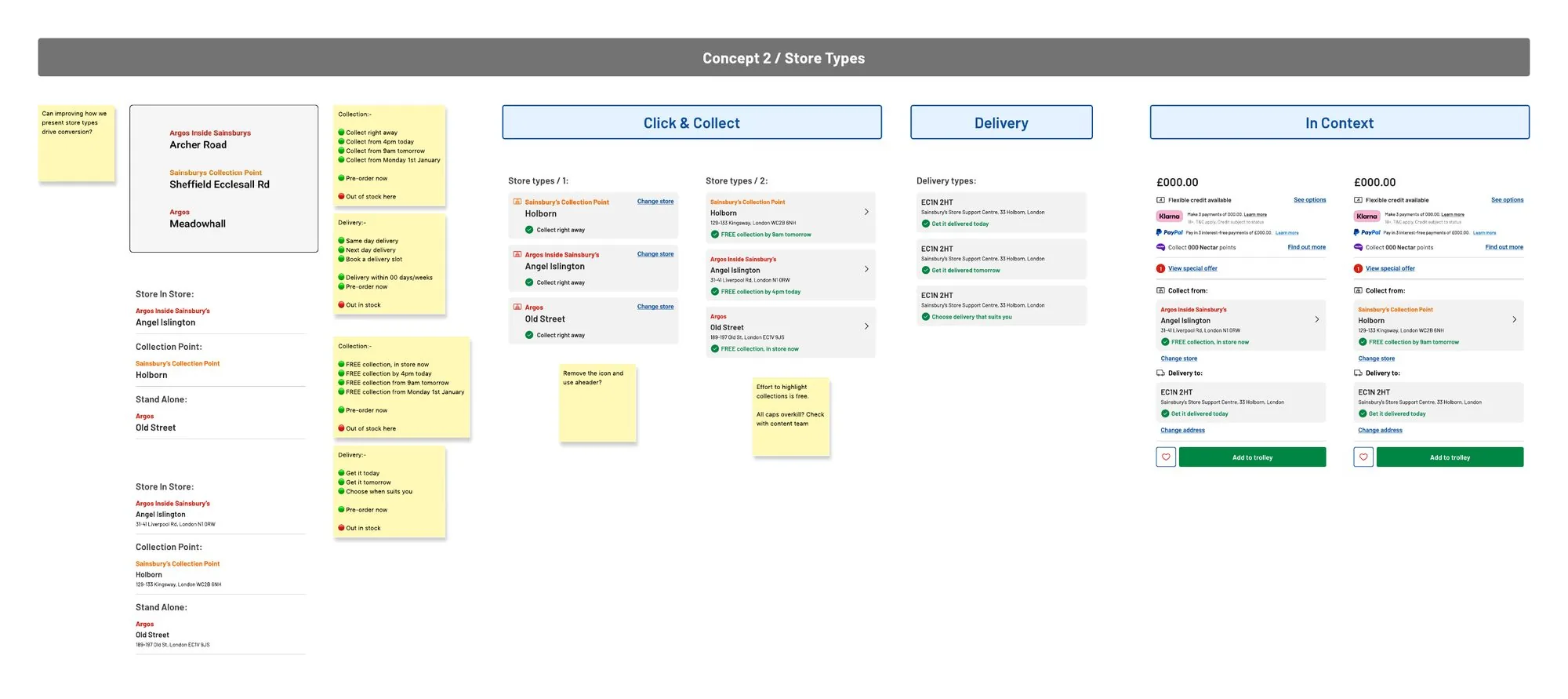
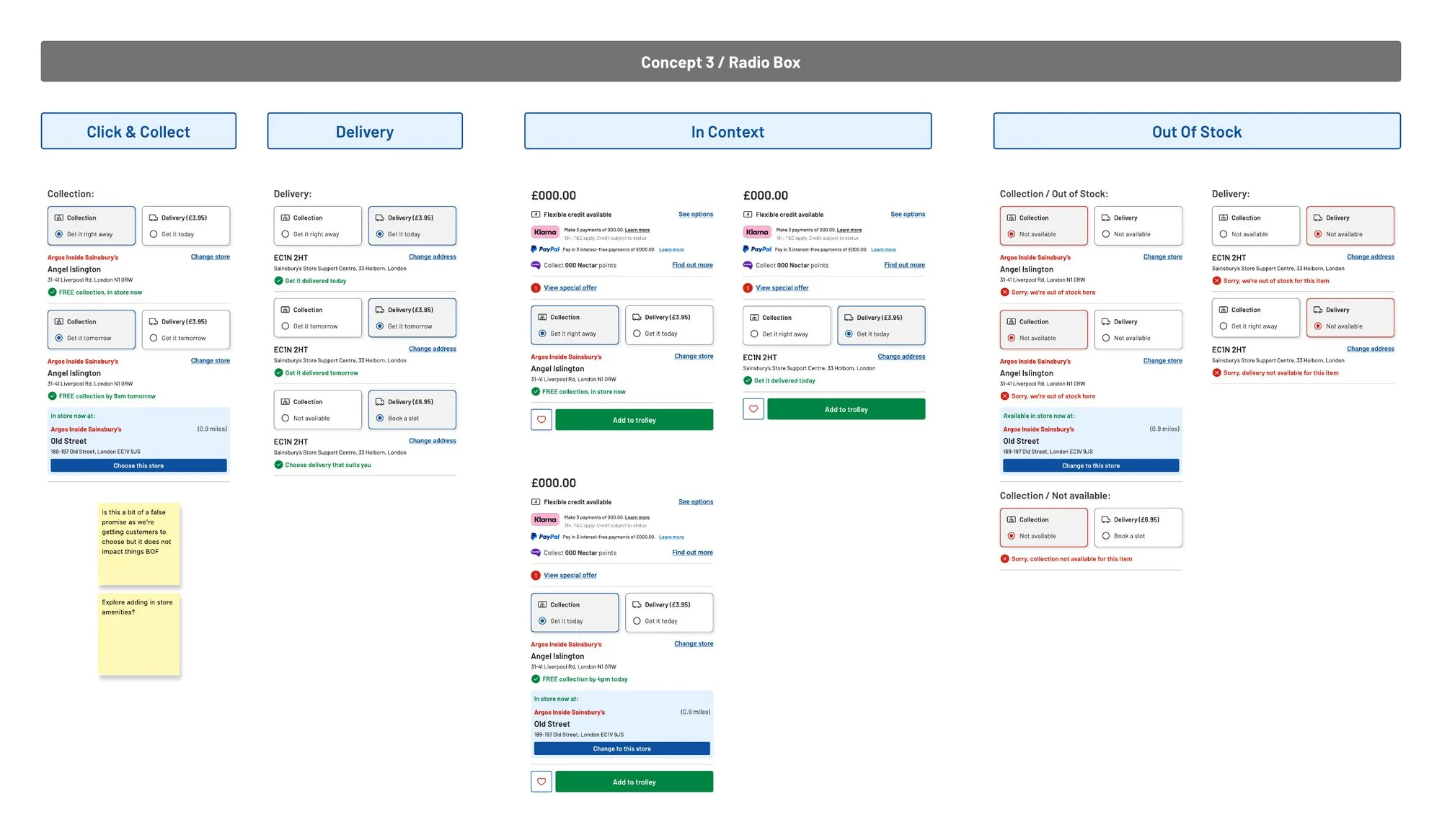
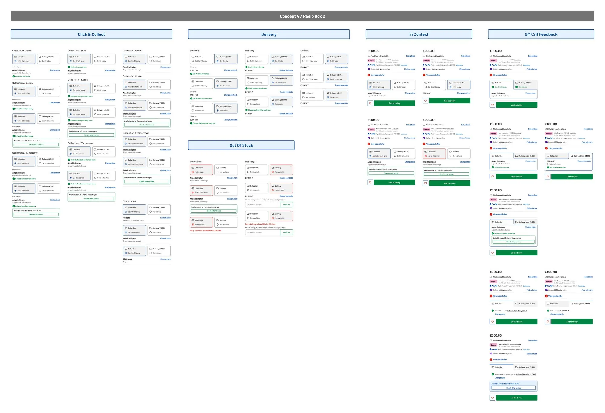
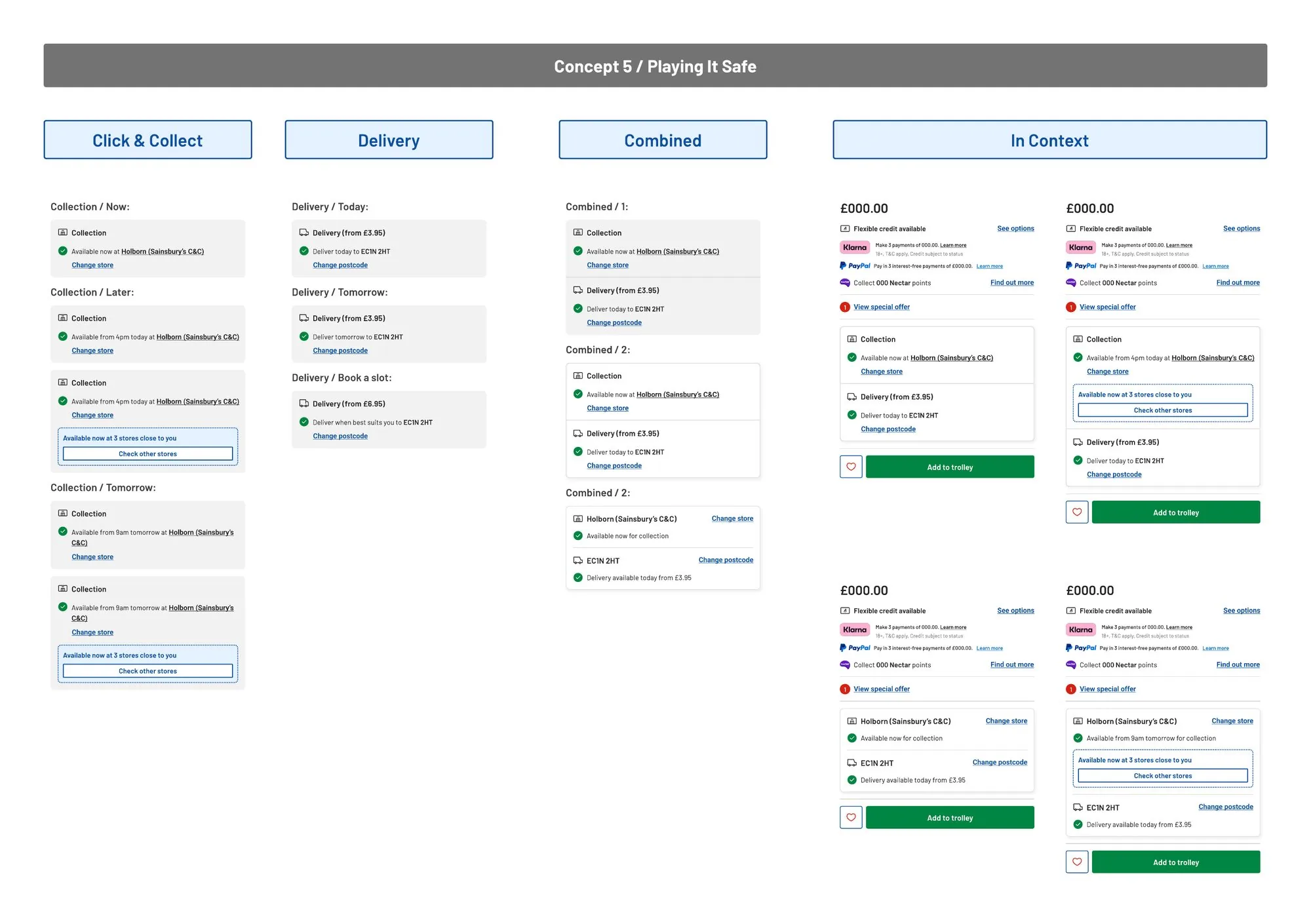
Seven ways to show the same choice
Seven concepts, each designed across collection, delivery and the full page, and the strongest went through design crit.
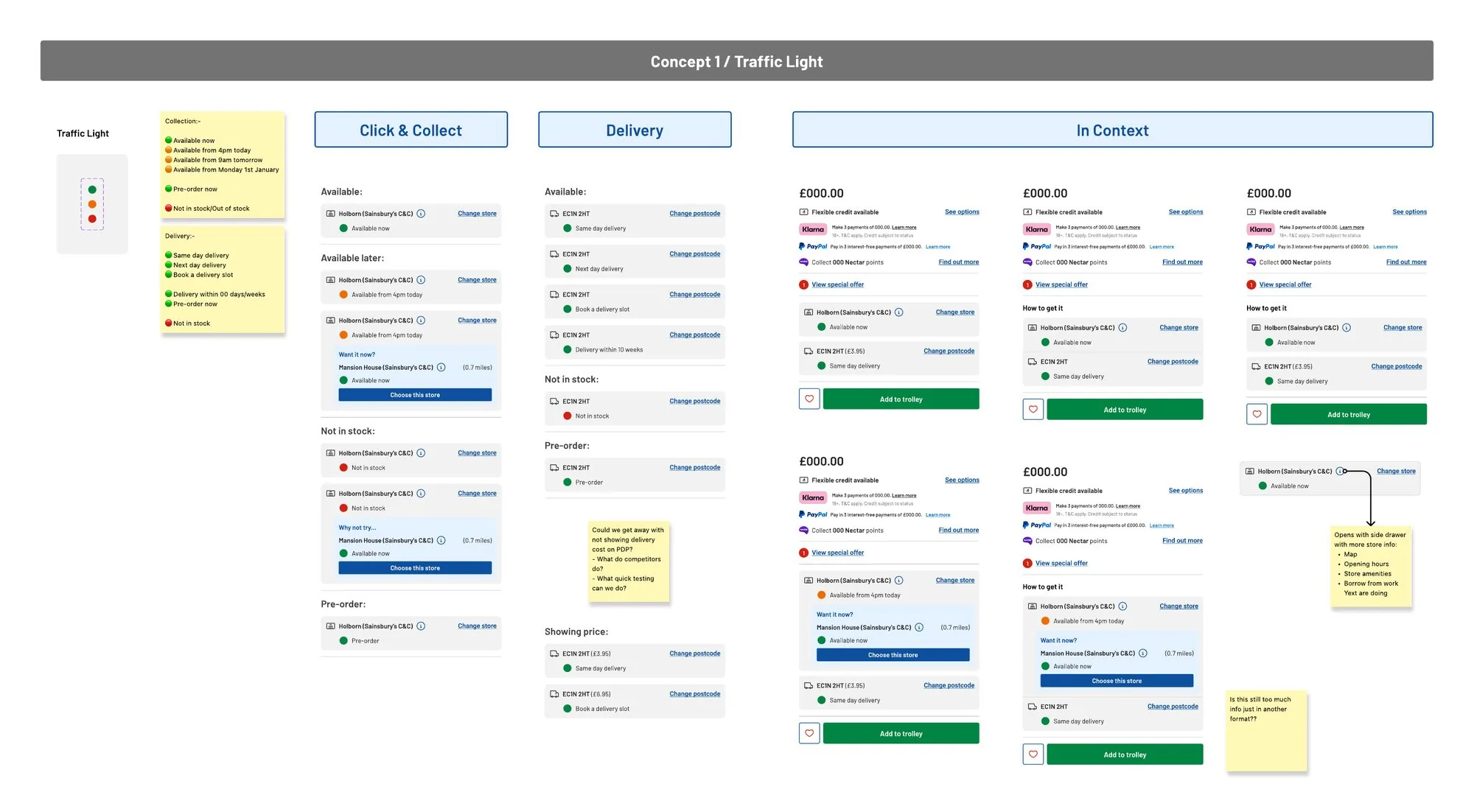
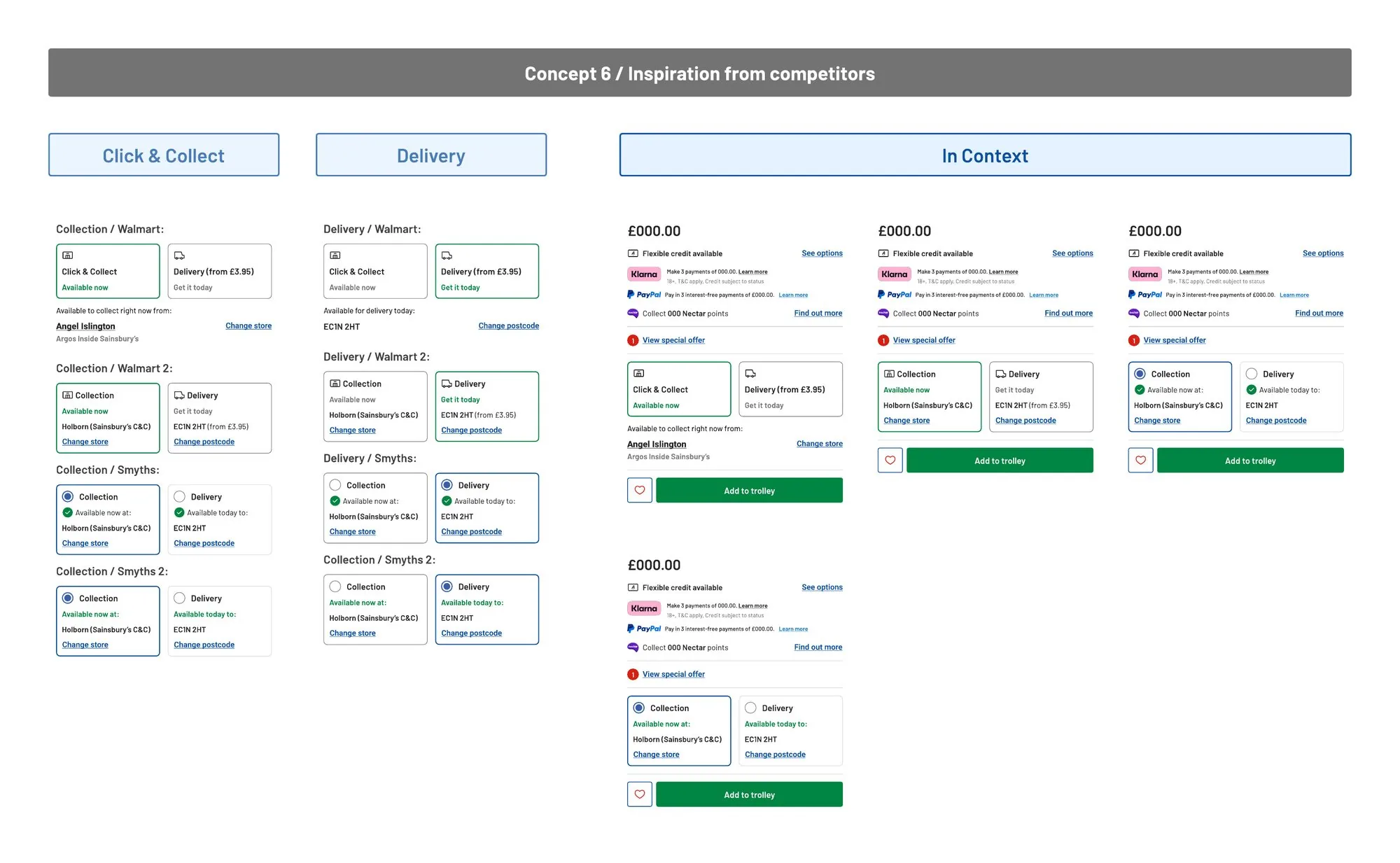
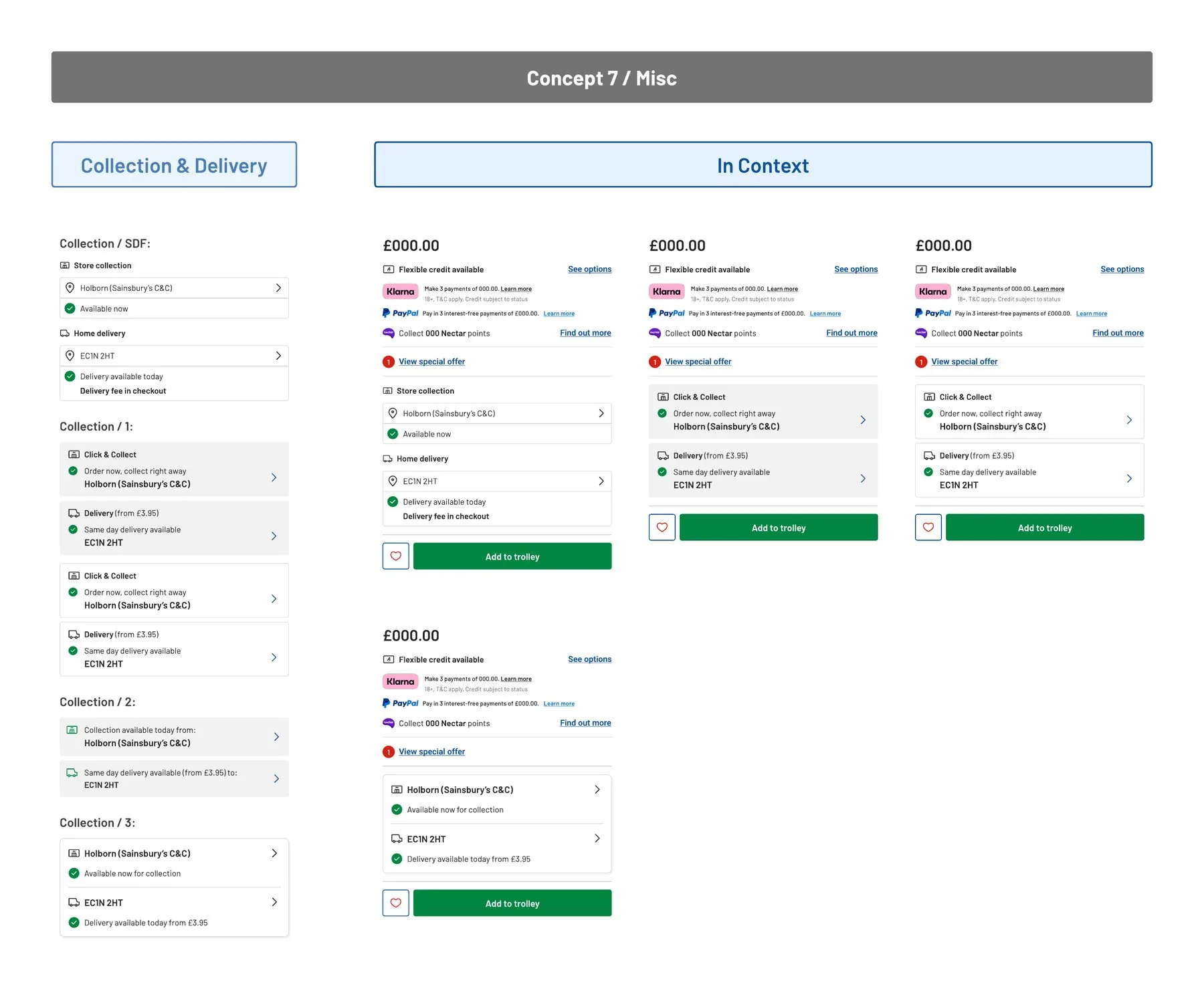
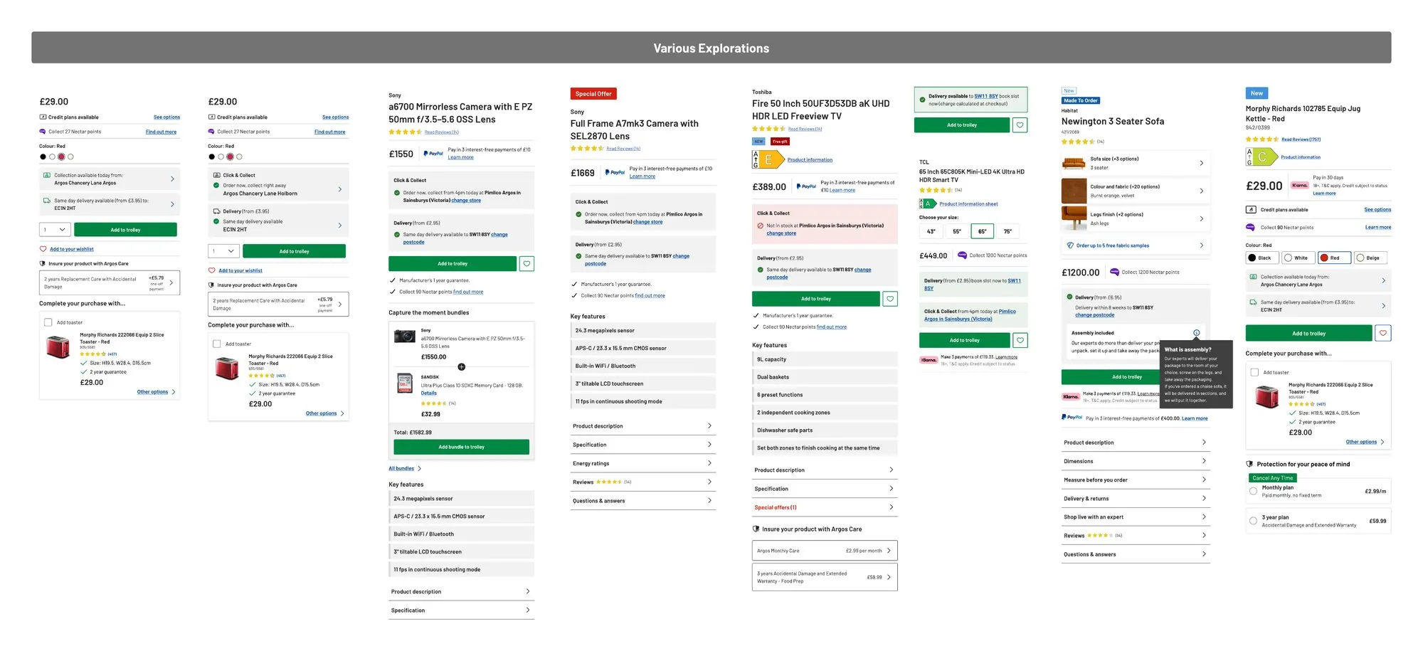
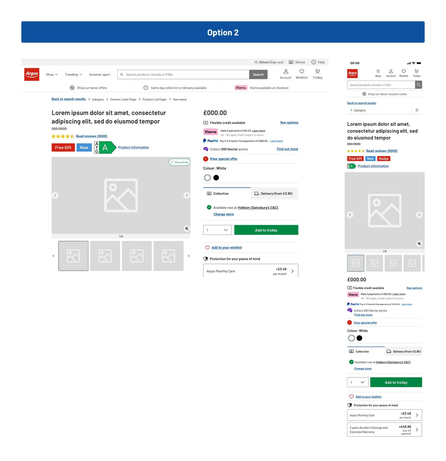
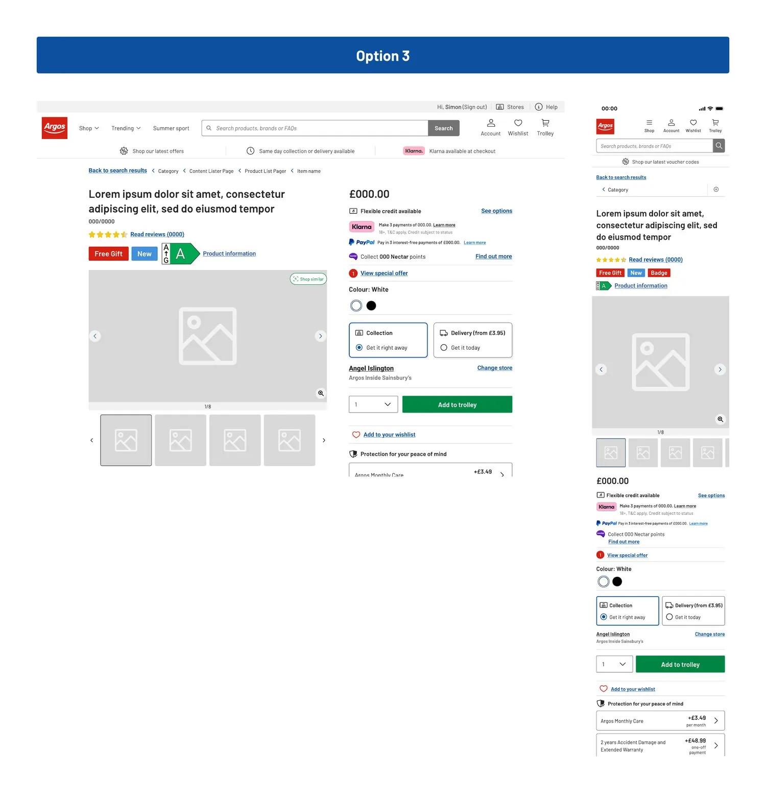
Three options, on the whole page
A fulfilment block only works in context, next to credit, offers and the gallery. I took the strongest directions into the full page on desktop and mobile. The choice cards in option 3 went forward.
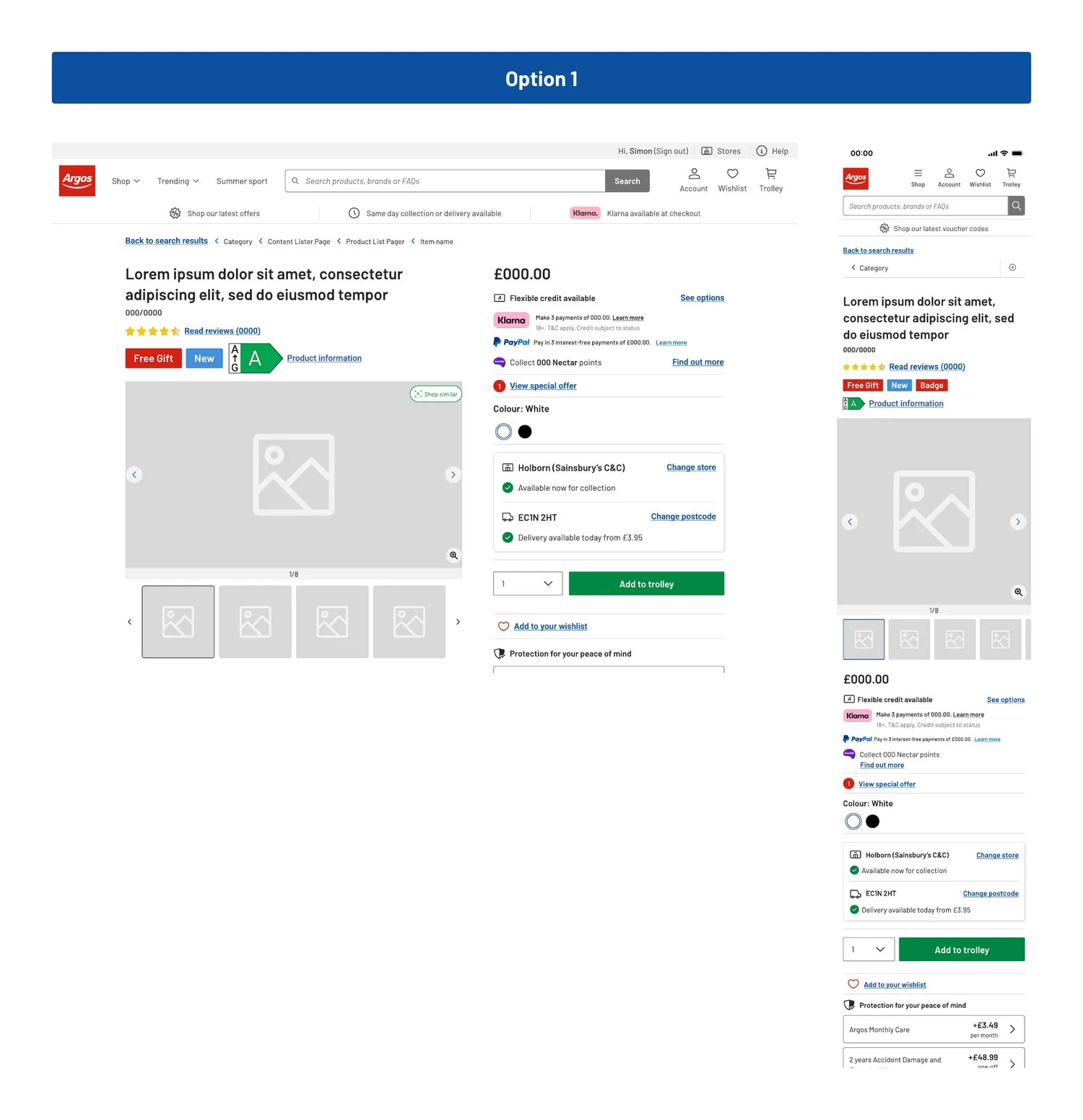
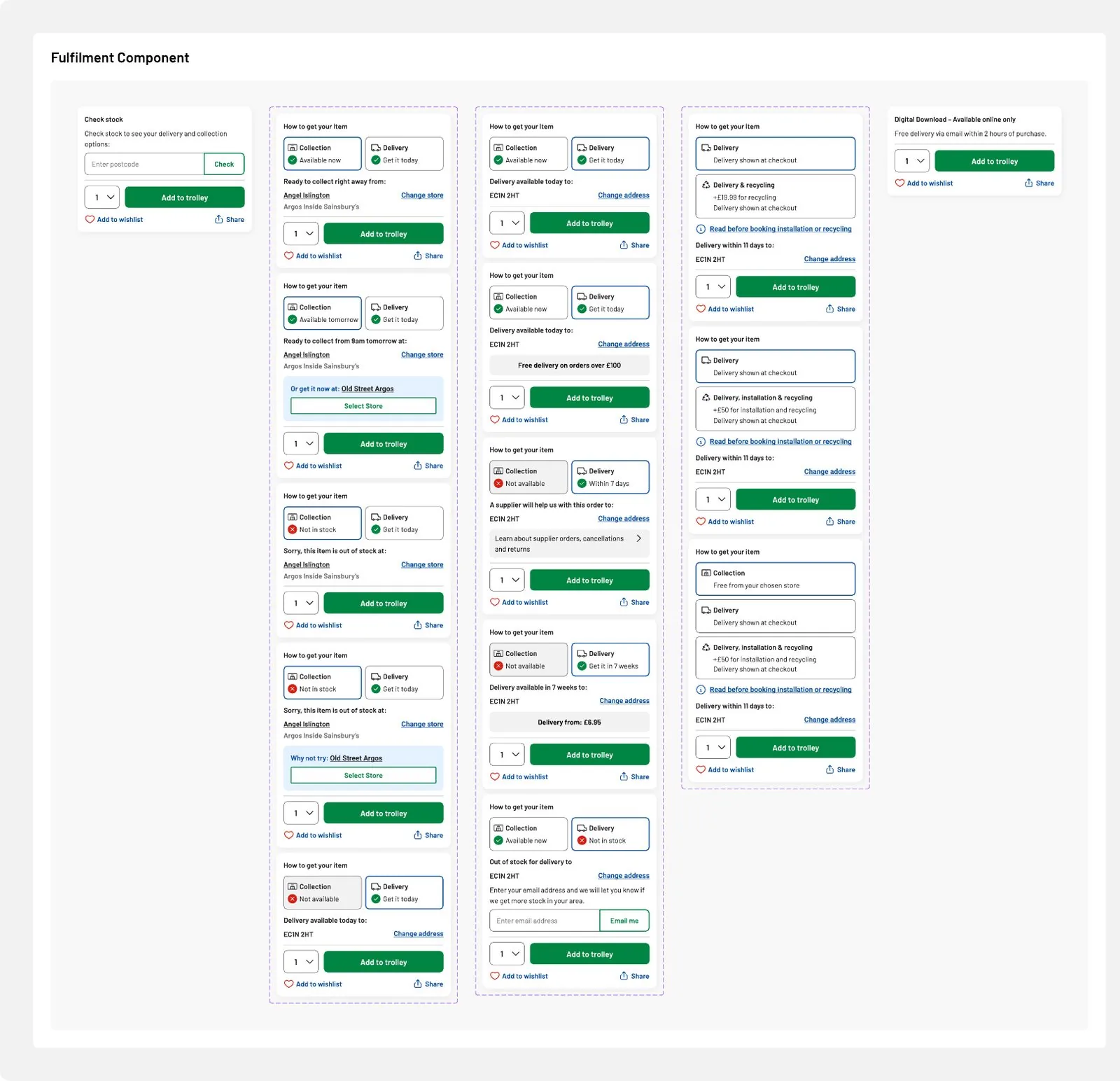
Every state, end to end
I designed every case the component would meet: collect now or tomorrow, a quicker store nearby, same day and slot delivery, appliances with installation and recycling, delivery only, supplier orders, out of stock with an email alert, and digital downloads. I wrote the messaging for each so every state answered the same two questions: can I get it, and when?
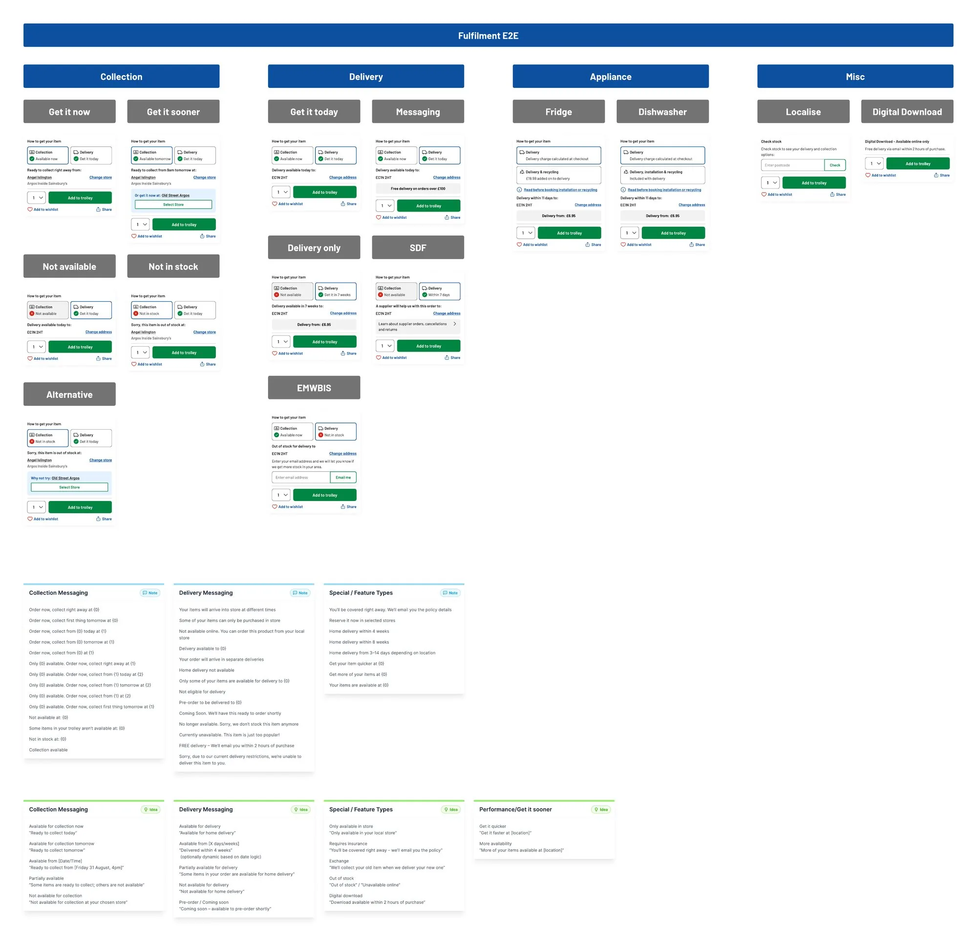
Showing the options that don’t apply, with a reason, teaches people what’s possible on other products.Nielsen Norman Group. It’s why the cards still show, marked “Not available”.
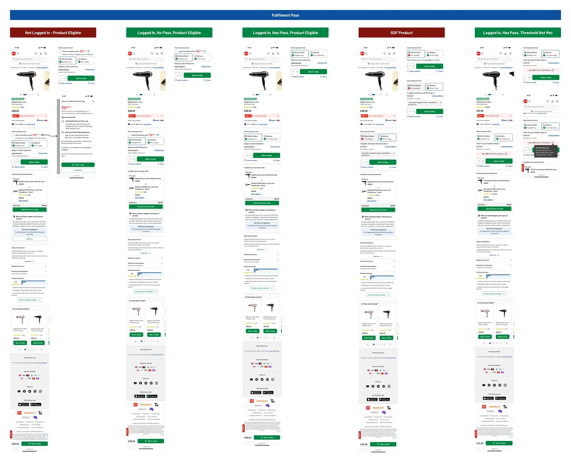
Argos Plus, built into the choice
Argos Plus is our delivery membership. I designed it into fulfilment itself and changed what it said by customer: logged out, logged in without it, a member, a product it doesn’t cover, and a member just under the free delivery threshold, nudged to spend a little more.
What it did
Working down the page
Fulfilment was one part of it. I worked through every part of the page from top to bottom, each with its own explorations and its own research. Pick a part.
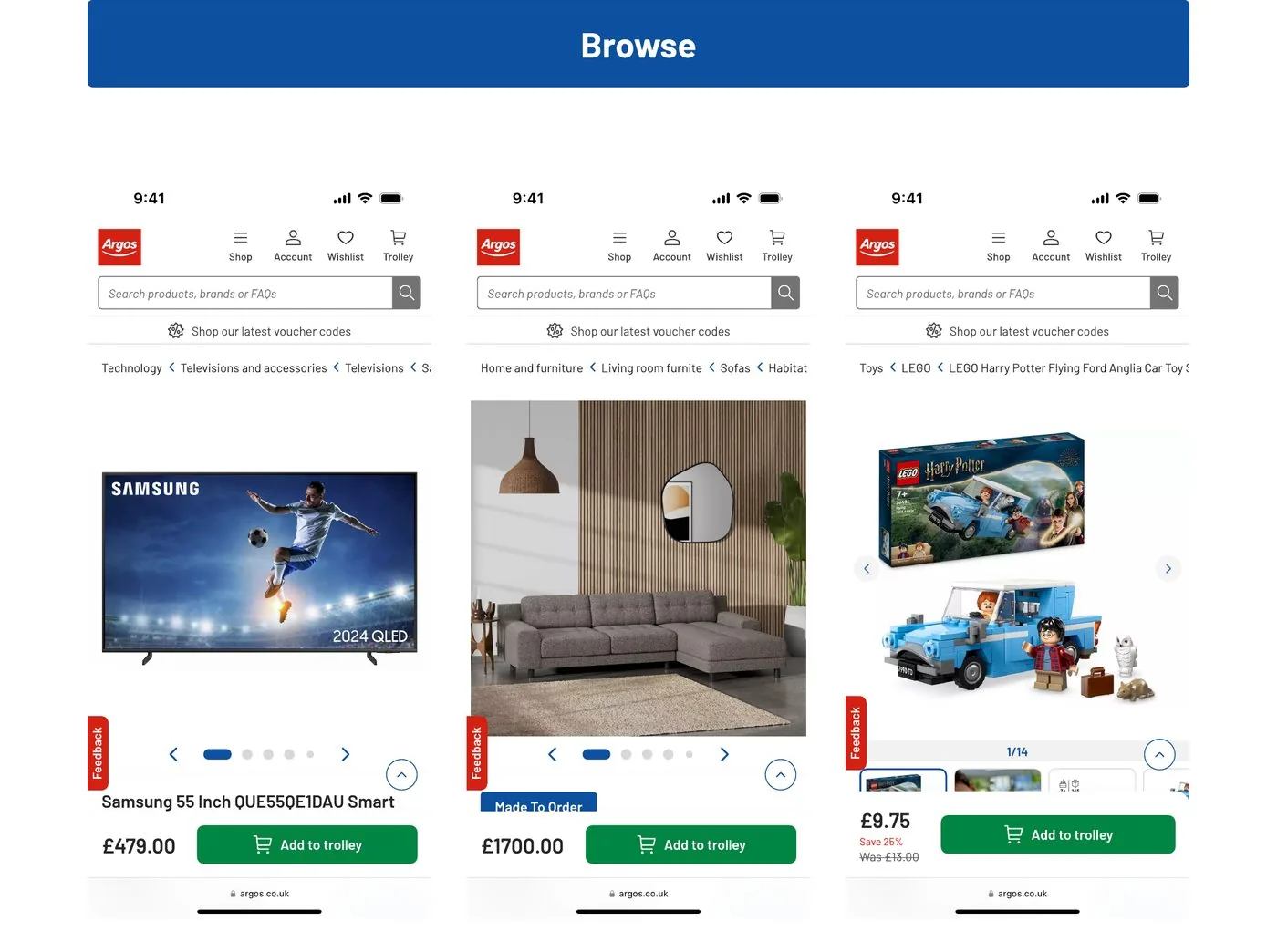
From browse, the full category path. From search, “Back to search results” first, so nobody loses their results.
Research: provide a link from each product page to a higher level category. Nielsen Norman Group.
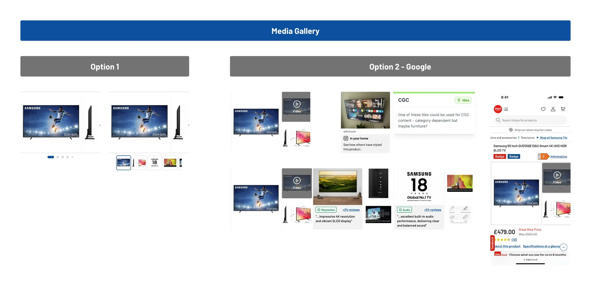
A carousel with a tracker, against a grid with video and a tile we could give to customer content in some categories. Then three options for the expanded view.
Research: 56% of desktop users explore images first. Baymard.
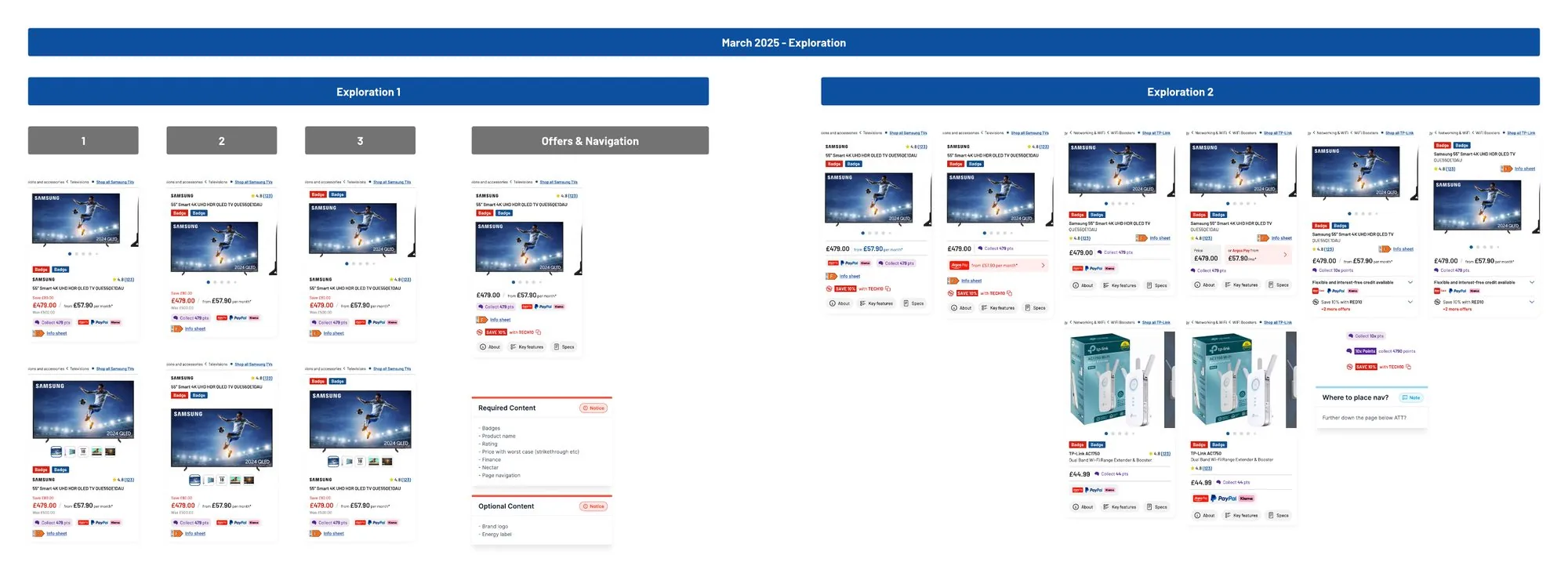
The busiest part of the page. I explored the order of name, rating, price, finance, Nectar and offers, then pulled four offer styles into one line that opens to show the rest.
Research: distinguish the sale price from the original price. Nielsen Norman Group.
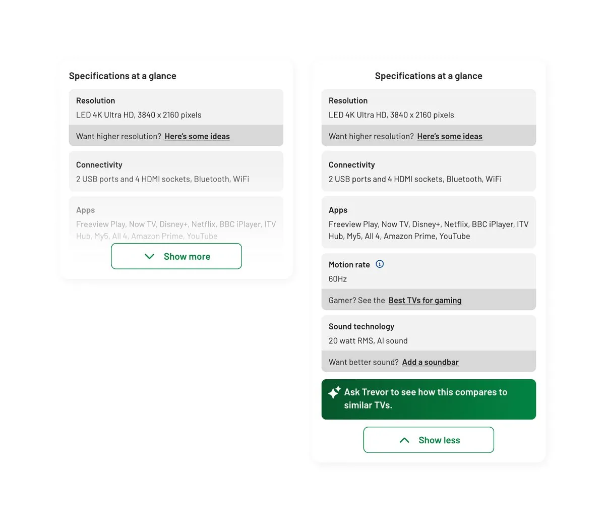
Three or four specs that decide it for that category, each with a helpful nudge: “Want higher resolution? Here’s some ideas.” Expanded, it hands over to Ask Trevor to compare similar products.
Research: include the characteristics that matter for that type of product. Nielsen Norman Group.
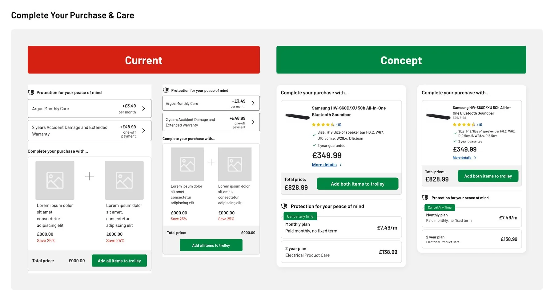
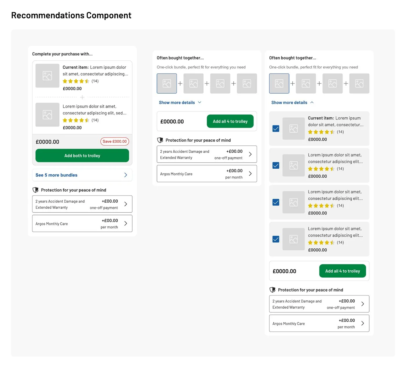
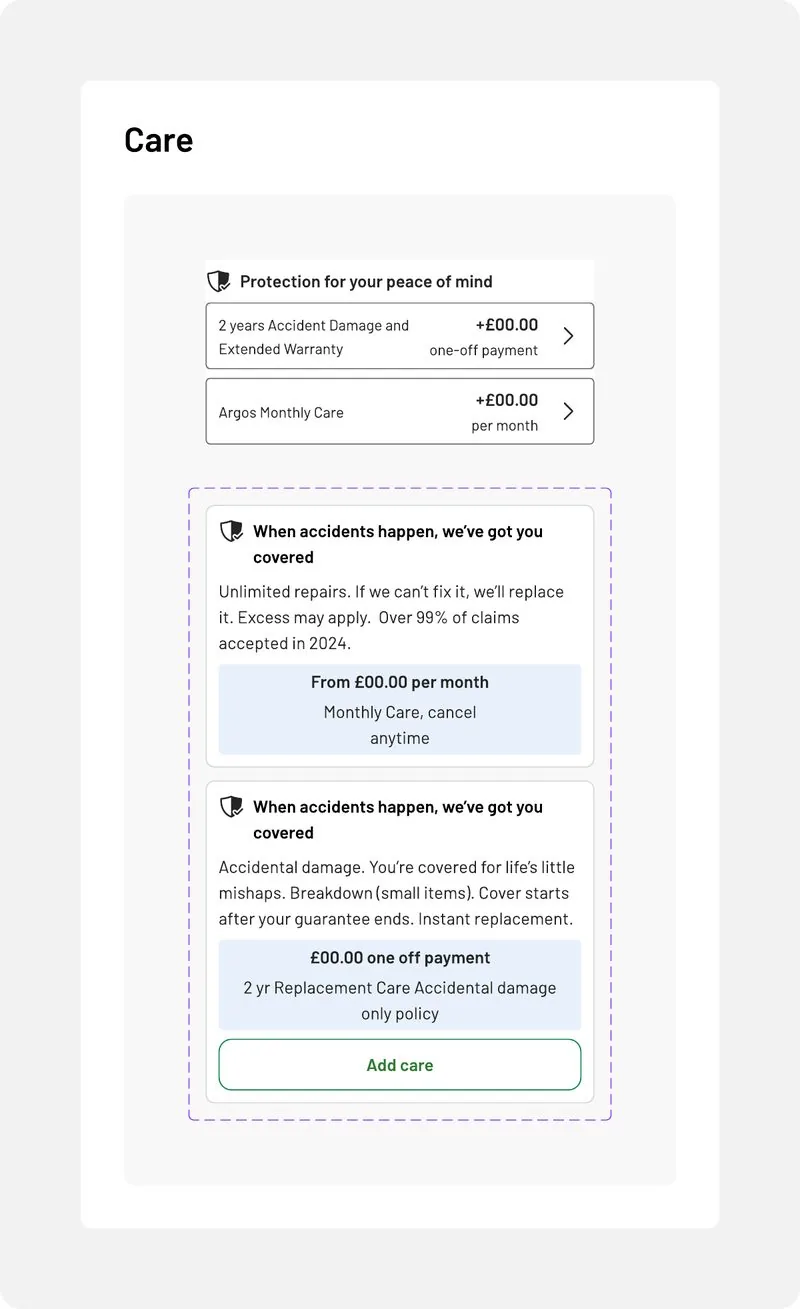
Attach is the job of the middle of the page. A bundle you can understand at a glance, with a total and one button, and care plans that say what they cover.
Research: describe each item included in a bundle. Nielsen Norman Group.
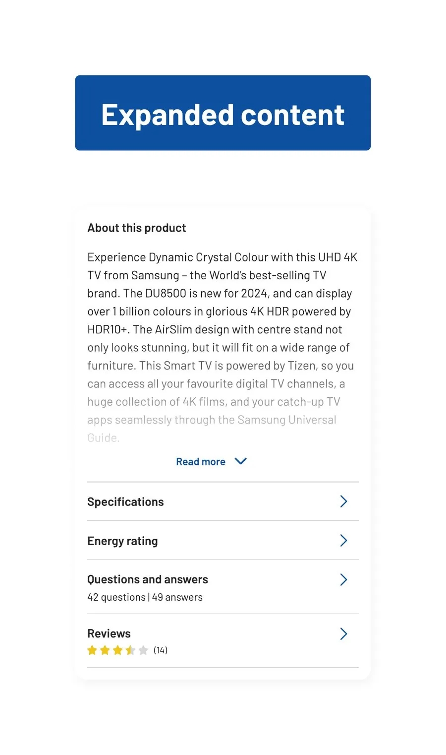
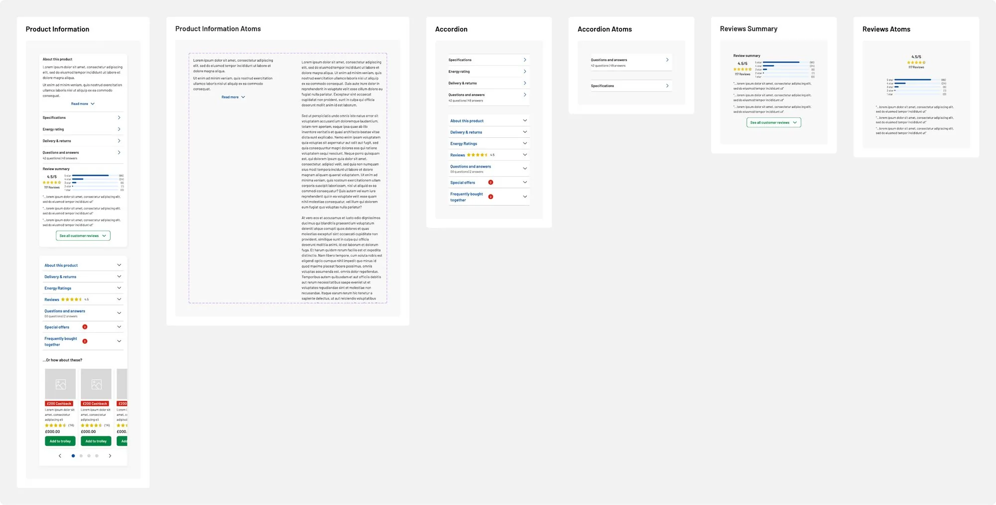
A short description with read more, then clearly titled rows that open side drawers. Reviews got a summary with the rating spread before the full list.
Research: summarise reviews and say how many people left them. Nielsen Norman Group.
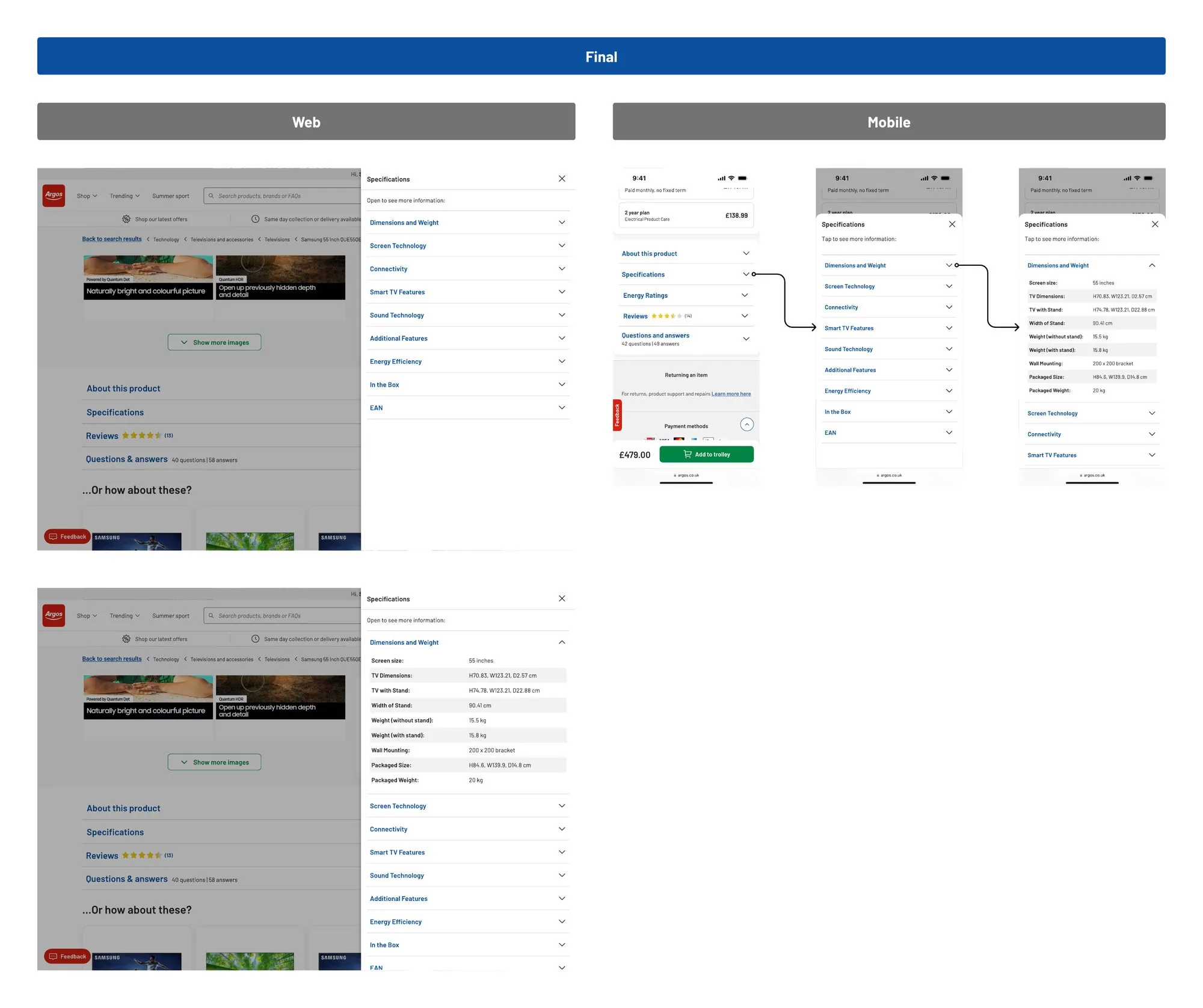
A TV can have dozens of specs. I took it from one long table, through web and mobile ideas, to grouped sections in a side drawer that keeps your place on the page.
Research: make specification tables informative and easy to read. Nielsen Norman Group.
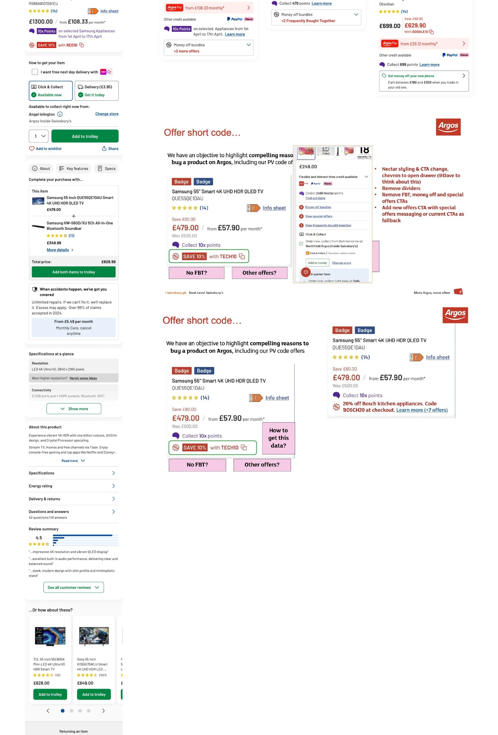
Discount prices, offer codes and colour selectors, brought together on real products so every part worked next to every other.
Research: show labelled colour swatches and which one is selected. Nielsen Norman Group.
Taking it to senior leadership
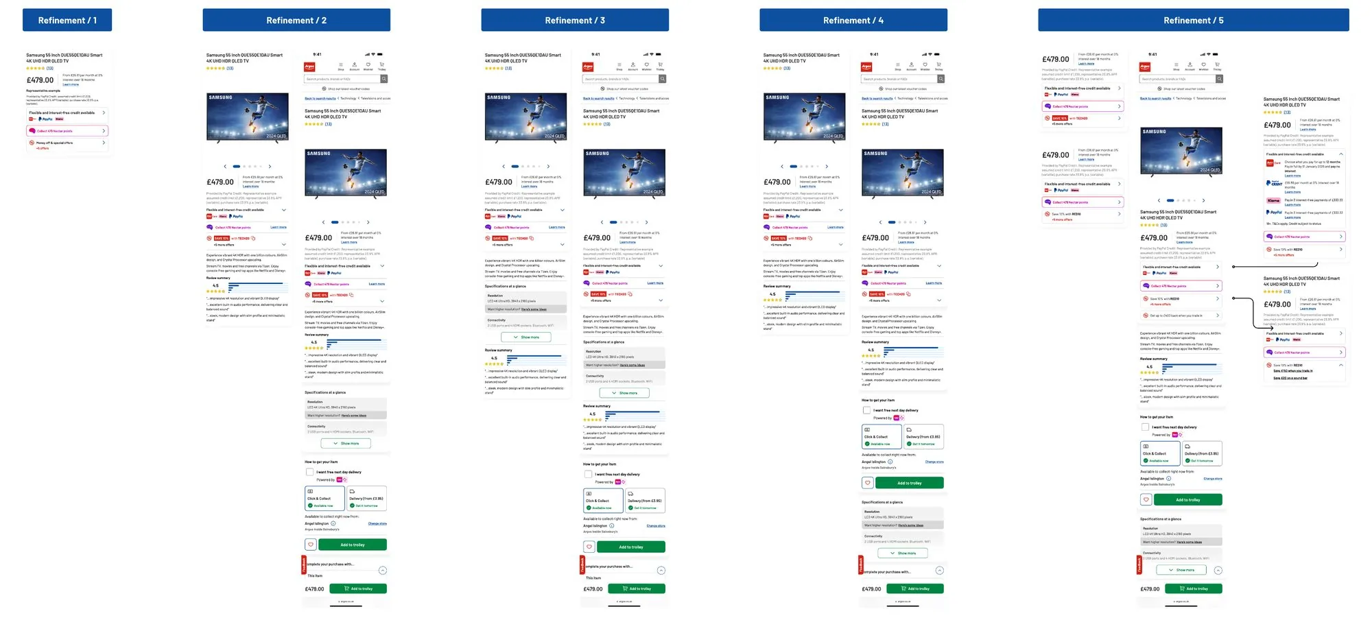
In February 2025 the work went to Hot Topics, the senior leadership review, as a prototype and a pre read. Before it did, product and I worked through what needed to land and I took it through five rounds of refinement on a real TV page.
- Offers
- Streamlined into one line, like “Save 20% with ELEC20, plus 2 more offers”, that opens to show the rest.
- Navigation
- A sticky navigation and a sticky add to trolley that appear once you scroll past the main button.
- Middle of page
- If its job is attach, everything in it should serve that. Specs at a glance moved below care.
- Top of page
- A very short description and a positive review extract, to test whether people decide faster.
The prototype and pre read set out the new template, the vision for each category, and how we’d deliver it in tested phases.
The test that didn’t all go our way
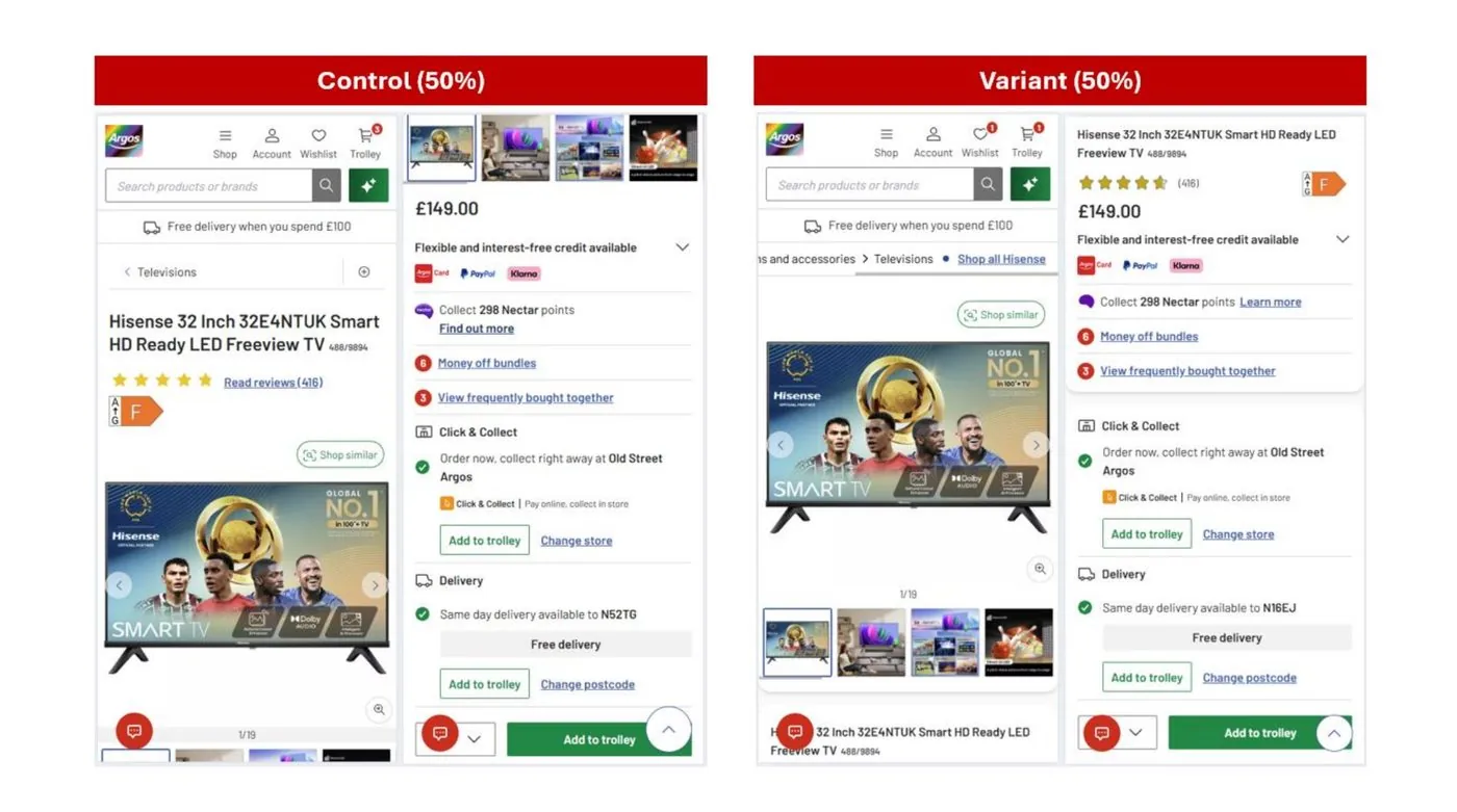
The first phase tested the new styling and structure against today’s page: the grey wireframe, breadcrumbs, the bigger gallery and reviews moved higher.
But revenue per visit and average order value dipped, and in the first period more people left the page early. I didn’t want to explain that away, so I worked through why. Reviews higher up could amplify doubts on lower rated products. Bundles got less attention once images and reviews pulled focus. More on screen at once meant some people got to a “no” faster.
I recommended scroll maps to see whether people still reached bundles and delivery, and splitting the results by device.
What shipped
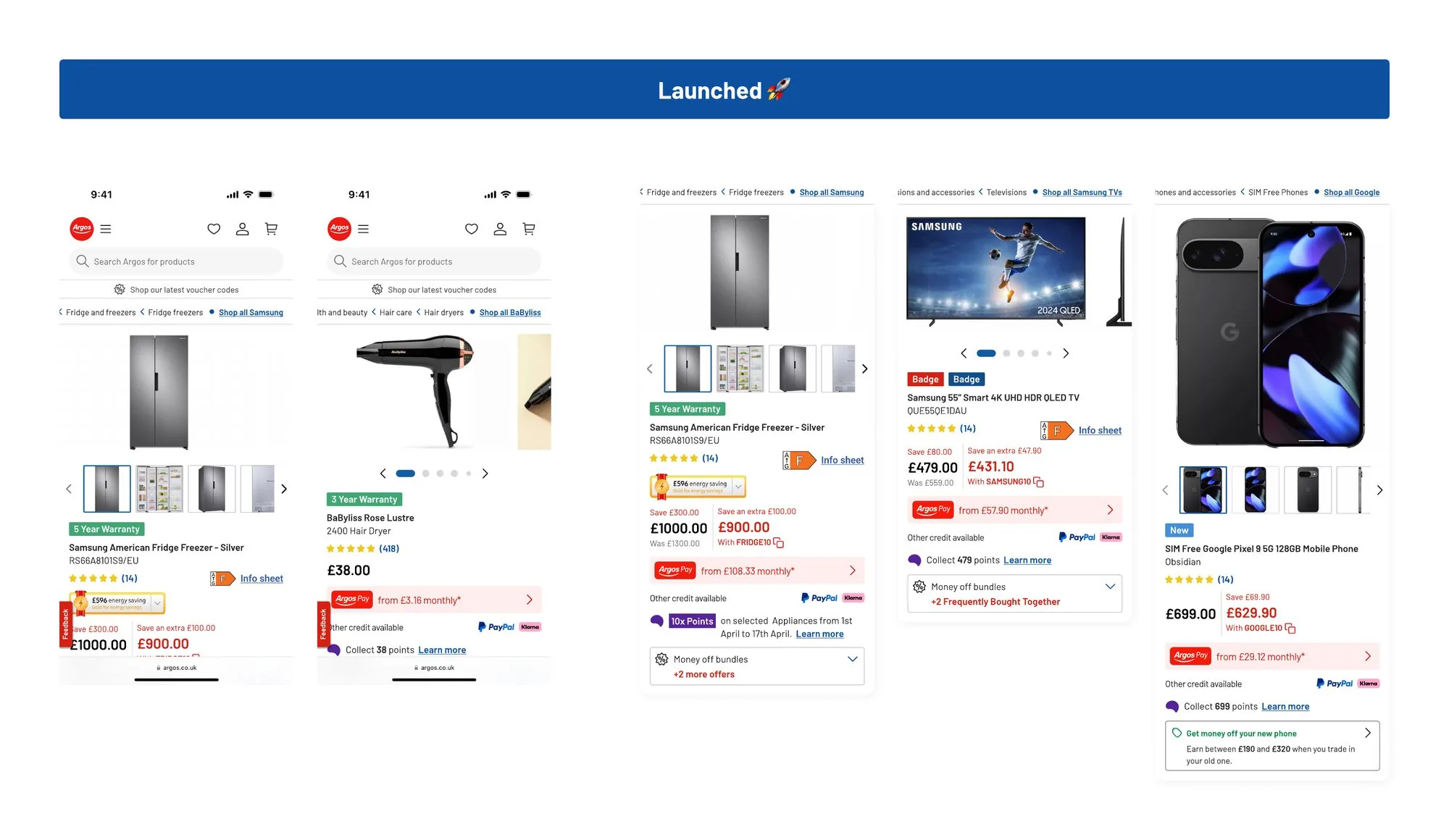
Each part went live as a reusable component, so the category blocks can be assembled from the same parts.
- The new product pageLive
The five zones on every product page, top to bottom, on mobile and desktop.
- Fulfilment componentLive
Collection or delivery as one clear choice, with every state designed. +0.6% conversion, +1.0% add to trolley.
- Styling, breadcrumbs and galleryLive
The grey wireframe, clear sections, breadcrumbs and a gallery tracker. +0.5% to +0.7% add to trolley.
- Upper and offer messagingLive
Price, finance, Nectar and offers in one order, with offer codes shown inline.
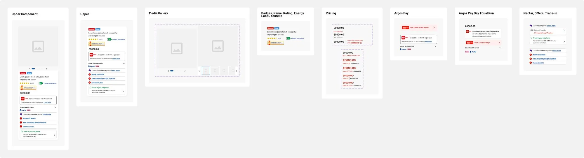
- Component setLive
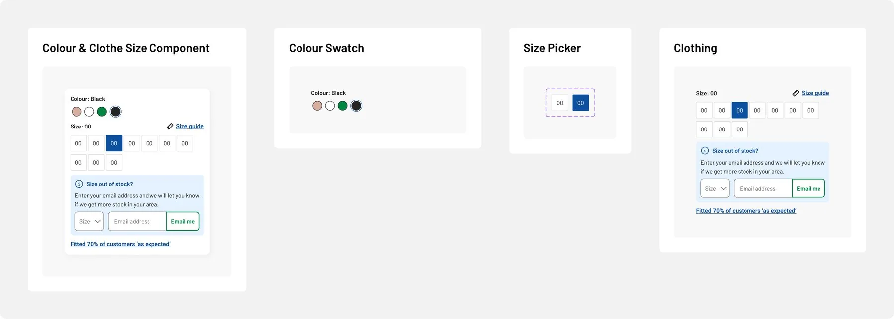
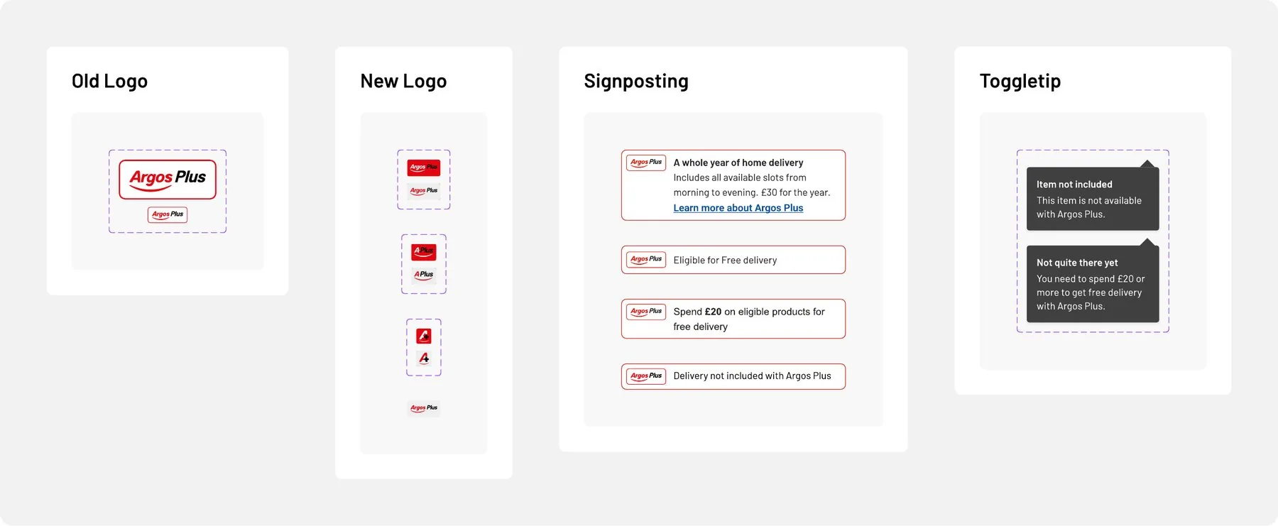
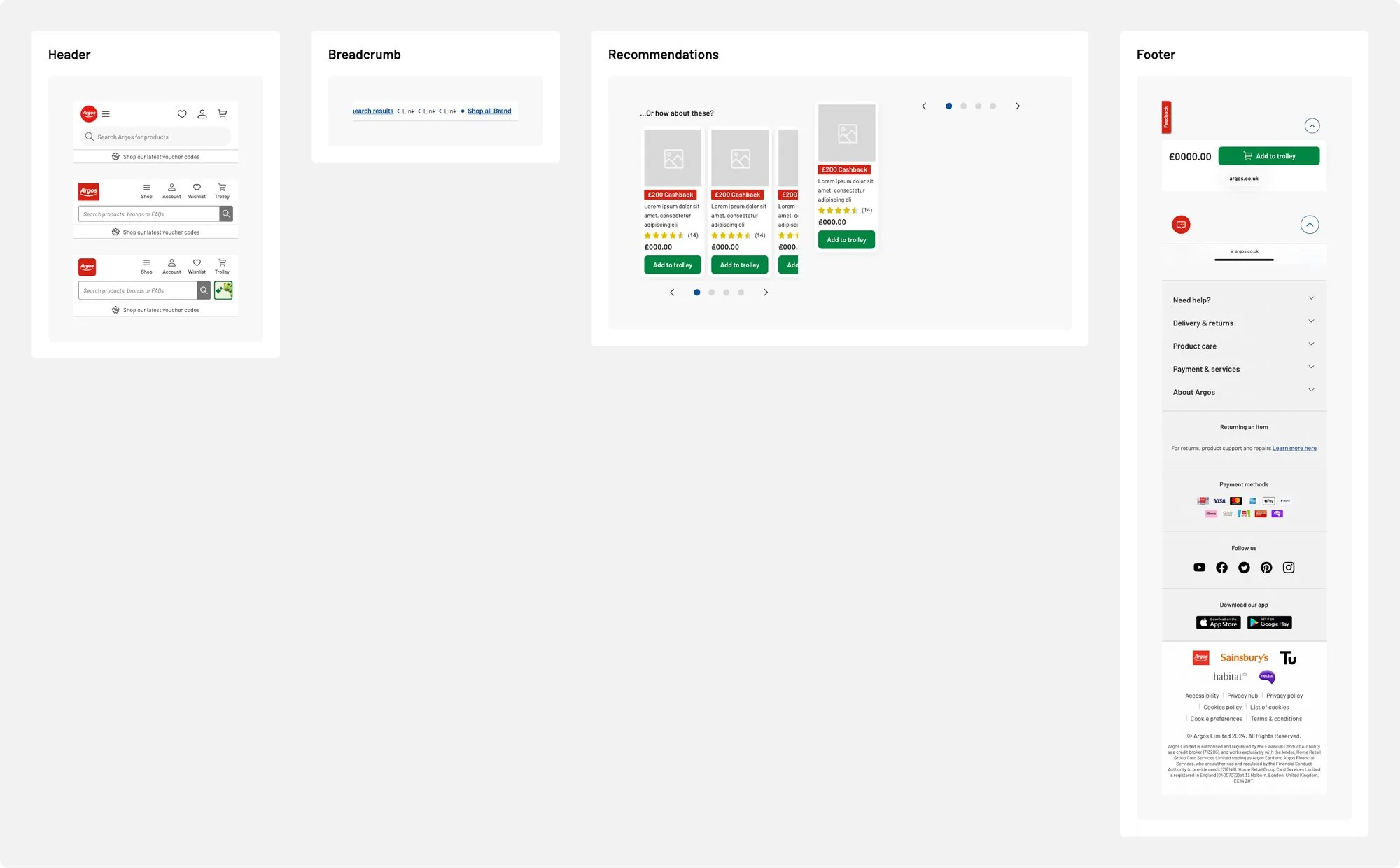
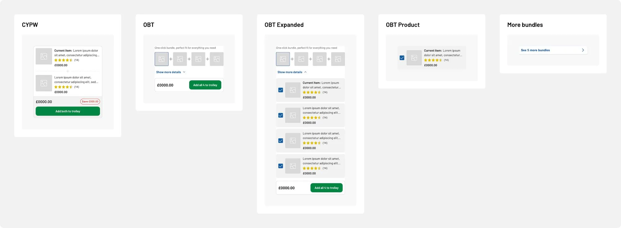
Product information, bundles and recommendations, care, colour and size pickers, Argos Plus signposting and the page atoms around them.
- The north star and category blocksNext
Toys, Technology, Furniture and Appliances, each with their own blocks, now being rebooted on the new template.
The components behind it
The blocks the new page and every future category experience are built from.
Decisions that shaped it
One template, swappable blocks
Four bespoke product pages would mean four things to build, test and maintain. One template with blocks means a customer learns one page, engineering builds each part once, and a new category is a content decision.
Design every state, then write it
Fulfilment had dozens of cases, and each team had written its own messages. Designing them all in one place, with one way of saying when you can get something, is a big part of why the component worked.
Ship it in tested phases
We delivered it as a series of A/B tests instead of one big launch. That got improvements in front of customers months sooner, kept the risk low ahead of peak, and let us learn between phases, including from the result that didn’t go our way.
What I learned
Arguing to widen the brief
Taking the brief at face value would have meant category components on a page with no structure. I made the case to product and trading with the Baymard audit: 25 failed guidelines, 14 of them high severity. It’s also why the category work can happen now.
Seven concepts for one component
It sounds like a lot. Fulfilment had three add to trolley buttons and a different message for every stock state, and it’s the part with the clearest result.
A mixed result is still a result
Add to trolley went up while order value dipped. I worked out why and recommended scroll maps and splitting the results by device, and both were run before the next phase.
Next case study
DCA Picking Tool →Redesigning the handheld app B&Q colleagues use to pick Click and Collect orders, built on research on the shop floor.