DCA Picking Tool
Redesigning the handheld app B&Q colleagues use to pick Click and Collect orders. Average pick time went from 11 minutes to under 8.
OutcomeAverage pick time down from 11 minutes to under 8, a 27% cut, across Digital Hub stores.
See what a picker needs at the shelf
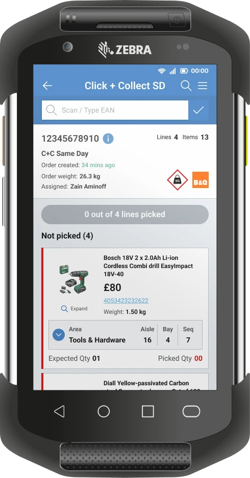
A tool colleagues worked around
DCA is the app B&Q store colleagues use on Zebra handhelds to pick Click and Collect and home delivery orders. It was meant to hold everything for a pick, but pickers kept leaving it to look items up in Product Query.
My role: I was a product designer in the B&Q Digital Hub team at Kingfisher, working with a senior designer, a product manager, business analysts and engineers. I worked on the discovery and concepts, ran store research at Hedge End, and iterated the key screens from the order list through to the full picking journey. I also jointly led the Colleague Research Network.
- Jan 2021Joined the team and learned the existing tool and how the stores worked day to day.
- Early 2022A design sprint using Kingfisher’s Discovery Toolkit: framing, How Might We statements and a concept to test.
- Mar 2022Store research and concept testing at Stockport, Colchester and Hedge End.
- 2022Iterating the pick list, the pick card and the full journey, then shipping.
- Jun 2022Average pick time under 8 minutes, down from 11.
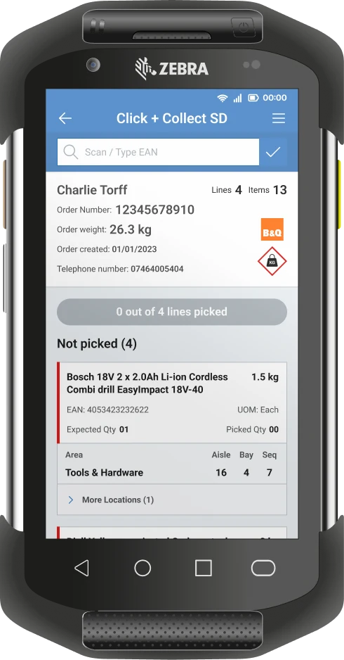
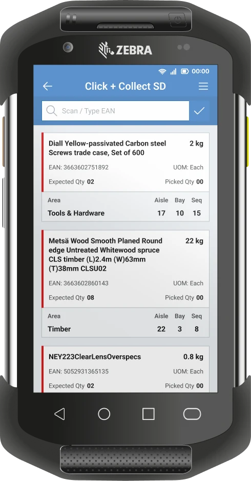
What the tool missed
The original screen gave pickers an EAN, a product name and a block of location numbers. Experienced pickers could work with that. Anyone new, or picking in a part of the store they didn’t know, was guessing.
On the shop floor, pickers ran the same checks in their heads for every item before scanning it:
- Where is it
- Area, aisle, bay and sequence, often on shelf labels that were hard to see.
- What is it
- The last four digits of the barcode, and what it looks like.
- How many
- The quantity to pick.
- How heavy
- Whether they’d need a flatbed trolley.
- What it costs
- Price, used to tell similar products apart.
The tool showed no picture and no price, so colleagues left the pick and went into Product Query to look the item up.
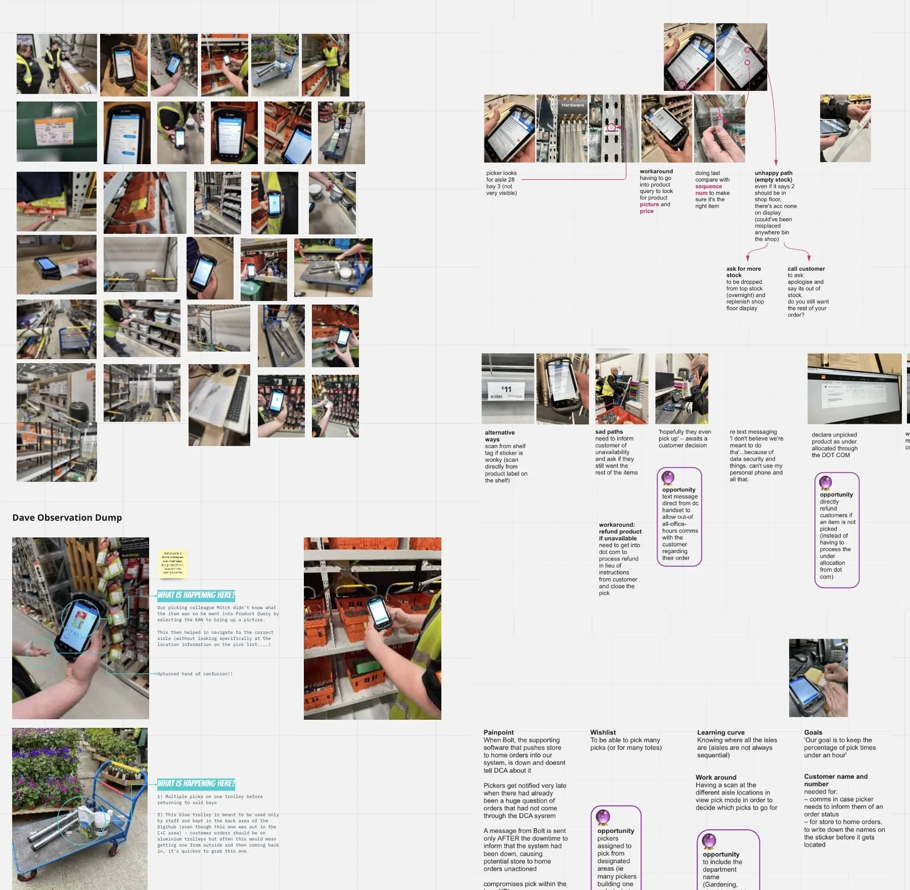
Watching picks on the shop floor
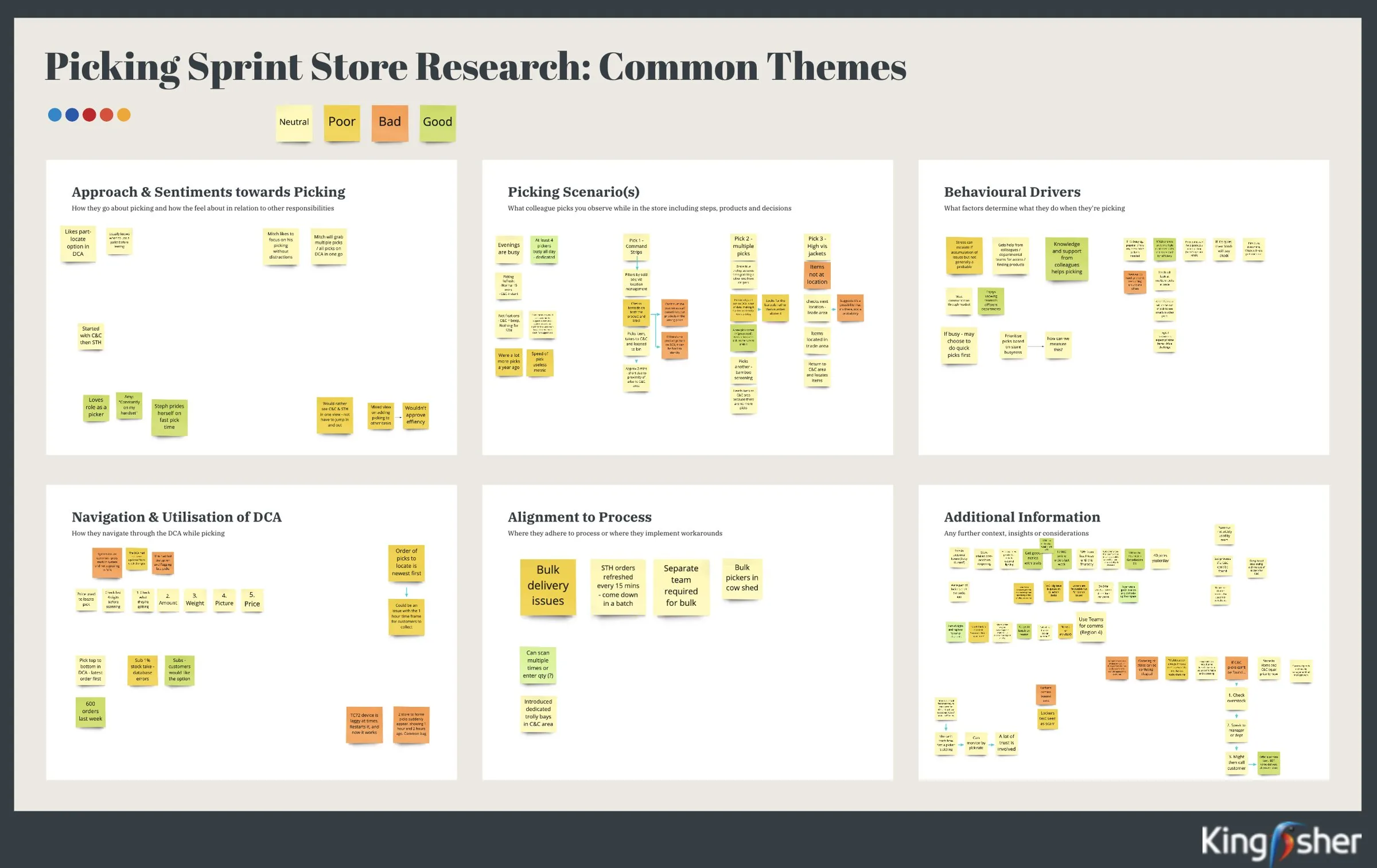
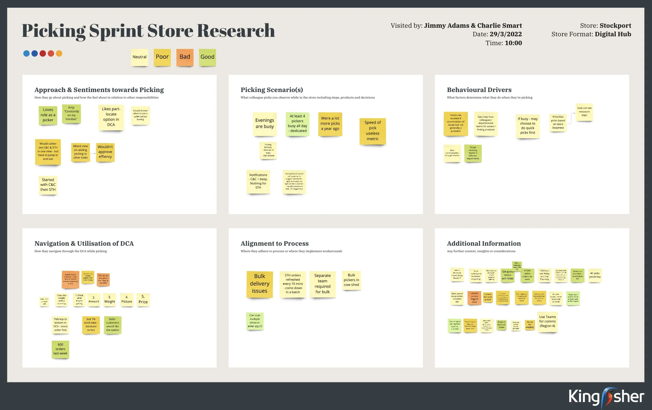
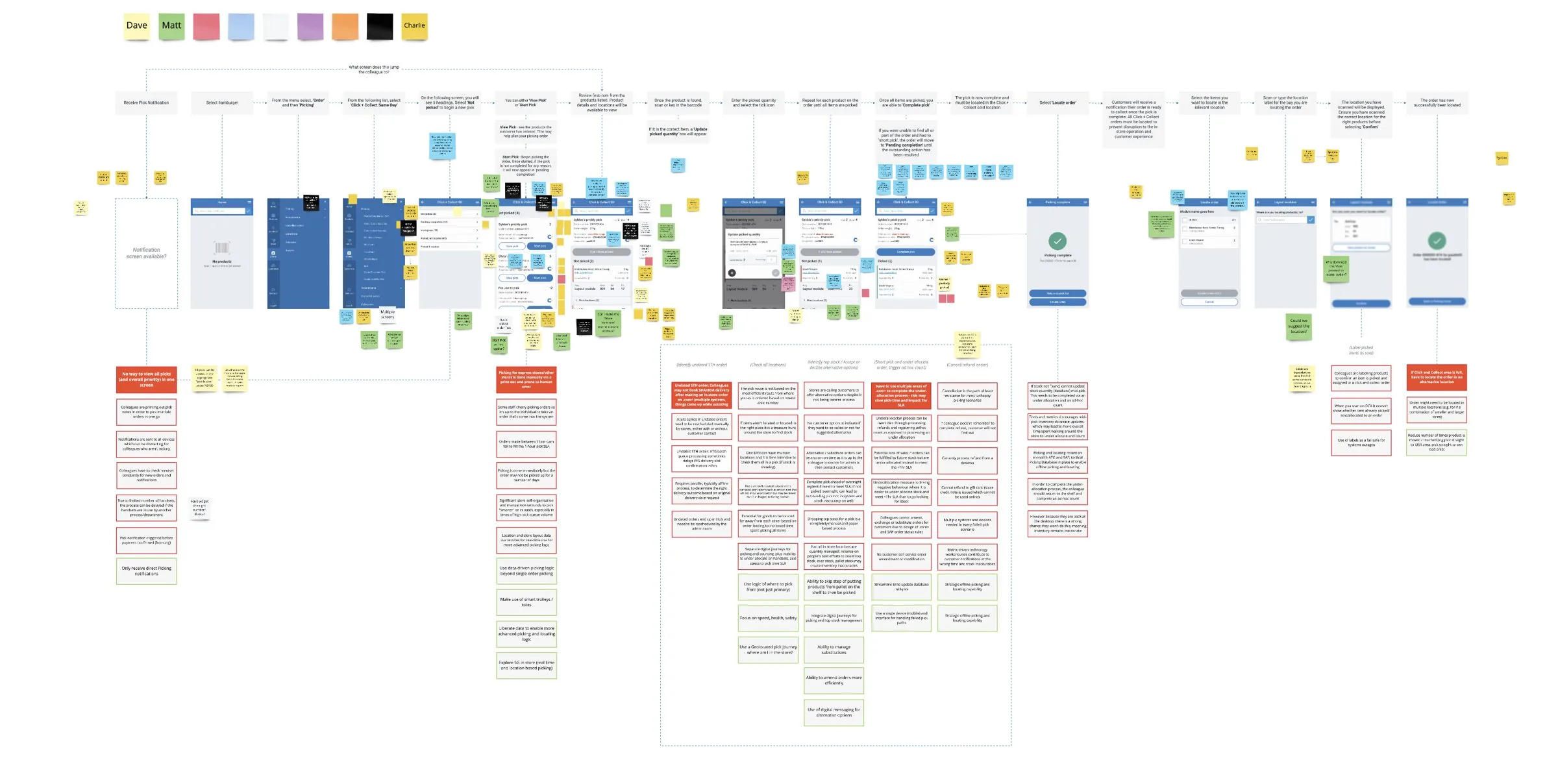
I went to Hedge End with another designer from the team and spent time with the hub manager and one of the pickers. Other pairs from the team did the same at Stockport and Colchester. We photographed picks, wrote down every workaround, and played the findings back as common themes across all three stores.
What problem were we solving?
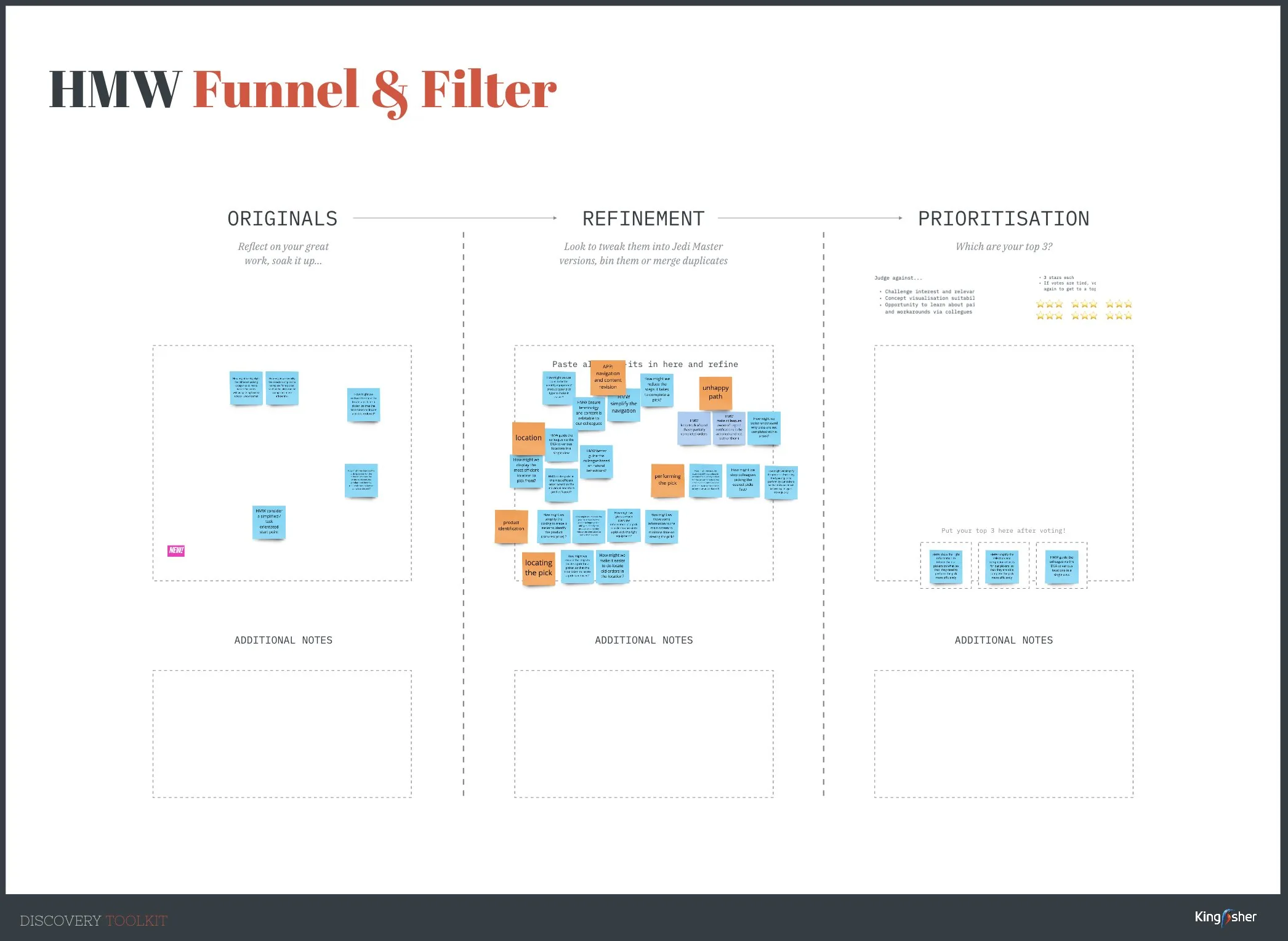
We ran a design sprint using Kingfisher’s Discovery Toolkit. The brief started at the tactical level: how might we understand more about the colleague experience, to work out what the best picking experience should look like?
We wrote How Might We statements from the research, refined them, and voted on three to take forward:
- Information
- Show pickers the right information at the right time, so they can pick more efficiently.
- Steps
- Simplify the journey, so pickers can complete a pick in fewer steps.
- Location
- Guide colleagues to every location for a pick in a single view.
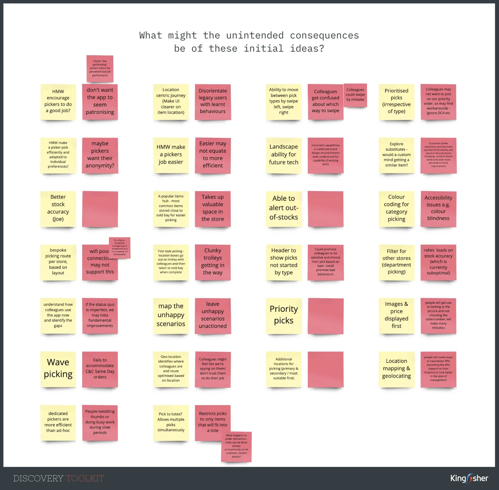
Then we sketched, and stress tested our own ideas by writing down the unintended consequences of each one. Prioritised picks might be ignored. Geolocation might feel like we were spying on colleagues. Images and price might stop people checking the code.
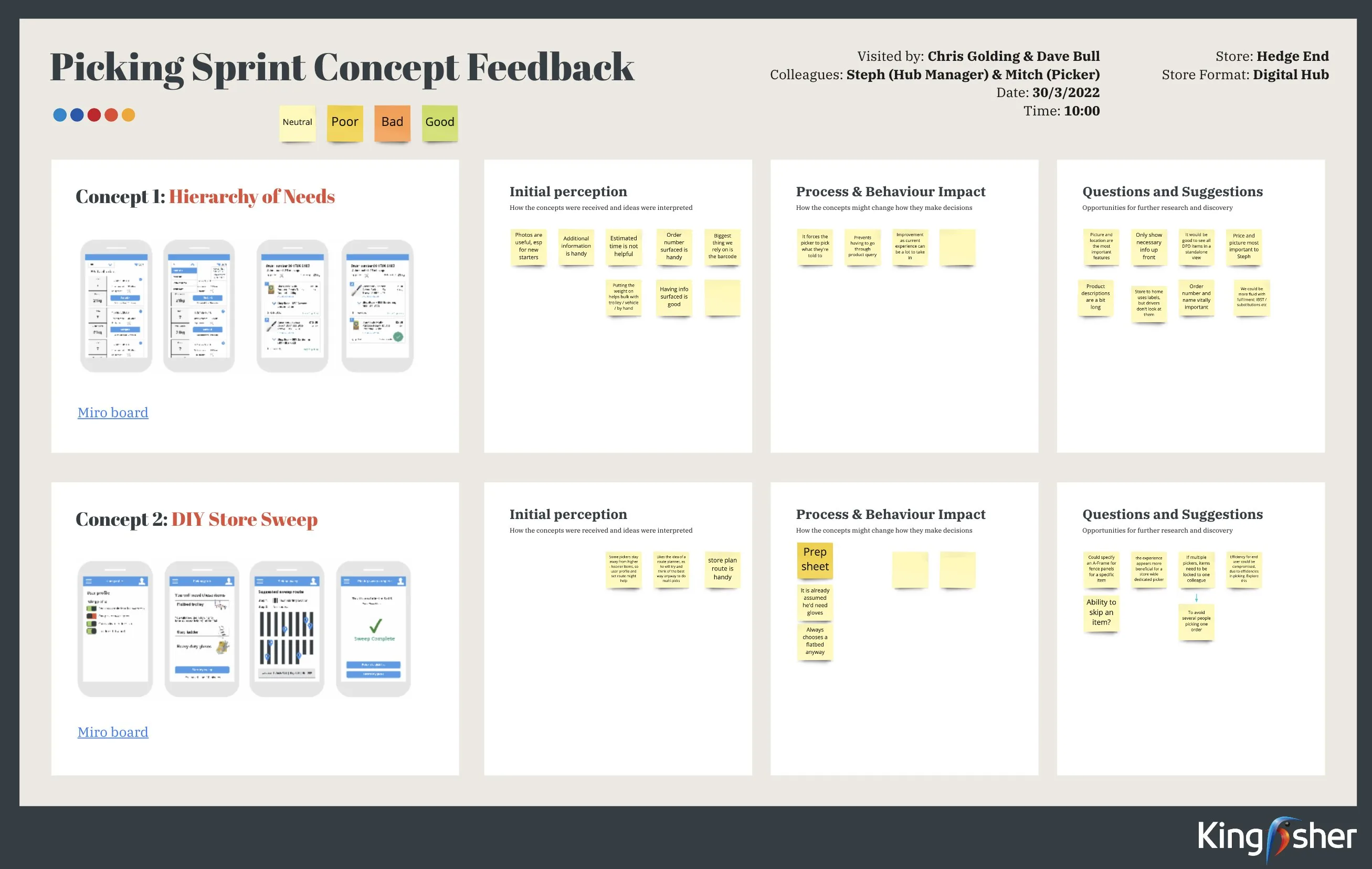
Testing the concept in three stores
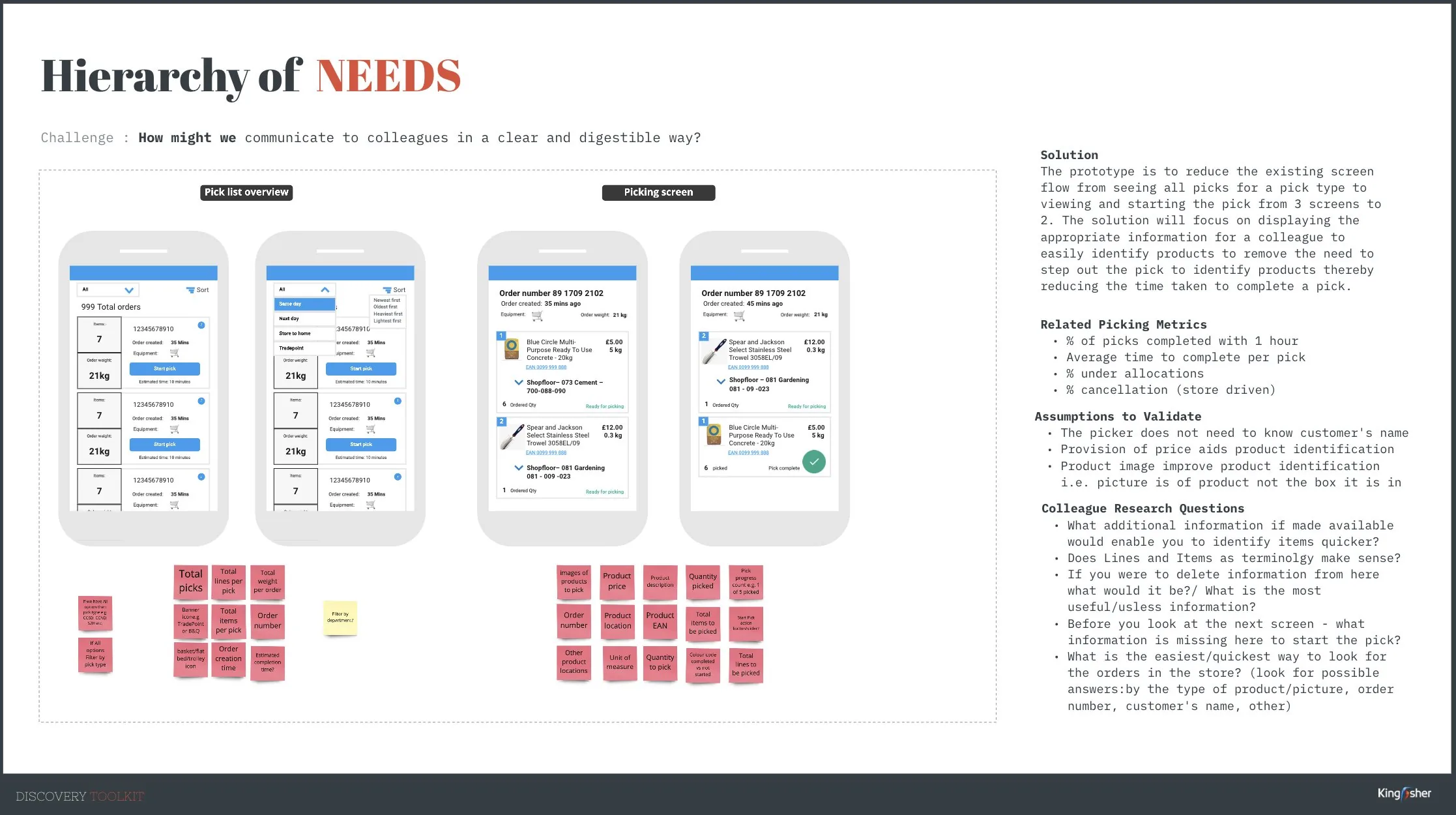
The concept we took into stores, Hierarchy of Needs, cut the flow from three screens to two and put the information pickers rely on first: a product image, price, location and order number.
It was built to test our assumptions as much as the screens. We assumed pickers don’t need the customer’s name, that price and product images help them identify items, and that order weight and estimated time would help them plan. We took it to pickers at Stockport, Colchester and Hedge End.
“Weight and number of items weren’t as important as we assumed.” Photos and price held up. Weight and time estimates didn’t.
What pickers told us, and what changed
| What we heard | What changed |
|---|---|
| “Photos are useful, especially for new starters.” | Every item card leads with a product image, with an Expand option for more photos. |
| Price used as a way to tell products apart: “Big massive improvement right there.” | Price sits large on every card, under the product name. |
| “The biggest thing we rely on is the barcode.” | The EAN stays on every card, as a link to product details. |
| “Wouldn’t need a phone number.” The customer’s name isn’t needed to pick. | The header leads with the order number and type. Customer details moved behind an info button. |
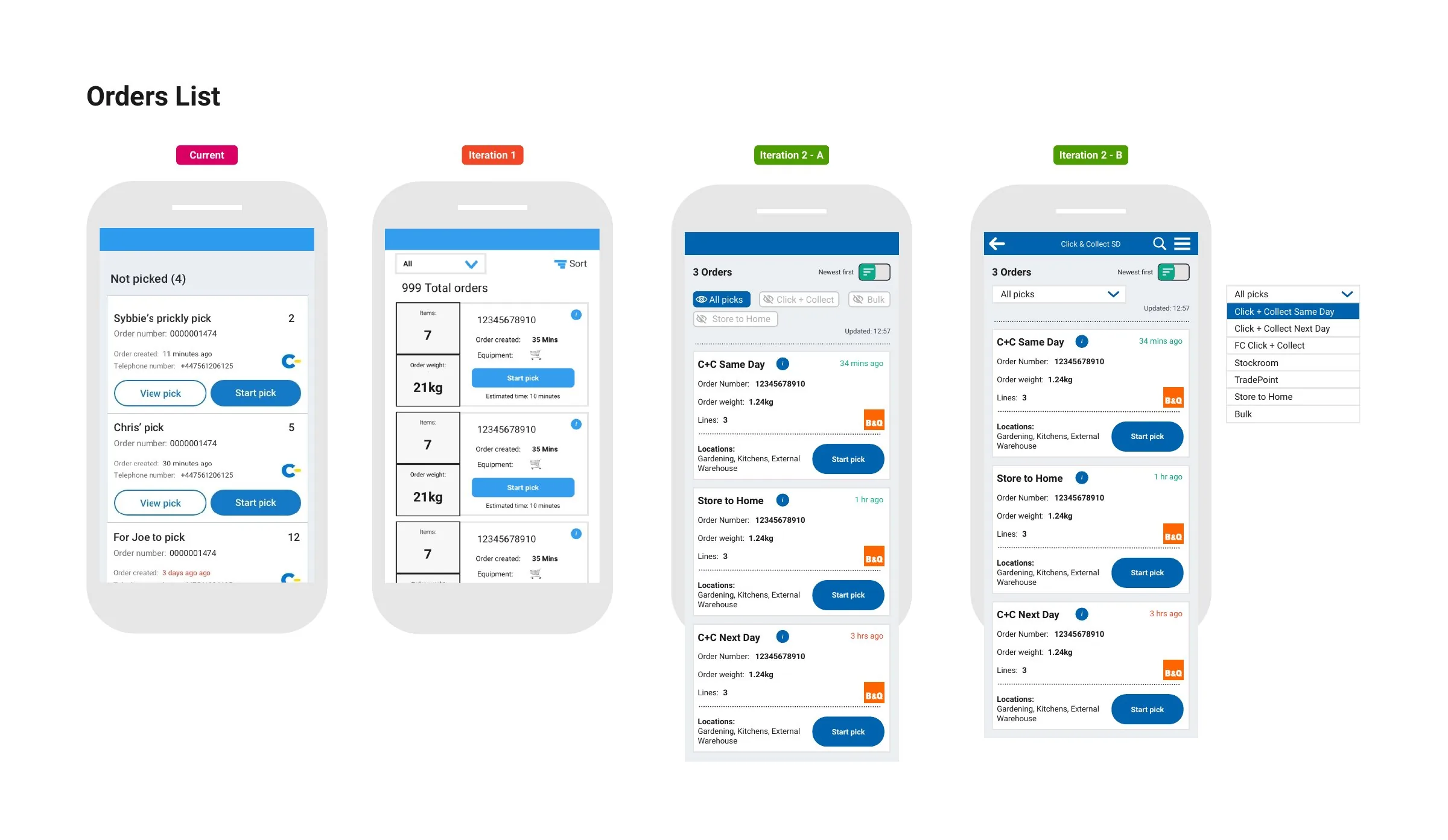
| “Showing weight initially may lead to choosing lighter orders.” “More information means more bad behaviour.” | Order weight stopped leading the list, so pickers follow priority, not the lightest job. |
| “Estimated time is not helpful.” Pick completion time wasn’t relevant. | Time estimates were removed. |
| Order number surfaced is handy. Order created is useful, as long as it’s recent. | Order created shows as “34 mins ago”, next to the order type and who it’s assigned to. |
The sprint, the concepts and the feedback
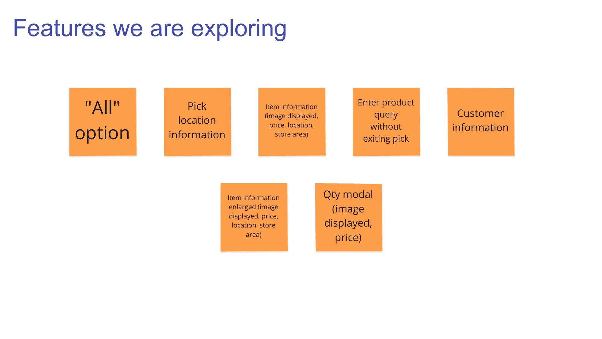
From How Might We statements to a concept, with the metrics and assumptions it was built to test.
What does a picker need at the shelf?
Each question a picker asks now has an answer one tap away, without leaving the pick. Pick a question.
The photo and price come first, with the location underneath.
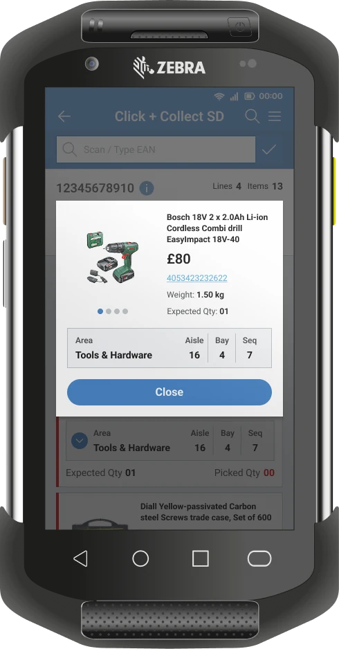
Expand opens more photos and the details, without going into Product Query.
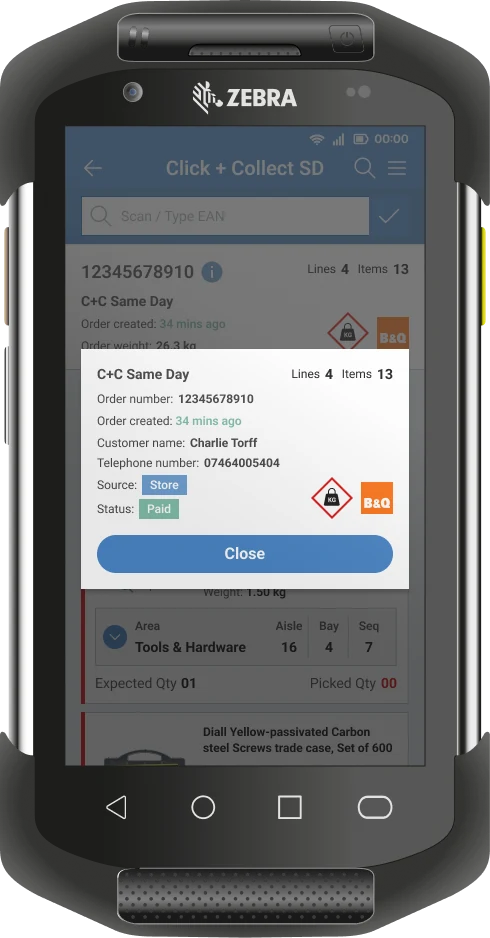
Customer details are there when a picker needs to make a call, not on every screen.
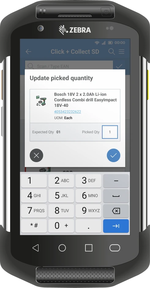
Quantity is updated against the item, with the number pad ready.
Decisions that shaped it
Lead with the order, not the customer
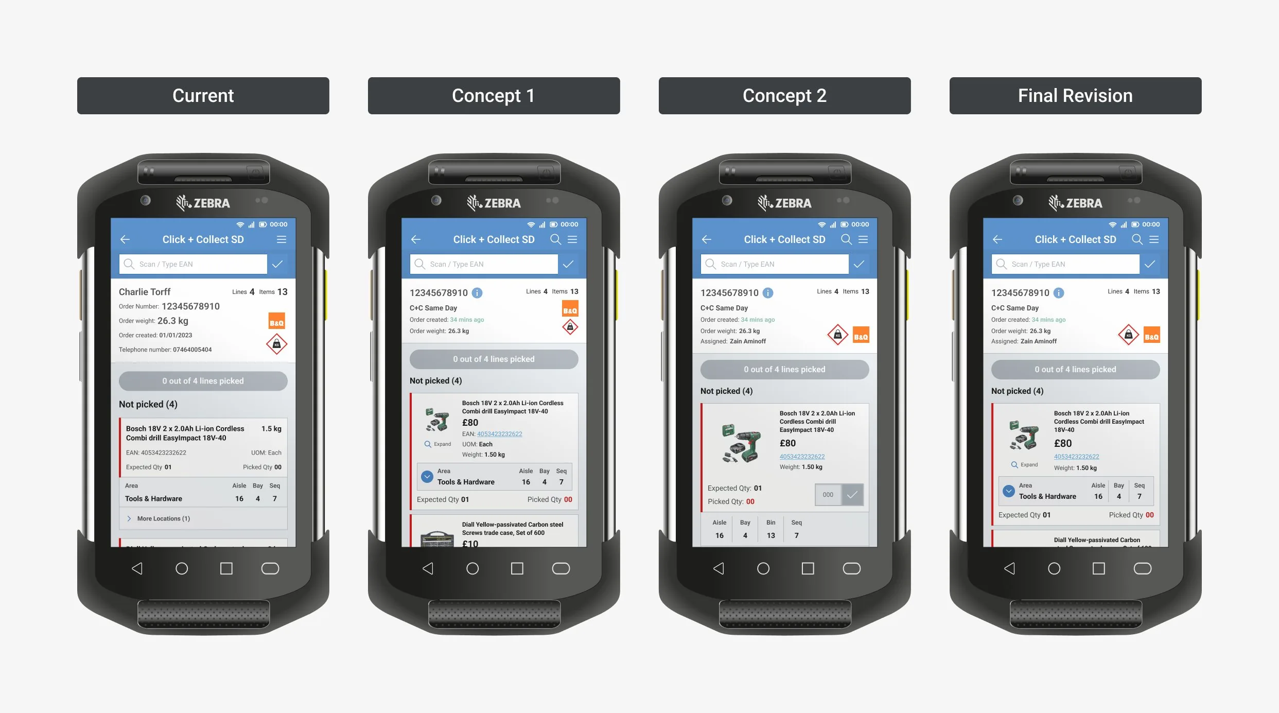
The original header led with the customer’s name and phone number. Pickers told us they don’t need either to pick. The new header leads with the order number, the order type, how long ago it came in and who it’s assigned to. Customer details moved behind an info button for when someone needs to call.
Show the checks pickers already make
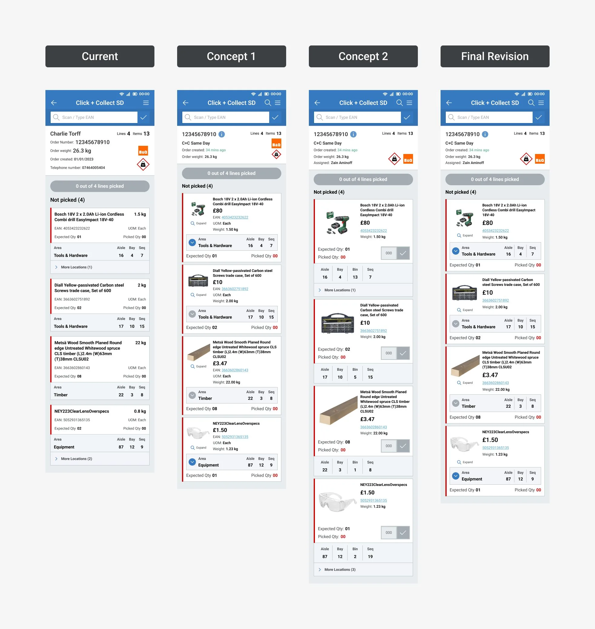
Every card now carries the photo, price, barcode and weight, with the location in its own panel. Price earned its place because pickers use it to tell similar products apart, and the photo because new starters can’t identify everything by name.
Stop sending people into Product Query
The most common workaround we saw was leaving an active pick to look something up. Expand opens a product details view with more photos, inside the pick, so nobody loses their place.
Design the unhappy paths
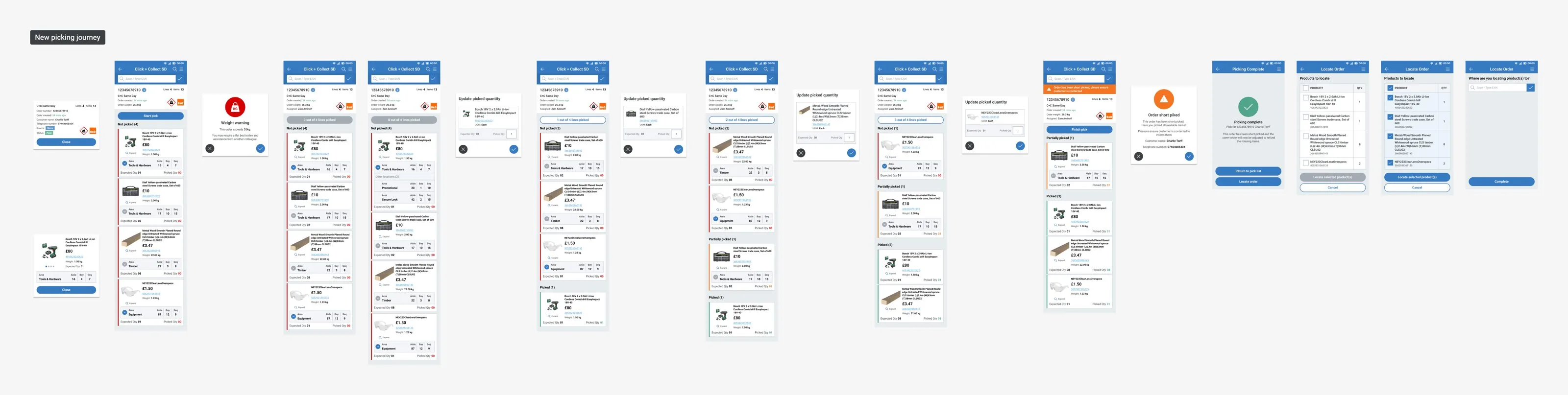
The old journey let colleagues mark a short pick, then left the rest to them. In store we saw people calling customers from their own phones and processing refunds through the website. The new short pick screen puts the customer’s name and number right there, with a prompt to contact them, and the journey ends with locating the finished order.
Take away what looked useful but wasn’t
Order weight led the old order list, and on every visit we saw pickers use it to choose lighter jobs, so heavy orders waited longer. Equipment prompts and time estimates went too.
Iterating the pick card
From the original card through two rounds of iteration to the final revision, tested against the same four orders each time. Then the full journey, from the order list to short picks and locating the finished order.

What changed
Pick time feeds straight into the customer experience. A quicker pick means a shorter wait at the collection desk.
Taking order weight off the front of the list changed behaviour too. Pickers stopped going for the lighter jobs and followed the priority order instead, without any training.
What I learned
Every workaround was a missing feature
Every workaround on the shop floor was something the tool had missed. Opening Product Query just to see a photo, calling customers from personal phones, abandoning picks when stock ran out. None of it was in a spec.
Test the assumptions behind the screens
Writing our assumptions down before going into stores meant we could tell which ones held. Photos and price did. Weight and time estimates didn’t.
Less information is the harder argument
Weight, time estimates and customer names all looked useful on paper. In store, they drove the wrong behaviour or got ignored. Making the case to remove something was always harder than adding it.
Direct access to users changes how you work
Through the Colleague Research Network we could ask pickers questions at any point in design and delivery, without waiting for a research sprint.
Next case study
Right Idea, Wrong Place →Recommendations in the Argos app trolley, and the evidence and test that showed the prescribed version was in the wrong place.