Right Idea, Wrong Place
Product recommendations in the Argos app trolley, powered by Swogo, a third party engine. The product team wanted one between the items you’d already chosen.
OutcomeThe prescribed version didn’t ship. 39% of Android customers closed it, against 28% for my alternative.
See where the recommendation went
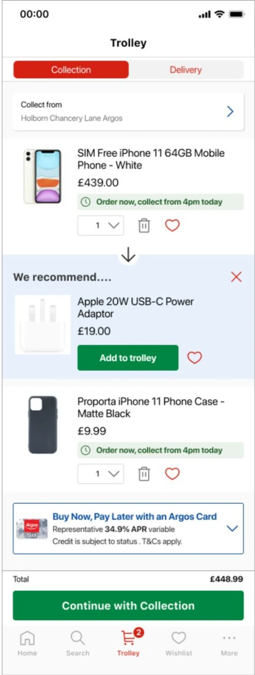
A favour that arrived as a roadmap item
Swogo is a third party recommendation engine Argos was already paying for on the website. The PM who owned the relationship wanted to use it somewhere new: the app trolley. It came to the app team as a favour, and went straight onto the roadmap as a quick win.
Show one “complete your purchase” recommendation for each eligible item, only if it was in stock, and let customers add it to the trolley from there. It would be the first time the app had ever shown recommendations in the trolley.
My role: I was the only designer on the Argos app. I owned the research, the designs, the user testing and the case for how it should be tested, working with the app PM, the recommendations PM and the analytics team.
- Jan 2023The ask arrives. I start with research before opening Figma.
- Feb to Apr 2023Two variants designed, iterated with the wider design team, and tested with customers.
- May to Jun 2023A/B/C test on iOS and Android for 47 days, split evenly between control and both variants.
- Aug 2023Results shared back to the design team, with what I’d do differently.
Where the recommendation sits
By the time someone opens their trolley, they’ve decided. They’re checking what they’re buying and what it costs. Anything that gets in the way of that risks the sale you already have.
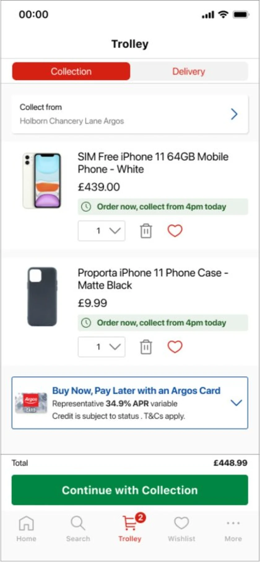
The prescribed design put the recommendation between the items you’d chosen, where it could look like part of your order. Before designing anything, I went looking for evidence on placement.
- Baymard
- Their checkout research found cross sells in the trolley can make people feel the site is pushy, lose trust and abandon. The pattern that worked best put recommendations below the items and the main button.
- Competitors
- ASOS, IKEA, John Lewis, Boots, Uniqlo and Space NK all kept recommendations below the line items. Apple asks before you reach the bag.
- Our own history
- Halfway through, I found that the website team had tested trolley recommendations six months earlier. The designer had left, and nobody had passed it on.
Two hypotheses on the table
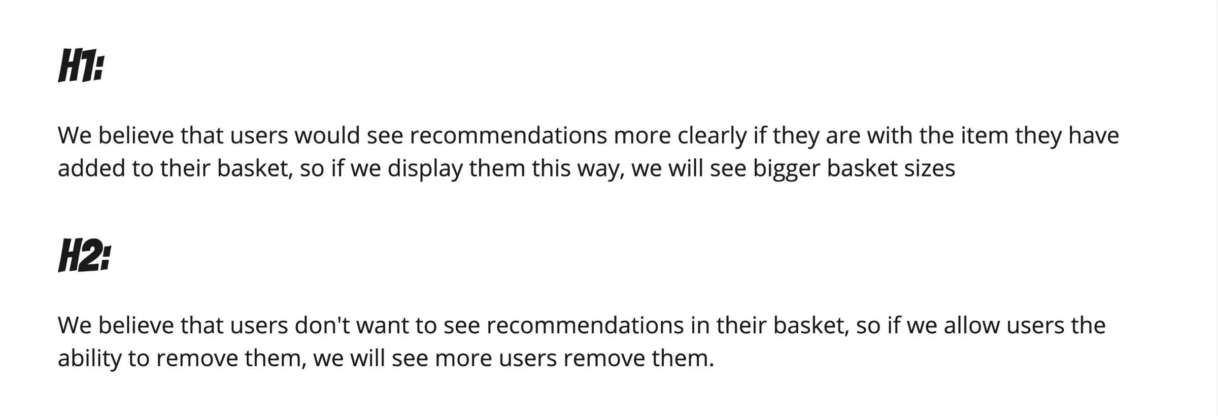
The business believed recommendations next to the item they belong to would be seen more and grow baskets. I believed placement would decide whether a recommendation helped or confused, and that if customers could close it, they’d tell us which. Writing both down meant the test could prove one of us wrong.
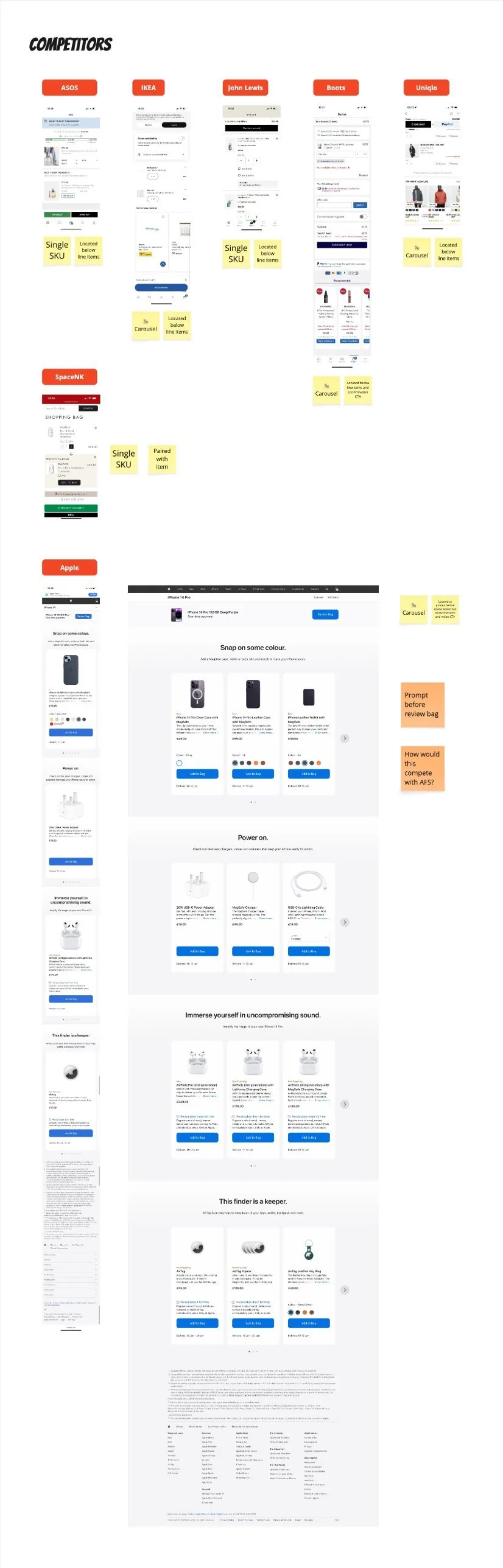
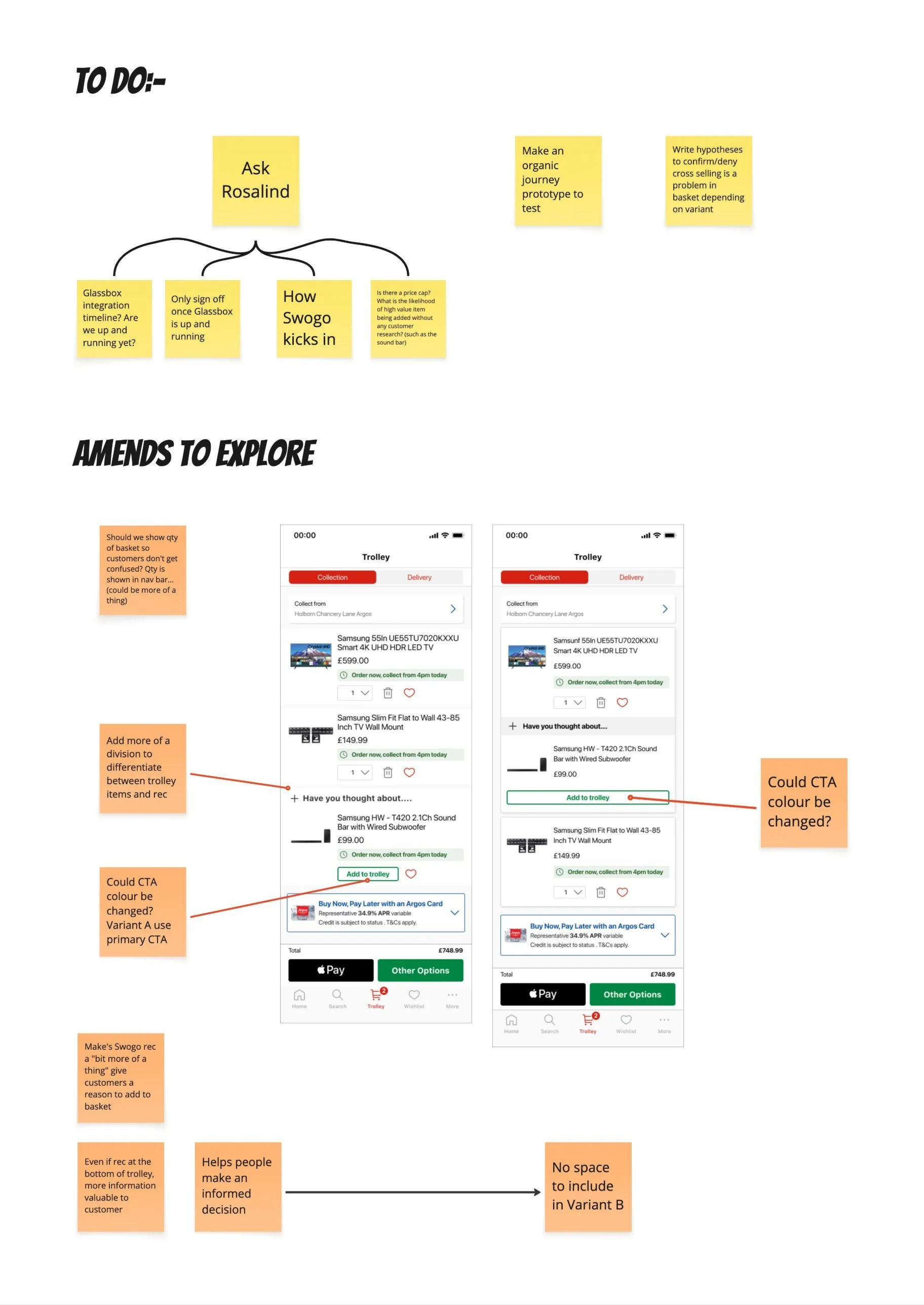
Where should the recommendation go?
The same trolley three ways. Pick one to see what customers in testing said about it.
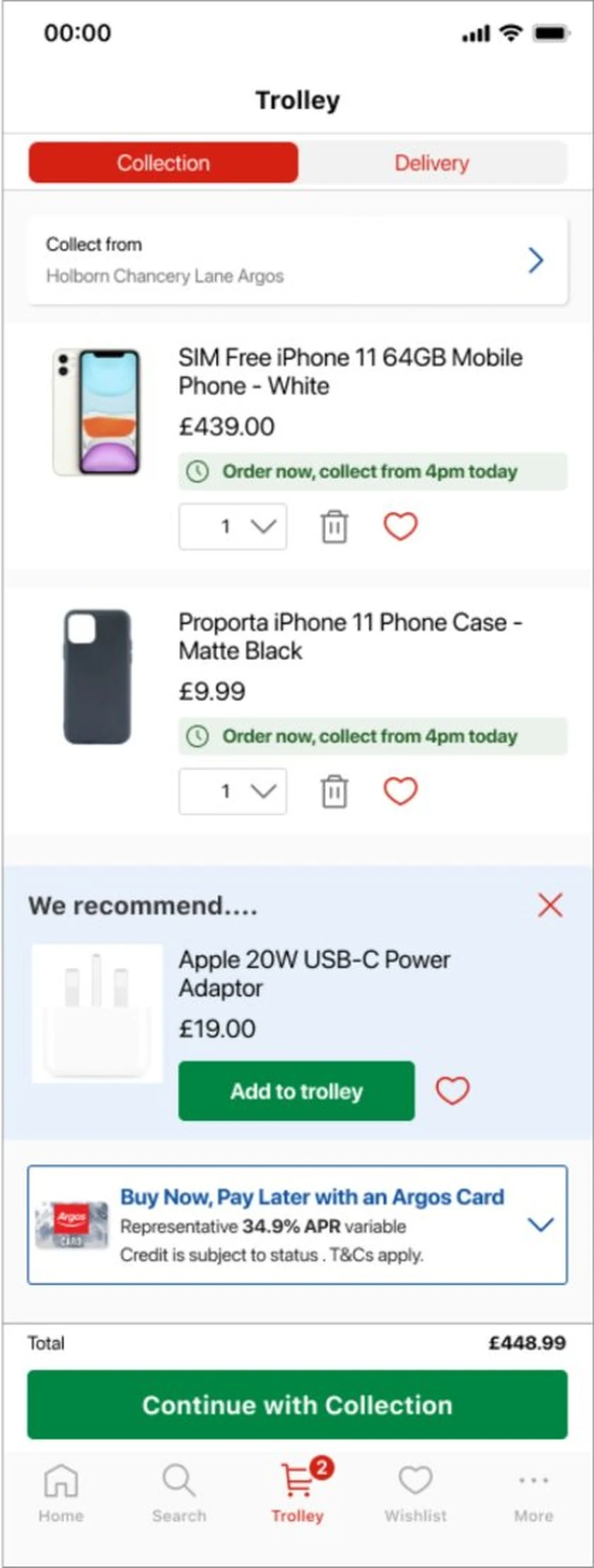
The trolley as it was: what you’re buying, what it costs, and how to pay.
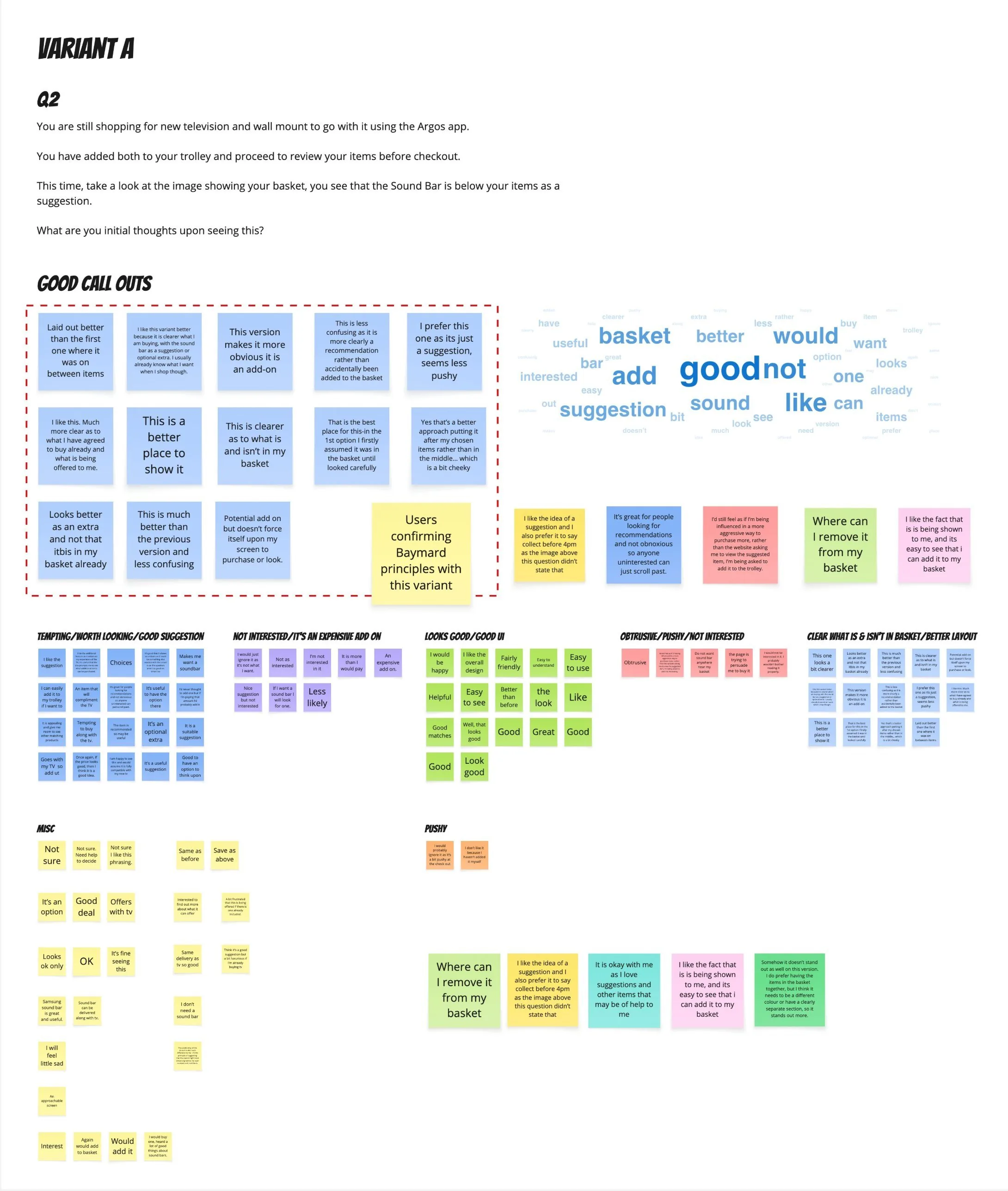
“This is clearer as to what is and isn’t in my basket.”
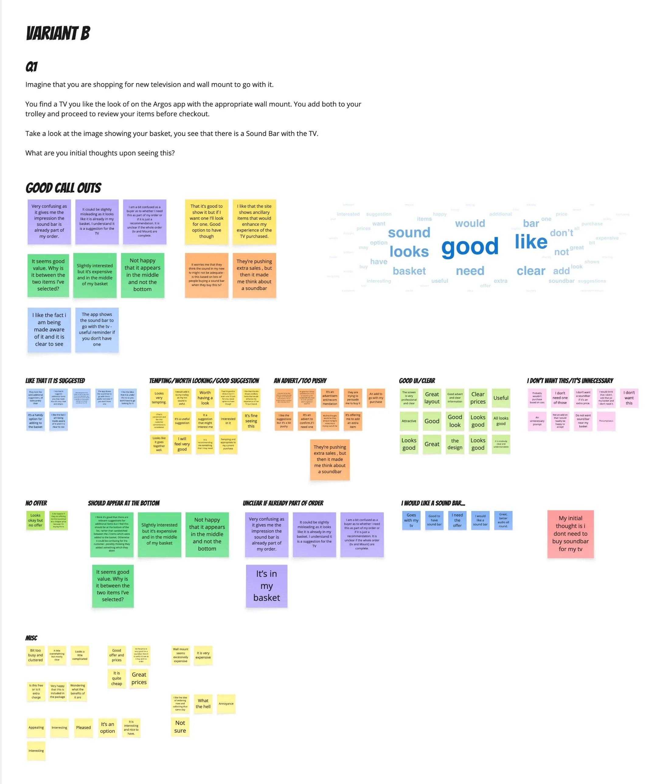
“Very confusing as it gives me the impression the sound bar is already part of my order.”
How I influenced it
Design both, properly
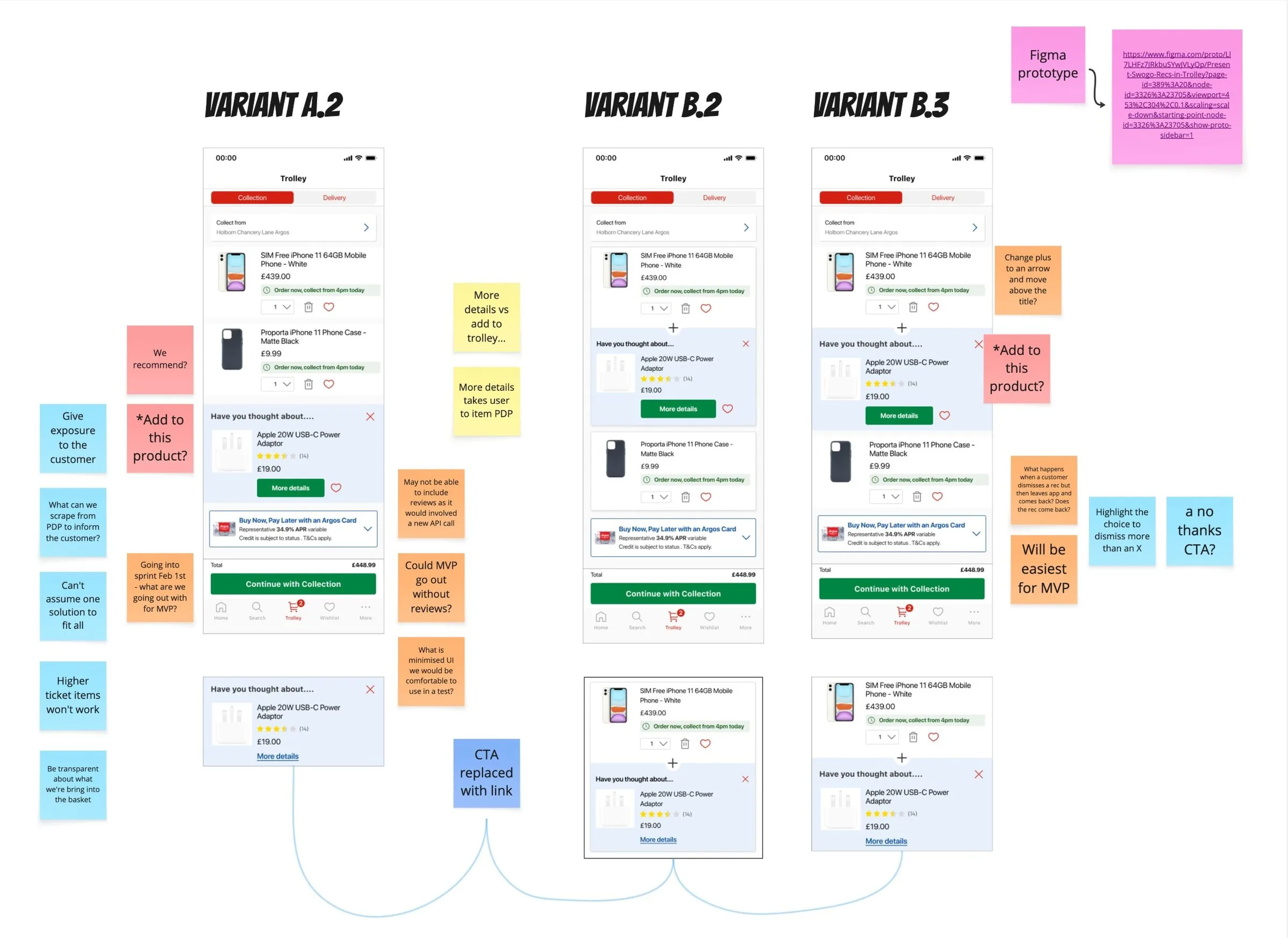
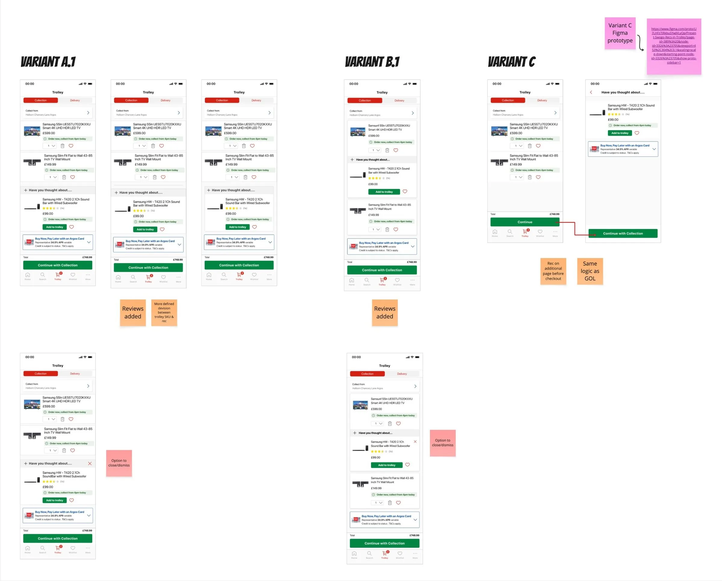
I didn’t believe in Variant B, but refusing to design it would have made it my opinion against the PM’s. So I designed both as well as I could, iterated them with the wider design team, and let customers decide.
Test with customers before the A/B test
Unmoderated testing on both variants came back clearly in favour of A. On B, people thought the recommendation was already in their order. That gave me quotes to take back to the PM, like this one.
“It could be slightly misleading as it looks like it is already in my basket.”
Fight for the dismiss button
The PM saw a way to close the recommendation as a nice to have and wanted it out of the first release. I put the case in writing: if the test reached significance on revenue but customers were closing the recommendation in large numbers, we’d need to know. Without it, a flat revenue result would have had no explanation. The dismiss button went in.
Count the dismissals as well as the sales
I asked for dismissals and removals to be tracked alongside revenue and conversion, so the result couldn’t be read as a simple win or loss.
Iterating and testing
Two rounds of iteration added reviews, a clearer divider between your items and the suggestion, a close button and a lighter “more details” option. Then both variants went to customers.
What the test showed
Neither variant reached statistical significance on revenue, on iOS or Android, and the analytics team recommended that neither go live. People did add a few more items, but they were cheaper accessories, so order values didn’t grow.
The dismissals showed the difference between the two variants.
Variant B was seen most and added most, and closed most. Analytics thought some customers were adding the item just to get it out of the way, then removing it. Variant A came out better on the measures that showed what customers thought.
The prescribed version didn’t ship, and the test showed why: customers closed it most. Variant A gave the business a better starting point if recommendations come back to the trolley.
What I learned
Evidence before opinion
I was worried from day one. Baymard, the competitor audit and customer testing gave the PM something to respond to.
Decide what you’ll measure before you test
The dismiss button was the most important call in the project. Without it, we’d have had a flat revenue result and no idea why.
Push back on the prescribed solution
The design was decided before anyone looked at the evidence. Next time I’d challenge how it’s meant to work before it’s locked onto the roadmap, not halfway through.
Check what other teams have tested
The website had already tested this. Finding that out halfway through, from a Figma file someone left behind, is why I now look across teams before I start.
Next case study
Trade-in →Moving trade-in from the bottom of the product page up to the price, then building it into Argos with two different partners.